
Legibility vs. Readability
After the designers finish talking about the cool fonts, any awesome layouts of their typography -- at the end of the day it all simply boils down to three things:- Does it portray the message correctly?
- Is it legible?
- Is it readable?
Legibility and readability are two very different requirements that your typography has to fulfill. While different faces have varying degrees of legibility, they ALL must be readable. If they're not, then you've defeated the purpose of the typography in the first place, and you can call it a work of fine art rather than a graphic design intended to communicate a message.
Legibility
Legibility is that characteristic of the type face that allows the eye to distinguish one character from the other. In some fonts, the actual shapes of some letters cause the face to have a depreciated legibility. For instance, setting Avant Garde very tight in smaller sizes certain combinations of letters become illegible -- like a lower case 'i' next to another straight, upright caracter like an 'l' or 't'.Legibility is built in to the font by the designer. It is something we can do nothing about -- it's beyond the graphic designers' control.
Readability
Readability is the relative ease with which a face can be read when characters are arranged in words, sentences, and paragraphs. Unlike legibility, readability in typesetting is at the mercy of the typographer or graphic designer setting the type. You can take a highly legible face and set it so it's totally unreadable. It actually happens a lot.The Myth of Readability Studies
You've heard many, many times about all the various reading research and studies done on fonts, type faces and which are easiest to read in a given situation.Colin Wheildon, in his book "Type & Layout" waxes on about this or that font in body text. The findings of his research however are rather decisive and he tells us:
"Body type must be set in serif type if the designer intends it to be read and understood. More than five times as many readers are likely to show good comprehension when a serif body type is used rather than a sans serif body type."
 The theories indicate that the serifs themselves form a visual "tramline" which helps the reader's eye continue along the line of type and facilitates reading groups of words rather than single words one at a time.
Additionally, the thick and thin elements of most serif faces aids the eye in distinguishing between the actual shapes of the characters; making letters more recognizable, and therefore words more readable.
This research of course was all conducted prior to the internet, so it refers solely to print typography.
Of course all of this is very academic and tends to point us in the right direction when selecting fonts. Right?
But I would like to point out that the set of the typography is as important in readability issues as is the face -- and that even faces considered to have problems with legibility can, in reality, be set in such a way to be highly readable. I go into this aspect of typesetting in great detail in my "Typography WOW" seminar so your type will always be readable even if the font is illegible.
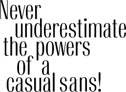
Enter the Casual Sans Serif
For years I've touted certain fonts for their high degree of legibility and readability under stressful situations. If you've attended or purchased my "Creative Layout Techniques" seminars you'll clearly remember I cite Optima as just one of those fonts. Optima is an ideal font selection for situations where you need readability from a distance or while in motion. That's why it's such an ideal face for outdoor signage like building directory or architectural markings.Here's a fresh new casual sans I've discovered that works just as well
(continues next page)
- Questions or comments on this article?
- SUBSCRIBE : to the Designers' CAFE email list