


Initial Letters
by Ilene Strizver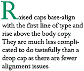

Do you have a lot of text to set and want to spice it up? Try using an initial letter. An initial letter (or cap as they are often referred to) is an enlarged first character of a paragraph which can sit above, below, to the left of or even behind your text and can be set in a different weight, style or color. Initial treatments include drop caps, raised caps as well as boxed, reverse and overlapped initials.
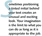
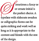
The use of contrasting typefaces including decorative, calligraphic or ornate type styles can be very effective. You can even use a lowercase character! (Consider it "typographic license.")
The key to using initial letters professionally is proper alignment. If the character is intended to appear flush left with the text, it should align optically rather than mechanically. Certain characters such as those with rounds (C, O, S, etc.), diagonals (A, V, W, Y) as well as characters with serifs (which get proportionally larger with size), should be pulled out to the left a bit to visually align.
 If the character is the first letter of a word (as opposed to a single letter word such as "A" or "I"), try to space the rest of the word close enough to the initial to read as a word. Your type can look amateurish and be hard to read when the rest of the word seems to be floating away.
A couple of things to remember: never repeat the enlarged initial in the text, and don’t use too many initial caps in one job. In fact, one per length of copy or long section is probably enough. Whatever kind of initial cap you use, readability should never be sacrificed for style. Keeping that in mind, your imagination is the limit to what you can do.
 Ilene Strizver is a typographic consultant, designer and writer specializing in all aspects of typographic communication. Her primary client is ITC, where she directs the typeface development program..
When you read the first few pages of Type Rules, you'll understand why I call this book, from Ilene Strizver, the most significant typography book since Alex White's Thinking in Type.
Author Ilene Strizver writes:
I can trace my interest in type and letterforms back to the posters I drew for my junior high school elections. I can remember spending hours on the lettering, measuring out the strokes of each character, the spaces between each letter as well as the spaces between the lines. Those posters would appear extremely crude by professional standards, but my interest in the geometry of letters and the relationships between their positive and negative spaces was evident even then.
After studying music and then fine art in college, I was lucky enough to have landed a seat in Ed Benguiat s lettering class at the School of Visual Arts in New York City; my life was never to be the same again. Ed instilled within me the passion for type that I have today, and that with which I will attempt to infect you. The bad news is if I succeed, there is really no cure for it; the good news is "catching it" will open your eyes to so many exciting things you have never seen before, and allow you to enjoy and appreciate the world around you in a completely new way. [End Quote]
Type Rules
 Is that a noun or a verb? Both. Type Rules gives superb tutorage in the ways and arts of type and typography. No, it's not steeped toward publication design as is Alex White's Type In Use, but rather a survey of proper, historic, tasteful, innovative, and creative ways of type.
Each page is a luscious immersion in the stuff that makes good type. You already know my love an passion for typography... well, this is the book I would dream of writing if I were to write about typography.
If you don't buy it, you'll be missing a most important opportunity to increase your skills and understanding of typography by quantum leaps. And that's all I'm going to say.
A full review, along with sample pages and spreads is in the "Editor's Choice" at the Designers' Bookshelf.
Type Rules is from North Light Books, and is available through the Design Bookshelf, or by clicking here
Thanks for reading...
![]()
Editor / Publisher: 60-Second Window, DTG Magazine, the User Group News Network, and Photoshop Tips & Tricks
Return to the Type Department
Participate in your Design Center
Lots of fun and information for all... don't forget, any community is only as good as the participation of its members. We invite your tips, tricks, comments, suggestions and camaraderie.
- Ask for the DT&G Monthly: to receive news about DT& headlines, happenings in the Design Center and regular columns like the "Mail Bag" and "Cool Sites"
- SUBSCRIBE : to the Designers' CAFE email list