| What is a Ligature? A ligature is a set of two or more characters that have been designed into a harmonious "set". Originally, they were designed to control letter spacing in situations where two or more letters take up too much space and have an uncomfortable feeling to the viewer. In olden days, these characters were created by "carving" into the actual block or having parts of characters extend beyond their block into the space of another character. __ The problem is, few fonts today (particularly cheap ones) have good ligature sets. This example above is from Adobe's "ITC Garamond Condensed" font, and even ADOBE did a poor job, only including the fi and fl characters. (Tsk, tsk tsk.) Not all fonts need them because of today's "optimized" fonts. Yet they lend a masterful appeal to the feeling and texture of good typography. As the producers get more money hungry, and less interested in typography as an art, there will be fewer and fewer ligatures. __ A fringe benefit is that many of the ligature sets in the old style fonts actually lend a decorative touch to some character combinations. In some you'll see a flourish, in others a different character to be used at the end of a word -- almost as if it were a swash. __ Take any font peeking program and view the entire character set. You'll see if ligatures are included. When you purchase Adobe fonts (in package, not online) you'll get a character map with the font. I use ASCiifont, a shareware program available on the Mac. "Keycaps" will do the very same thing. __ After the final proof-reading stages of the project, and everything is in place, go back with your find-replace function and replace the character combinations for which you have ligatures in the font. __ Most readers won't notice. But if they do, they'll say "geez, this guy really knows what he's doing." Kerning 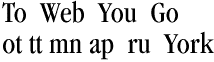 Kerning is the art of character fitting so that the space between characters
is visually correct rather proportionally set by the machine. Most often recommended
in headlines, and larger settings of type, it's the art of carefully moving characters
together so the word looks and reads better without holes within the word. Kerning is the art of character fitting so that the space between characters
is visually correct rather proportionally set by the machine. Most often recommended
in headlines, and larger settings of type, it's the art of carefully moving characters
together so the word looks and reads better without holes within the word. __ Good cases are: Ta, To, Wo, Po or other situations where a hole is formed by a wide portion of a letter. Rule of thumb: round characters can be Kerned more than straight characters. Tracking  This is a generalized term popularized by the software companies who initially
didn't have a clue as to what they were doing other than selling software. It is
similar to Kerning in that it adjusts the space between characters, words or acronyms.
Usually it's done by the machine -- not by the eye -- to a whole block, article or
document as opposed to character kerning individual pairs. This is a generalized term popularized by the software companies who initially
didn't have a clue as to what they were doing other than selling software. It is
similar to Kerning in that it adjusts the space between characters, words or acronyms.
Usually it's done by the machine -- not by the eye -- to a whole block, article or
document as opposed to character kerning individual pairs.At right you see normal machine spacing (Adobe Pagemaker) and the same word sample after some rather careful hand kerning. Note I said "hand" kerning. __ I put the anchor lines in yellow. Squint at the word at right and the lines will fade out. Which one looks better? Have fun. Fred. Use your BACK BUTTON to return to the article you were reading. |
.
.
.
[ The Design Center ] _ [ &Type ] _ [ DTG Newsletter ] _ [ Designers' Bookshelf ]