

Ross Henderson of McMurdo Multimedia, wrote in to praise our article on the "Basic Rules of Design & Layout" (September DT&G) and then followed with a question that got all of our attention.
He wrote:
Much more complex is typeface selection. I would love to find a simple guide to this - everything I have examined seems to rely on complex or custom typefaces, which for a one-off jobs cannot be justified. What I think is needed is something which uses "standard" typefaces ie those which can be obtained without great difficulty or expense.
Also see: Leslie Cabarga on "Selecting" fonts"
The voice of typography
"Which typeface should I use" is a very frequent question. A 'simple' guide simply doesn't exist but some very simple concepts do.
For years I've made only two points about headline or display fonts in my Creative layout techniques workshops:
1) use typography voice, and
2) exploit typography message.
For instance, what does the following line of type say to you:

Let's take a look and see how to discover an 'easy' answer to the very difficult question of Which Typeface to Use
Open your eyes and listen
Of the hundreds of typography books I've read, I've gleaned hundreds of different opinions but no 'simple' solutions. Only one hits the bull's eye -- Jan White, author of Editing by Design, said:
"Open your eyes and listen."
This is the one, single suggestion that satisfies.
All fonts carry two visual characteristics that give designers a free ride. (Well, those who actually recognize these characteristics.) After the legibility and readability issues are solved, we're still left with that one nagging question, which face.
As visual communicators we should be careful not to become too enamored by reading. Yes, we need to have a solid copy platform, carefully combined word sets, and a thorough understanding of the message. But the message and concept should already be established. So how come so many designers today ignore what happens in the first few moments of the initial visual gulp. I'll repeat: "Open your eyes and listen."
Jan went on to say:
"Type is speech made visible, with all the nuances, inflections, tonalities and even dialects of the human voice. It is one of humanity's most precious possessions."
The astute designer will read the headlines and body text aloud with the intention to capture the "nuances and inflections" the message dictates. It's then rather obvious where to look for a type face that resounds those inflections.
I give my students two choices: organic or inorganic.
After reading the phrases we ask ourselves, who are we talking to and who is doing the talking?
We further ask ourselves questions about the origin, personality, and mood of the speaker, and if that is appropriate to the subject matter and the audience. After so many years of practicing this method, the actual process itself becomes almost involuntary and the designer will almost instantly arrive at the solution rather than fretting over it.
How to listen...
To establish the discipline, and get ourselves into practice we must consider the following questions:
![]() 1. Organic vs. Inorganic: Is the subject or message an organic (living, human) voice, or is it an inorganic (mechanized, mechanical) voice.
1. Organic vs. Inorganic: Is the subject or message an organic (living, human) voice, or is it an inorganic (mechanized, mechanical) voice.
Hard-edged subjects, or those which relate to non-human characteristics perhaps would be better portrayed with a uniform, hard-edged face such as a sans-serif. If the subject or message speaks in an organic (human) tone, perhaps a serif face would be better.
 2. Is it hard, or is it soft? What is the emotion of the message?
What are you trying to get across? Certainly you wouldn't use the same voice to tell someone about baby lotions as you might use to declare a hazzard warning. Is there an urgency to the message? Is it angry, sad, happy, soothing, tired, bewildered? What?
 3. Who is talking... to whom?
Put a voice to your message. I sometimes find it helpful to dream up a spokesman for the message. Would it be James Earl Jones? Barbara Walters? Walter Cronkite? Arnold Swartzenagger? (sp?) Listen to voices. What typefaces do they suggest?
![]() 4. Where or when is it?
4. Where or when is it?
History, place, setting, atmosphere and environment all speak voices -- voices that are visually inherent in typefaces. If it's a little old, soft and human, perhaps an Art Nouveau face is appropriate. If it's far away, and exotic, perhaps an Asian style face will fit. You can send messages very quickly and effectively just by thinking place and time. Is it uptown and avant garde, or is it down-home and salt-of-the-earth?
 5. What is its posture? What is the attitude?
If a face hasn't suggested itself to you yet, perhaps its posture will. Is it running fast? Is it slumping? Is it standing erect at attention? Is it sensually reclined? Yes, there are faces that reflect posture as well. Sometimes the 'set' of the type suggests posture... italics are moving, or speaking to the side. All caps seems stiff and erect -- many times traditional and dignified. Just like body language, the postureand attitude of the message can suggest the perfect face for the job.
The test
 Next time you're wondering which face to use to set the mood, and best embrace your message try this.
* Select the most important piece of typography in the project. Or two.
*Now, select 6 of your most different and diverse fonts, and set the type.
*Tack it up to the wall and stand back. Now, there should be no question.
 So, what I'm trying to say is there are no simple solutions -- no cookie-cutter tricks that fulfill the real requirements of design. For each project carries its own rhythm, tone and attitude. One must be fully receptive to letting the message itself dictate the font and face.
In reality all you actually have to do is practice the simple act of
"Opening your eyes to listen."
![]()
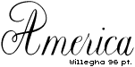
Postscript: trickling down this page is the word "America" in very different type faces. All carry the same meaning, yet say it in different voices. With each, we can 'hear' the mood, tone and attitude one might expect to encounter in the article or editorial work. At right are links to full font showings of these faces. Two of them are available FREE for download in the Publishers' Warehouse
John Newcomb, in his landmark "Book of Creative Problem Solving" said:
"When pictures and words pull in opposite directions and the poor reader doesn't get any message at all, he simply turns the page."
Something to think about.
Now, back to the DT&G Department
- Questions or comments on this article?
- SUBSCRIBE : to the Designers' CAFE email list