Where fonts go wrong
The auto-trace method becomes really evident when the author either doesn't take the time to correct tracing mistakes, or doesn't know how fonts are constructed. It really shows in many of the antique and display fonts.

Look at script fonts -- the true test of font designer's mettle. They're so popular, but seldom done well.
In this example the author either didn't know, or didn't care, that the lower case "e" in this script example is actually formed by the stroke crossing over itself as it continues on to the next letter. Note the round "crotch"where the strokes are supposed to cross. Now, let's look closer...
This is a dead give-away that the character was copied or traced from a poorly printed sample of the font. Had the author known, (or cared) he would have turned those into sharp truncations. This font will print on your printer already looking like a photocopy, or a poor printing job. Taken to the printer, and being further violated with dot gain, roller mashing and paper absorption, this font has no chance of contributing to a professional printed piece.
Now, let's separate the "men from the boys." (Woops! read "the bush league from the pros")
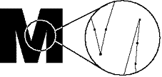
The true font craftsmen will know how to construct the physical characteristics of a letter for the most clear visual representation once printed on paper. Many (even some of the "big-boys") will be inclined to create this Helvetica Black "M" crotch with a single anchor point. Not so with a craftsman. To visually look as it should, the crotches will be mortised back slightly. When printed, it will be less likely to grow together.

Try it yourself. Type an upper-case M, X, N, or A and set it at, say, 600 points. Print it out. What do you see? Take the same character and print it at 10 points, and look at it under magnification. Does it hold its integrity? I've seen fonts that look like a photocopy when typeset. This is where the character shapes will bleed together, making the overall typeset look mashed, and sloppy -- not crisp and fresh. Now, let's look closer...

The craftsman has taken it a step further. To prevent mashing, the crotch is actually constructed from two anchor points rather than one. This will not be visible in most typeset sizes - but it will very definitely contribute to the overall look of the final printed type.
The font that satifies
So now you ask why I went through all this. These are some of the reasons why some type looks professional, and some doesn't. They're all things to look out for if you want a really polished, professional finish to your projects. Particularly when imaging on high-resolution devices. Poor type imaged on a Linotronic 550 really shows!There are many other points we could discuss. Like kerning/spacing metrics. Good fonts have thousands, all carefully hand placed. Bad fonts have perhaps a few - but automatically placed by a stupid machine. Electronic font creation has also fostered some short cuts that have eroded the personalities of some fonts. With today's software it's too tempting to copy a serif, and flip it for the other side of the character -- or step it along the font for use on other characters. If uniformity is the rule of that particular face, then that's the rule. But what about Mr. Goudy's font?
Carefully examine your copy (or look alike) of Goudy. Serifs the same? NOT. Once again if we go back to the ortho-film master of the original Goudy, we discover that only a few of the serifs are identical. Most have been individually created, with their own subtle personalities, to work in harmony with it's parent character. And, it's not a simple matter of drawing each letter. It takes hundreds and hundreds of pencil to paper drafts to arrive at a final font. True Goudy has a lyrical and inviting quality that the reader can read tirelessly, hours on end. Did you ever look very closely at an original issue of Garamond? You'll find very few straight lines. They all bend or curve slightly to grow the stroke into the serif. Not so with most of today's so-called " Garamond" fonts.
Look at most of the electronic versions of Clarendon, Egyptian, Fortune or even Baskerville. They'll sit flatly on the baseline. In reality, those feet should be ever so slightly concave, giving a rhythmic life to the printed words as they occupy the baseline -- not flat and static.
This could begin to sound like a tent revival. I guess I'm only attempting to drive home the point that if you care about typography and the eventual beauty of your printed communications, there are fonts that will deliver for you, and fonts that won't. Look for quality and integrity. The ITC license is a good guarantee you'll be pleased -- both with the craftsmanship and the reliability of the characters. Stone is one of the new foundries that lives by the creed of craftsmanship. You can't go wrong with anything that has been touched by Summer Stone. Many of the smaller producers like Red Rooster carefully place each anchor point lovingly by hand, then supply hundreds of kerning and character pairs, each visually divine.
Sure 1,600 fonts on CD for $49.95 is wonderful. Go for it. Many of those fonts will make some of your projects shine. But beware. If you use fonts that are not up to snuff, make damn good and sure they don't visually betray their lack of quality. And if you don't do it for yourself or your client -- then do it for your reader. Because they are the ones who will eventually decide to read (or not to read) what you've created!
![]()
(Now, stepping down from his soap-box!)
See: Mat Planet's rebuttal to this article, presenting some interesting comments to be taken very seriously. We always invite responses to any of the editorial content found in these pages.
Participate in your Design Center
Lots of fun and information for all... don't forget, any community is only as good as the participation of its members. We invite your tips, tricks, comments, suggestions and camaraderie.- Ask for the DT&G Monthly: to receive DT&G newsletter each month, happenings in the Design Center and regular columns like the "Mail Bag" and "Cool Sites"
- SUBSCRIBE : to the Designers' CAFE email list
- SUBSCRIBE: to the Web Design & Review email list
- READ Our Writer's Guidelines: before sending articles
- SUBMIT: a news link, new font, or product review
- SUBMIT: a link to a Photoshop web site
- Trademarks & Legal

