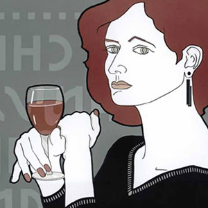
Thanks to the new book tracing four decades of stunning posters from David, I have the distinct pleasure of idolizing yet another of my most-admired contemporary graphic designers. Everyone who loves the visual arts needs this …
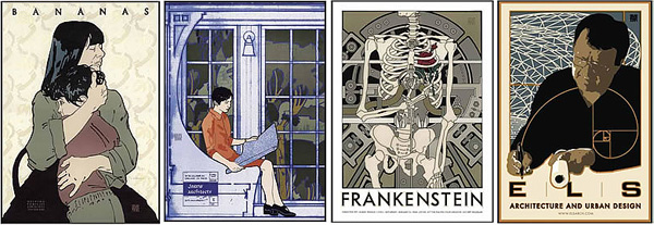
![]() I first learned of David Lance Goines sometime just after 1974. My mother-in-law, blueblood from Berkeley CA, gave me a Karl Kardel poster which Karl, her house painter, had given her. I was astounded by the art and the creative game the artist had played with the wings of the bee. She said, “you know, the artist is right here in Berkeley.” From that point on, I made a point to follow David’s work.
I first learned of David Lance Goines sometime just after 1974. My mother-in-law, blueblood from Berkeley CA, gave me a Karl Kardel poster which Karl, her house painter, had given her. I was astounded by the art and the creative game the artist had played with the wings of the bee. She said, “you know, the artist is right here in Berkeley.” From that point on, I made a point to follow David’s work.
Then in 1980, on a trip out to Berkeley, I visited Goines in his print shop, “St. Hieronymus Press,”. To say the least, I was captivated by the artist’s digs. When I arrived, he was hunched over a small light table in the back of the dimly lit shop space. David was working with a brush and jar of red opaque. As we became acquainted, I learned he was actually painting parts of his image onto the film which would burn the plates of his next masterpiece. He commented that many of the negatives he uses are either created or retouched by hand, using opaque, pens, brushes, or cut from rubylith.
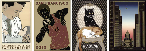
Children’s Hospital, San Francisco Olympics, Diamond Foam Cats, Central Library
 Goines prints his posters using well-worn offset lithography equipment on the highest grade paper available — hand-mixing the colors, and carefully watching the press run for quality. He taught me the split-fountain techniques he used to produce perfectly seamless, graduated color fields. (Like the sky in “Central Library”) I watched as he meticulously mixed the separate batches of ink — sometimes a dozen steps of color — then loaded the ink fountain in the sequence to be merged. The key to smooth graduated color fields is priming the fountain, and running the ‘idle’ roller until the gradation is perfect. When the fountain blend looks smooth and uniform, he runs a few prints … maybe a dozen or so, then carefully checks the color. He then runs until the fountain begins getting low. Then he shuts off the paper feed and goes through the process again, reloading and then running the idle roller until ready to turn the paper feed back on again. This is truly the highest form of the offset-litho arts.
 He also shared his secret that to achieve those wonderful deco-inspired colors … “always consider mixing just a touch of opaque white with any other primary colors in use in order to achieve the antique, or deco look in colorization.” For some colors, he actually begins with opaque white. You would be hard pressed to find another litho press operator in the world willing to do this. I’ve tried to get commercial printers to go this extra mile for some of my projects and they all say no due to press roller wash-up. They claim it’s impossible to get all the white off the rollers! But it’s this dedication to the art that marks true craftsmanship!
During that visit, he invited me to take home some “samples” — I picked up two of the Chez Panisse posters while the ink was still slightly wet. I also grabbed a “Velo Sport” which later became my young son’s favorite. These prints are, today, the most prized pieces in my print collection.
Returning home, I was so inspired by the visit, I attempted to emulate David in my next several poster projects. But that dream ended quickly. Clients around here were aghast at the cost of hand drawn, hand lettered, multi-color posters.
Although of special meaning to me, all designers and artists should discover the works of David Lance Goines — and this new title from Dover Books is a great way to do it. The book traces 40 years of David Lance Goines poster art — it’s a joy to behold, and a joy to own.

My collection: Karl Kardell*, Velo Sport*, Mirage*, and Calahan Piano Services* and three others not shown.
The Poster Art of David Lance Goines: A 40-Year Retrospective
 Now, even if you didn’t visit David’s shop in the 70s, 80s or even the 90s … you can enjoy this designers exquisite art in the new book from Dover : The Poster Art of David Lance Goines: A 40-Year Retrospective.
This book is a celebration of David’s four-decade career, treating you to 155 full-color posters. David Lance Goines’ distinctive design posters promote movies, galleries, restaurants, and concerts, in addition to other events and products. This original edition was developed in cooperation with the artist, who has written the Preface. (Linked below!)
In this article, I’ve shown you just two examples of Chez Panisse posters David has created over the years for the popular, high-brow Berkeley restaurant and cafe. (Been there, but you have to make reservations a year in advance!) Alice Waters, chef, author, and the proprietor of Chez Panisse, provides us with an inspiring introduction to the book — fitting for Alice and David’s long-standing friendship.
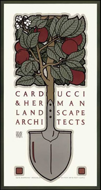
David’s career has seldom wavered from his original “style” of distinctly deco flavor, unique use of classicly styled typography, and flat, outlined color fields with beautifully muted color palettes. There have been slight shifts and ‘experimentation’ into character deliniation and modeling, such as in the “Mr. Expresso” and “Jazz” posters. Most characteristic however is the distinct drawing style interwoven with interesting shapes, patterns and visual twists of reality — like where the handle of the shovel becomes foliage for the ‘Landscape Architects’ poster, above.
You should pick up this book. Although it shows only about a quarter of David’s most memorable works, they are nicely reproduced and convey the works beautifully. David is producing new works every day. His prints are displayed in people’s homes, business and in chic galleries across the country. I predict he’ll eventually be counted amongst the masters and coveted by museums and private collections. There have been several books before this one — all, now, out of print — (I have two of them! — so grab this one as soon as it’s available in just a few weeks.
IF you thirst for more, you can get an even broader look at his works with a simple Google Image search — but don’t settle for viewing the works on the web. The web kills the liveliness of David’s work — it’s simply impossible to capture all the nuances in a JPG. And, if you’re a lover of truly fine art, design and printing, or a dedicated print collector, you seriously need to own at least one genuine Goines poster. Nothing else really comes close to holding the real thing! You can order prints online at his www.goines.net, or stop in next time you’re in Berkeley!
![]()


The Poster Art of David Lance Goines: A 40-Year Retrospective
Paperback: 160 pages ~ Publisher: Dover Publications (available this November 17, 2010)![]()
![]()
![]()
![]()
![]()
![]()
![]()
David Lance Goines online![]()
![]()
![]()
![]()
![]()
![]()
![]()
David Lance Goines Fine Arts Posters Master List![]()
![]()
![]()
![]()
![]()
![]()
![]()
![]()
![]()
![]()
![]()
![]()
![]()
![]()
![]()
![]()
![]()
![]()
![]()
![]()
![]()
Study this work. Then try to emulate it. Even if you copy the concepts directly (not for publication of course), you’ll learn a lot. Create those subtle outlines. See if you can creat a poster in the tradition of Goines. If you will at least try it, you’ll be a much better visual designer.
And, thanks for reading
POSTSCRIPT: So, if you’re still reading — and you’ve made it this far — I’d like to say that with this article, I have now had the distinct pleasure of writing about yet another of my most admired contemporary graphic design idols. I have yet to get Chuck Green in here, but I will … enjoy ![]()
![]()
![]()
![]()
![]()
![]()
![]()
![]()
![]()
![]()
![]()
![]()
Milton Glaser: To Inform and Delight![]()
![]()
![]()
![]()
![]()
![]()
![]()
![]()
![]()
![]()
![]()
![]()
Seymour Chwast: Obsessive Images![]()
![]()
![]()
![]()
![]()
![]()
![]()
![]()
![]()
![]()
![]()
![]()
Peter Max: changing a generation through art![]()
![]()
![]()
![]()
![]()
![]()
![]()
![]()
![]()
![]()
![]()
![]()
![]()
![]()
![]()
![]()
![]()
![]()
![]()
![]()
![]()
![]()
![]()
![]()
Alex White: Design’s Function & Typography and 2,
3, on Avant Garde![]()
![]()
![]()
![]()
![]()
![]()
![]()
![]()
![]()
![]()
![]()
![]()
Drew Struzan: legend in movie posters![]()
![]()
![]()
![]()
![]()
![]()
![]()
![]()
![]()
![]()
![]()
![]()
Thomas Morris: pied piper of the west-coast rock generation![]()
![]()
![]()
![]()
![]()
![]()
![]()
![]()
![]()
![]()
![]()
![]()
![]()
![]()
![]()
![]()
![]()
![]()
![]()
![]()
![]()
![]()
![]()
![]()
… along with two heros, not of my generation:
![]()
![]()
![]()
![]()
![]()
![]()
![]()
![]()
![]()
![]()
![]()
![]()
James Montgomery Flagg
![]()
![]()
![]()
![]()
![]()
![]()
![]()
![]()
![]()
![]()
![]()
![]()
J.C. Leyendecker
Don’t forget … we encourage you to share your discoveries about favorite or famous graphic designers and illustrators with other readers. Just comment below, or join the forums
