Alex comments
Dear Fred,
and those who would use Avant Garde:
In case you ever get a letter asking about the advisability of using Avant Garde in a design after, say, 1978, I have prepared this historical note.
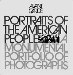
Avant Garde -- the typeface -- was born as a logo for a new magazine of the same name in the mid-60s. Ralph Ginzburg collaborated with Herb Lubalin (pronounced "Loo-ba-lin") on four magazines, of which Avant Garde was their second. Ginzburg remembers, "Avant Garde (the magazine) began as the single most difficult collaboration we had -- his [Lubalin's] first logo was in Hebrew. He thought that was funny. Then he did it in Coca-Cola script. We went through a dozen logos, masterfully executed."
 Lubalin and Ginzburg used a collection of Picasso erotica in the promotional materials for the new magazine and needed a complete alphabet for their titles. Lubalin used three assistants to hand draw the 26 characters (only capital letters were needed) very quickly and, with the vital involvement of Tom Carnase, another of Lubalin's partners, many additional fitted character pairs (called "ligatures") were created as their work progressed. It is these upper case character pairs that made Avant Garde one of the most original typefaces of the twentieth century.
 But Avant Garde, the all-cap typeface, was intended only for use in the magazine by its art director. The International Typeface Corporation (ITC), a business venture begun in collaboration with Aaron Burns, released the first full Avant Garde fonts in 1970. A serifed version of Avant Garde, called Lubalin Graph, and designed by Tony DiSpigna, was released by ITC shortly thereafter.
One of Lubalin's partners, Tony DiSpigna, says, "The first time Avant Garde was used was one of the few times it was used correctly. It's become the most abused typeface in the world." Ed Benguiat, one of type's best friends and an ancient pal of Lubalin's, says, "The only place Avant Garde looks good is in the words Avant Garde. Everybody ruins it. They lean the letters the wrong way."
 There are two knocks against Avant Garde: It is irrevocably connected to the era in which it was born; and it is ugly.
Lubalin's typeface was a landmark design of the late 60's. It was such a fresh approach to letterforms and their interaction that it became a typographic icon of the period. For those who were aware back then, it is permanently connected to that era and is best used to help create a thirty-year-old mood in a design.
The upper and lower case typeface was developed as an outgrowth of an all-caps logo. Certain design decisions that were made in the brilliant interests of a two-word piece of display type had to be followed to make the font work as a unified collection of characters. As a result, the lower case characters are squeaky clean distortions of other slightly less geometric sans serif fonts like Futura and Univers. In fact, Avant Garde has the most geometrically- perfect rounds and truely straight strokes of any typeface I can think of. A collection of such extreme shapes causes fatigue at text sizes and cannot help but draw attention to itself, which is arguably the greatest sin a typeface can commit.
 |
Its strength has always been its all-cap ligatures. Avant Garde should be used as it was originally intended: as a display face where its ligatures can be carefully crafted into magnificent letterform gems. The pity is that none of the digital Avant Garde versions with which I am familiar include any of the ligatures. So we only have access to the least interesting aspect of the fonts.
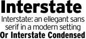
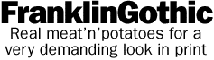
If an elegant sans serif font is needed for both display and text, I recommend the Interstate family from the Font Bureau and Franklin Gothic from ITC for text and the less homogenized versions from Bitsream for display.
With best regards,
Alex W. White
New York City
Thank you very much, Alex.
And with that note, I reverantly lay my original Avant Garde 2-inch film font master to rest in the Typositor graveyard in the basement. May it rest in peace.
Thanks for reading
![]()
Don't forget ... we encourage you to share your discoveries about favorite or famous graphic designers and illustrators with other readers. Just comment below, join the forums for discussion, or give me a tweet at Twitter/DTG_Magazine
[ The Design Center ] [ &Type ] [ Photoshop Tips & Tricks ]
Want to discuss it? Subscribe to The Designers' CAFE
Web Tips: If you are looking for search engine optimization then you need to choose a good virtual private server with dedicated ip and also pay attention for your web site design to succeed.
All Rights Reserved ©1999 DTG. DTG(TM) and 60-Second Windows(TM) have been published continuously online since 1988. The Design & Publishing Center is a Spam-Free web site and welcomes your articles, comments and contributions. Graphic-Design.com and The Design & Publishing Center is a wholly owned subsidiary of Showker, Inc., TA. Showker Graphic Arts & Design, and is located in Harrisonburg, Virginia; in the Shenandoah Valley of Virginia, USA, established in 1972. 540-433-8402.