
Michael Doret & Alphabet Soup
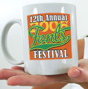
Our 'official' type font for this year's Fall Fonts Festival (above), as well as the typography adorning our Anniversary Coffee Mugs comes from the pen and brush of Michael Doret, master illustrator, designer and typographer. These examples scarcely scratch the surface of what you can do with this font! Already, people have asked if I lettered it by hand!
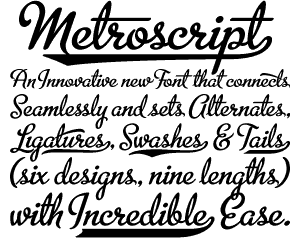
You met Michael earlier this year when we broke the news about the "Letter as Image" show, and then in the Design Center Gallery. Michael has been an icon of the design and lettering industry for nearly 35 years, producing some of the most outstanding visuals of all times. Now Michael has gotten around to getting his fonts going -- and if Metroscript is any indication of what we'll be seeing from him, this is going to be big news!
 Michael says:
Metroscript was totally a labor of love. It's actually a style of letter that I'd been using for years in my work -- a kind of 1930s/'40s script. I would always just draw the letters I needed for a particular assignment. When I showed Stuart some samples of my work that contained that style he convinced me to go ahead and try to make a font out of it.
The only way it would really work was to create it in OpenType because of how the letters needed to link and flow together -- impossible with a standard font. For example a lowercase "b" that starts a word would be different from one that falls in the middle of a word. So many lower case characters have three separate glyphs -- one for starting letters, one for "middle of the word" letters, and one for ending letters.
There are also all six different "tail" styles that can be appended to the end of words that can be as long or short as needed. Plus there are numerous swashes, ligatures and alternate characters that, I feel, make Metroscript a totally unique font.
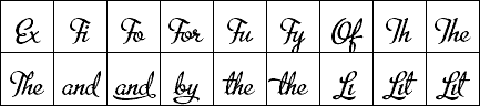
(Click here to see a selection of glyphs available in this awesome font. Click here for Glyphs in Use example! )
![]() Metroscript has been described as "baseball" or "sports" script, but its applicability is really much wider than that. Metroscript is chock full of features that will expand its usability such as; 6 different tail styles with variable lengths; letters that "know" when they're at the beginning or at the end of a word or following a certain other letter-and change accordingly; plus swashes, ligatures, accents and foreign characters all fitting together in a way that makes each word seem hand-lettered. Michael has even included a "How-To" pdf file that helps you get use out of all the goodies in Metroscript.
Metroscript has been described as "baseball" or "sports" script, but its applicability is really much wider than that. Metroscript is chock full of features that will expand its usability such as; 6 different tail styles with variable lengths; letters that "know" when they're at the beginning or at the end of a word or following a certain other letter-and change accordingly; plus swashes, ligatures, accents and foreign characters all fitting together in a way that makes each word seem hand-lettered. Michael has even included a "How-To" pdf file that helps you get use out of all the goodies in Metroscript.
RUN, don't walk to Michael's Alphabet Soup to pick up a copy of Metroscript
![]()
BUT WAIT... there's more. . .
Continue for more 2006 Fonts Festival
We always invite you to share your favorite freeware or shareware fonts for the DTG readers. Got comments or suggestions? Just give us a shout.
Last Year: 2005 Fall Fonts Festival...
Or return to the Type Department
- Questions or comments on this article?
- SUBSCRIBE : to the Designers' CAFE email list