
OF ONE THING YOU CAN BE SURE: if a design or communication arts book has the name "Allworth" on it, you're guaranteed that it's going to provoke thoughtful learning. This article is excerpted, with permission, from Allworth's "DESIGNING EFFECTIVE COMMUNICATIONS Creating Contexts For Clarity and Meaning" edited by Jorge Frascara, containing blockbuster essays from a diverse group of prominent figures in the communication design field.
This excerpt by Rubén Fontana embodies the very essence of what all typographers should have flowing in their veins. He asks some simple questions about typography that I'll expect you to discover the answers to...
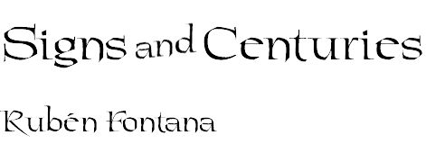
Fontana-Diseño, Buenos Aires, Argentina
(Translation into English: Peggy Jones and Martin Schmoller)
CULTURE HAS DISTINCTIVE FEATURES and has the capacity to condense human experience. The slightest glance at our behavior, our intellectual and social environment, our relationships, and our systems of production and exchange, confirms that complex networks of signs, many of which have yet to be translated, traverse our entire lives.
![]()
THE TASK OF A TYPEFACE DESIGNER is, above all, to generate spaces for communication, context, or structure, and when designing a font, the typographer is partly anticipating future communication conditions. Typographers build the contexts and part of the circumstances surrounding the reading of a message that does not yet exist. They work from their knowledge and, at the same time, influence a historical convention and its projection into the future, that is to say, in a cultural and temporal context. They develop systems of abstract forms to represent abstract sounds.
Rhythm, structure, color, legibility, proportion, and harmony are designed and recombined for each new communication purpose, recreating the most conventional forms capable of manipulation. When analyzing the form of each letter, the thought behind the shape of its counter, the force of its black and white rhythm, the course of its strokes, the space that will envelop it, joining or separating it, a typographer is not anticipating the beauty of a shape, but foreseeing the future of an as yet unknown word.
A font conveys conditions beyond the limits of time and message. Type styles developed in the sixteenth century continue to be reference models and provide the context for contents and forms of reading in the twenty-first century. Although the meaning of a text transmitted by a typeface might be ephemeral, the cultural framework in which the design of the font was generated can be timeless.
Type can be a good or bad interpreter of the word it represents. In its inevitable relationship, type and content either act harmoniously or disallow each other dramatically, obstructing communication. Typography starts with the interpretation of a style, the relevant one for the message, and thereafter its mission is to become transparent. Its behavior on a page is similar to that of paper; in other words, it should act as a medium, a background for the content, which will make the message more accessible and legible.
This brief summary leads to a series of questions, some of which have been answered by history in one way or another, whereas others have not yet been wholly formulated: When creating a font, how can we take into account this vast number of references? Can we predict to what extent the effectiveness of a message will be conditioned by its vehicle--letters? In the design of a page layout, can letters lead to varying subtleties of interpretation? What makes a typeface design timeless?
[End Quote]
Fontana then goes on to tell about The Tower of Babel, the hanging gardens of Babylon, the epic poem of the legendary hero Gilgamesh, the Hammurabi Code, the walls of Ur and how milestones that have defined the cradle of western civilization for more than five thousand years figure into the development of the alphabet.
Now, I'd like to turn the tables on you, and focus on Fontana's all-important series of questions.
1. When creating a font, how can we take into account this vast number of references?
2. Can we predict to what extent the effectiveness of a message will be conditioned by its vehicle--letters?
3. In the design of a page layout, can letters lead to varying subtleties of interpretation?
4. What makes a typeface design timeless?
Find an answer to these questions. Find them from within yourself, or through careful and detailed study. The truth is out there! I will send a "12th Annual Fonts Festival" coffee mug to the pereson who writes the best answer to any or all of the above questions.

![]()
"DESIGNING EFFECTIVE COMMUNICATIONS"
Folks, if you're serious about becoming an intelligent, learned designer, then run (don't walk) to your nearest bookstore or Amazon.com and buy "DESIGNING EFFECTIVE COMMUNICATIONS" from Allworth books.
You'll be smarter than most everyone else, and you'll thank me later.
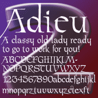
But there's more: AdieuTwo Pro
The headlines decorating this article are crafted from the latest font, AdieuTwo Pro, from David Bergsland. It's a radical reworking of one of his old workhorses called Chivalry. I selected it because it speaks the spirit of Fontana's essay. Like all David's OpenType Pro fonts AdieuTwo Pro has small caps, small cap figures, oldstyle figures, many ligatures, and more. It's display only, but wonderful for invitations and formal announcements -- or any time you want a voice of classic antiquity.
Continue for more 2006 Fonts Festival
We always invite you to share your favorite freeware or shareware fonts for the DTG readers. Got comments or suggestions? Just give us a shout.
Last Year: 2005 Fall Fonts Festival...
Or return to the Type Department
- Questions or comments on this article?
- SUBSCRIBE : to the Designers' CAFE email list