'60s influence
Max Alexander Kisman, originally from eastern Netherlands, is the creative force behind Union Fonts -- bringing lively typography into today's digital world from a decidedly "60s" background.When asked "What influenced your passion for typography?" Max relates...
As a teenager in the late '50s, I was greatly influenced by the emerging music scene -- The Beatles, The Who, the Kinks, Soft Machine, Pink Floyd and others. My artistic tastes tended toward the "Frisco" style psychedelic concert posters, Dali, Toulouse De Lautrec, Matisse, Esher -- but mostly the Frisco style psychedelic concert posters and all the art that surrounded the "counter" culture revolution.
Kisman studied art in another eastern Netherlands town, before moving to Amsterdam to study at the Gerrit Rietveld Academy. He graduated in 1977 in studies of graphic design, illustration, animation and typography. From there he started small design studio with a friend, with their first major assignment: Vinyl Music magazine (1980-1986).
First passion for lettering
Max relates:
"Those fabulous psychedelic hippie posters and albums covers of the sixties were my first fascination with letters and lettering. I'd incessantly copied the meandering lettering styles all over my school diary and my book bag. When asked to design the cover of my high school news letter and some event posters, I took the assignment seriously. This lettering was no longer a pleasure just for myself, it was a job.
From lettering to typography
His fascination with type and letterforms merged with his talent and interest in drawing...
"... with drawing and sketching, I could easily and immediately create images. Adding text gave informational value to the image. It became very apparent that the styling of the letters had great impact on the communication value as well as the overall impression of the design. Camouflaging the text too much confounded the message. It was fun. it was work.
Typography to Fonts
With the introduction of the computer in the early 80s, Max saw the darkroom and so many of the techniques involved in creating type become obsolete. He was no longer tied to the photo copier and stat camera and by 1986 he was designing and digitizing typefaces for Language Technology we to repeatedly used in various application for any purpose without too much difficulties. Max reminisces:
"At that time a relatively small group of pioneering designers like Zuzana Licko, Rudy Vanderlans and Neville Brody started to digitize their typeface designs and created new typographic and graphic design concepts, inspired by technological changes. Opponents called it a threat to the quality in graphic design, typography and the creative process in general. Meanwhile, the complete graphic production process became available to the individual graphic designer. With all its advantages and disadvantages, it was going to change the profession for ever. And fast!
Favorite Fonts
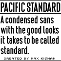
"Once before, this same question was asked by a Dutch print magazine, and I replied I didn't have any. "Make one yourself," my friend Chris Vermaas told me. So I did and came up with a font called "Jacque." Now available at FontShop. I don't think it's my favorite though.I often use a font cryptically called MK4SR in my illustrations for a Dutch Newspaper. For posters I tend to use the Pacific Standard Bold a lot. Basically because it is designed to be a poster font.
Favorite font designer?
"Roger Excoffon. I admire the grace and variety in his outstanding designs of Choc, Mistral and Vend�me. I also completely respect the work of Gerard Unger, once my teacher, and master of the curve
Hot Metal
Max's passion for typography continues to grow. One of the fonts included on the "IndieFonts 2" collection is HOT METAL a freeware font created by UK based designer David Luscombe at UNION FONTS. As you can see it's uniquely crafted from digitized and modified pictures of actual hot metal font slugs. (Used in your header above.)
The Future
Max continues to explore the undefined territories of illegibility, legibility, reading of symbols and visual language references, related to typography and typeface design. He shares these closing thoughts with us:
"As a visual composing tool kit, the possibilities of the keyboard are endless. Experiments, not just to redefine type or typography, but to redefine the keyboard, is possibly most useful to expand the territories of graphic design, typography and visual communication in either print or dynamic media.
The final merge of the "old" school typography into visual communication, confirms the point that typeface and symbol design must be a part of the educational program of visual communication. And as much as photography, motion graphics, illustration and image processing, it will offer the future designer a serious tool for the enhancement of individual identity concepts.
Union Fonts
Union has some superbly unique typefaces for the bold and the avant garde. Both Pacific Standard Bold, and HOT METAL are included with the IndieFonts 2 Book/CD package.
Visit UNION FONTS and I believe you'll find some exciting visuals there -- as well as some excellent opportunities to expand your typography design vistas.
Special thanks to Max Alexander Kisman, Union Fonts, and the whole gang at P22, for participating in this year's Fall Fonts Festival.
...back to &Type
This interview includes excerpts from "The Keyboard is a Tool Kit." First published in Tipografica, August 2003, Argentina.
- Questions or comments on this article?
- SUBSCRIBE : to the Designers' CAFE email list