Continued from the previous page ...
The Andy Warhol Style
If you were to produce this project using an exacting Warhol technique, you would start with a black and white photo, then move on to process a high-contrast Kodalith. (This renders the photo to primarily a single value: opaque.) From there, you would produce a series of film positives -- opening or masking areas for various colorization. With these films you would burn photo-screens which, in turn, receive the color inks for printing. During the screen-printing phase, you would experiment by printing different colors using different stencils, and even open, or mask, specific areas of the stencils using cut or torn paper or even the tusche method.
How do I know? Unfortunately, (or 'fortunately' which ever your point of view,) my printmaking professor at VCU in 1969 was had an acquaintance with Warhol, so he required all his students to make at least one print following the exact same technique used by Warhol. When I recover that print from storage, I'll scan it and show it here. But the unique thing about Warhol's method in regards to these prints, is that much of what you see in the finished art is the result of modification or experimentation with inks and stencils during the actual printing process.
Interestingly enough, if you search for "Warhol" tutorials online, you'll find several hundred. I read many of these along with a dozen or so in Photoshop books by famous Photoshop gurus, and NONE of them actually portray the true Marilyn technique correctly. Okay, they come close to producing something that looks specifically like the Marilyn technique -- but that's or are further interpretations of the Warhol technique, but they all seemed to either leave something out -- or add in their own twists. The key to the true Marilyn style is not the technique, but the artistic process. So, first, let's analyze the Warhol style.

In this technique, Warhol would combine a raw print of a high-contrast photo underlaid with flat, hard-edged color shapes. Most Photoshop tutorials are based on building this effect using posterizations as the solution for all situations. This is one way to get close. In reality, Warhol worked with a single photomechanical image, and then applied flat color shapes which were hand cut. Utilizing 2nd and 3rd color layers from exact Photoshop layers destroys the hand-cut feeling. This technique frequently saw varying degrees of severity in the contrast stylization of the photo images.
Close analysis of Warhol's methodology
While many of popular tutorials on Warhol style suggest that there are actions or plug-ins available, to truly appreciate Andy's process we have to understand that a lot more goes into the art than raw mechanical or digital techniques. The tutorial sites show you only the raw technique -- not the methodology behind why Warhol painted subjects the way he did. Remember that art is interpretation of qualities in the subject far and beyond the literal presentation of the image. To Andy, just as each photo is different -- each personality in the photo is different as well.
So, let's look briefly at the qualities of the subjects that inspired Warhol to present the images as he did. Remember, this is interpretive speculation.
How did Warhol express Marilyn Monroe?
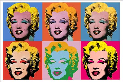
(Open Figure One) Well, she was certainly flamboyant! Her film career, albeit short, was steeped in bright lights and Hollywood glitter. Her persona was everything in cotton-candy, sex-pot audacity. I believe Warhol saw bright, gaudy colors, overstated glamour features and those big red lips. Thus, we see his art with rough, overstated shapes for eye-lid makeup, the brilliantly colored 1950s hair-do against rather rude, shocking color. Oh yes, and those lips.
The colors used, the raw-cut shapes, and treatment of the birth-mark clearly show that Warhol was portraying many of Marilyn's intangible features along with her visual ones.
Next: Warhol Perceptions into Art
Return to: Photoshop Tips & Tricks, or the Design Center Front Page
Participate in your Design Center
Lots of fun and information for all... don't forget, any community is only as good as the participation of its members. We invite your tips, tricks, comments, suggestions and camaraderie.- Ask for the DT&G Monthly: to receive DT&G newsletter each month, happenings in the Design Center and regular columns like the "Mail Bag" and "Cool Sites"
- SUBSCRIBE : to the Designers' CAFE email list
- Link to this site, and then show us the link. We'll send you any of our current door prizes, just for your trouble.
- Help Support The Design Center: with your donation, we say thank you with free books, listings, and even links on the front page!
- SUBMIT: a news link, new font, or product review
- SUBMIT: a link to a Photoshop web site

