Fred Showker says:
Shortly after I graduated from Design School, I hit the pavement working for a dull, drab, advertising agency with mostly ag-industry, hardware and plumbing supplies clients. At night I would take in freelance work, and read through the pages of my U&lc Magazines over and over, dreaming what it would be like to be in the New York design scene.
In the backs of almost every issue was a small space ad with killer lettering advertising Michael Doret. I would often think ... "Man, if I could just work for Michael Doret, I'd have it made!"
34 years later...
DTG asks:
Michael, what has driven you all these years?
Michael says:
I am hopelessly in love with letterforms.
DTG asks:
What do you mean, Michael? What kind of letters?
Michael says:
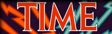
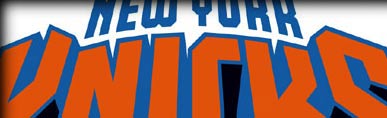
Not just flush left, caps and small caps, but big, colorful expressive letterforms
DTG asks:
Big and expressive?
Michael says:
YES! Ones that can twist and turn, that have a point of view
DTG asks:
But don't all letters have a point of view
Michael says:
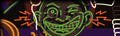
Letters and design with letterforms should never be just a transparent medium. Most use letterforms to simply convey a message. The ultimate design is with letterforms that ARE a message unto themselves.

DTG says:
Michael, I think we'd better take a closer look...
Michael says:
C'mon folks... let's go...
The Art of Letterform & Image Design
If you're in the LA area, don't miss
LETTER AS IMAGE / IMAGE AS LETTER
Or, Back to the Design Center Gallery