Sometimes we run across something really intriguing and we have to follow up on it — we were told all about Luc Devroye’s article on whether or not Adobe actually created the Cronos font! But there’s more — some nice freebies in this edition, and a young lady doing some remarkable art with type and letterforms! Have fun . . .
- Does Adobe steal fonts? How close are they?
- Posterama Sans Serif, Display with attitude!
- Charmante is a charming little font
- Trying fonts online … again
- Type on the sidewalk
![]() Sometimes we run across something really intriguing and we have to follow up on it — we were told all about Luc Devroye’s article on whether or not Adobe actually created the Cronos font! But there’s more — some nice freebies in this edition, and a young lady doing some remarkable art with type and letterforms! Have fun . . .
Sometimes we run across something really intriguing and we have to follow up on it — we were told all about Luc Devroye’s article on whether or not Adobe actually created the Cronos font! But there’s more — some nice freebies in this edition, and a young lady doing some remarkable art with type and letterforms! Have fun . . .
- Does Adobe steal fonts? How close are they?
- Posterama Sans Serif, Display with attitude!
- Charmante is a charming little font
- Trying fonts online … again
- Type on the sidewalk

Does Adobe steal fonts? How close are they?

We ran across this sad story of how Adobe misled the world about the origins of Robert Slimbach’s Cronos family, which was borrowed from Kuester’s Today Sans Serif. Interesting article by Luc Devroye, School of Computer Science , McGill University![]() http://luc.devroye.org/fonts-23920.html
http://luc.devroye.org/fonts-23920.html![]() Compare the fonts : https://graphic-design.com/wp-content/uploads/graphic-design.com/Type/cronos/index.html
Compare the fonts : https://graphic-design.com/wp-content/uploads/graphic-design.com/Type/cronos/index.html
Cronos is a humanist sans serif typeface designed by Robert Slimbach and released by Adobe in 1996. The style of the Cronos typeface is taken from Italian Renaissance calligraphy but with a modern lilt. The Cronos font family comprises 32 typefaces in total including italics, regular and several caption styles all available across 4 weights.![]() Robert Slimbach Foundry: Sans Serif, Humanistic Sans
Robert Slimbach Foundry: Sans Serif, Humanistic Sans ![]() see more . . .
see more . . .
Posterama Sans Serif, Display with attitude!

Posterama is one of those strong san serifs that you really don’t appreciate until you learn to use it’s idiosyncrocies!
Designed by Jim Ford at Monotype this whopping font has 63 different faces from Thin to Ultra Black, in 9 distinct families! What makes Posterama so unique and versatile are the eight alternative display families. By making use of a collection of alternative glyphs, Posterama sets an evocative flavor to visualize an entire century of futuristic reference points from art, architecture, poster design and science fiction into one family. ![]() Posterama by Jim Ford at Monotype
Posterama by Jim Ford at Monotype![]() see more . . .
see more . . .
Charmante is a charming little font

Charmante comes from Juraj Chrastina and is one of those superb handlettered, Casual Scripts that everyone needs
Juraj Chrastina is a self-teaching freelance designer from Slovakia. He is new to designing type and tries to spend more and more time in this domain.![]() Charmante by Juraj Chrastina via fonts.com
Charmante by Juraj Chrastina via fonts.com![]() see more . . .
see more . . .
Trying fonts online … again

In 1994 my best friend and web partner Barry Selack developed an online fonts tester. We launched it in the design center and then tried to attract the attention of the fonts industry. They all turned us down, for fear of getting their fonts ripped off. Adobe said : “Not interested, fonts online just doesn’t fit our formula.” We scrapped it. Since then every font venue and their brother has developed a font tester online.
Now even Hofler&Co has come up with their own tool for working with H&Co fonts, right in the browser. This one may be the best I’ve seen, although I’d prefer a longer line length . . . but try it out! ![]() Hofler&Co Try.typography.com
Hofler&Co Try.typography.com![]() see more . . .
see more . . .
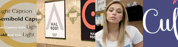
Type on the sidewalk

Freelance graphic artist Yana Stepchenko takes part in an issues parade hosted by Manifest Communications. Manifest is a social issue communicator that took the issues it works on every day from its old office on Peter Street, and walked them down the sidewalks
Found this in our 2006 Fonts Fest newsletter’s Web Site of the Month: ArtFani.com, the site of Siavash Fani, graphic designer in Tehran Iran![]() See : Yana’s Branding of Toronto Public Highschools (OCAD Graphic Design)
See : Yana’s Branding of Toronto Public Highschools (OCAD Graphic Design)![]() Yana Stepchenko, Toronto, Ontario, Canada on Behance
Yana Stepchenko, Toronto, Ontario, Canada on Behance
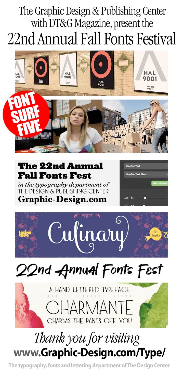
Fresh bites and delights : Culinary

culinary_sidebar.jpg RIGHT You’ve probably seen this font in packaging or main stream retail. We saw it in a copy of Coastal Living Magazine and had to chase it down . . . it’s very Culinary
Culinary is a typographic system inspired by the art of cooking. This family comes with 2 subfamilies: one Regular Family of 4 weights plus a Sans Line font and a set of Borders, and one 4-weight Script Family that also includes Sans Line and Borders. Culinary is well-suited for packaging, restaurant and cafe branding, bakeries, logos, magazines, menus, recipe books, invitations and much more. ![]() Culinary by Sofia Mohr at Latinotype
Culinary by Sofia Mohr at Latinotype![]() see more . . .
see more . . .

Surf along with us — and please, share your findings with DTG readers! We’ll be back tomorrow and continue our 22nd Annual Fall Fonts Festival Surf … stay tuned!
![]() Previously: 22nd Fonts Fest Surf Four . . .
Previously: 22nd Fonts Fest Surf Four . . .
![]() GO NEXT: The Fonts Festival Continues . . .
GO NEXT: The Fonts Festival Continues . . .
For now, thanks for reading
![]()
Editor/Publisher : DTG Magazine
+FredShowker on Google+ or most social medias @Showker
Fred Showker’s DT&G has been Published online since 1988
Don’t forget … we encourage you to share your discoveries with other readers: ![]() Send an email to our editorial staff
Send an email to our editorial staff![]() Contribute your own article
Contribute your own article![]() Follow DTG on Facebook!
Follow DTG on Facebook!![]() PIN THIS with DTG on Pinterest
PIN THIS with DTG on Pinterest![]() Fred Showker, Design on pinterest
Fred Showker, Design on pinterest
Visit Fred’s profile on Pinterest.
The original version of this file is at : https://graphic-design.com/wp-content/uploads/graphic-design.com/Type/2016/fonts_fest_surf_five.html