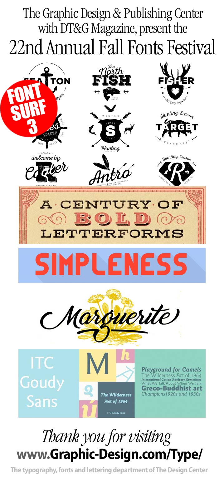
Moving on into the 3rd surf for the month, we’ll see some new stuff, a new Goudy — a new Avant, and with the help of Steven Heller and Louise Fili we’ll visit some historic fonts!
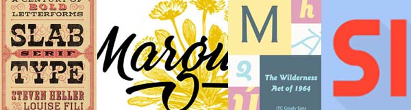
- Another Marguerite font? Yes, and this one’s better!
- ITC Goudy Sans: the different sans serif typefaces
- Slab Serif Type: A Century of Bold Letterforms
- A new Sans in the Avant Garde tradition
- Simpleness Display Free Typeface
![]() Moving on into the 3rd surf for the month, we’ll see some new stuff, a new Goudy — a new Avant, and with the help of Steven Heller and Louise Fili we’ll visit some historic fonts!
Moving on into the 3rd surf for the month, we’ll see some new stuff, a new Goudy — a new Avant, and with the help of Steven Heller and Louise Fili we’ll visit some historic fonts!
- Another Marguerite font? Yes, and this one’s better!
- ITC Goudy Sans: the different sans serif typefaces
- Slab Serif Type: A Century of Bold Letterforms
- A new Sans in the Avant Garde tradition
- Simpleness Display Free Typeface
Another Marguerite font? Yes, and this one’s better!

Free Marguerite ScriptFree Marguerite Script — Marguerite is a smooth and fresh script font, with soft curves and natural connections. Made with love of its type designer!
Thanks to StereoType for bringing us this very beautiful free script. You sure don’t want to miss more of Marguerite full version features, a complete set of 26 alternate ending glyphes and a wide range of 13 ligatures and swashes to create your own style, go take a look and have it for commercial use!![]() stereo-type
stereo-type![]() Download : marguerite.zip
Download : marguerite.zip
ITC Goudy Sans: the different sans serif typefaces

ITC Goudy Sans is a fresh Humanistic Sans from the ITC Design Staff at the Frederic W. Goudy Foundry
ITC Goudy Sans is different from most sans serif typefaces, which tend to have a quiet, conservative structure. Instead, ITC Goudy Sans is friendly, almost playful, with an unusual cursive italic. Unlike the obliqued roman italics that are typical of its sans serif cousins, Goudy Sans italic has a light, flowing quality that both complements and enhances the roman design. ![]() ITC Goudy Sans Complete Family Pack
ITC Goudy Sans Complete Family Pack
A new Sans in the Avant Garde tradition

Font Designer Mathieu Desjardins is the Senior Art Director for The Pangram Foundry in Montreal, Quebec, Canada. They have a decided taste for classic sans serif fonts. The Pangram Typeface boasts more than 2800 meticulously crafted glyphs — it has seven weights from ExtraLight to Black — obviously inspired by some of the greatest historic typefaces like Avant Garde and Folio.
You can try the fonts for free. Mathieu believes :
… a great font is one that uplifts rather than overshadows the design it is part of.![]() Pangram Pangram Foundry
Pangram Pangram Foundry![]() Here’s the big sample page
Here’s the big sample page
Simpleness Display Free Typeface

Simpleness Display free typeface is an all caps minimalist font, inspired by the Bauhaus movement. It is modern and simple just like its name, makes this font suitable for many different kind of design work. Therefore, Simpleness are looking great on logotype, apparel design, branding and advertising as well.
Thanks to Valentin François for providing us this exquisite and well made font. So, if you like this font and use it on your project, you can add a credit to appreciate his work. Also, check out for other type work from him on his website, there you may find more awesome typefaces.![]() valentinfrancois.fr
valentinfrancois.fr![]() here’s a big sample
here’s a big sample![]() … another text sample
… another text sample![]() Download it
Download it
Slab Serif Type: A Century of Bold Letterforms

We’ve been talking about Steven Heller and Louise Fili almost as long as we’ve been talking about typography. Now the duo have brought out their next amazing volume, this time about Slab Serif Type. With 500+ illustrations, you can bet tthis will be one of your favorite idea starters!
From Egyptian to Stymie to Rockwell, the Slabs, came in many iterations and were eventually recognized as a face with many characters and nationalities. This new volume comprises an artfully curated selection of hundreds of international and classic examples to inspire fresh and unexpected typographic ideas — you do NOT want to miss! ![]() Slab Serif Type: by Steven Heller and Louise Fili — get the book now!
Slab Serif Type: by Steven Heller and Louise Fili — get the book now!![]() Here’s a large poster with several samples!
Here’s a large poster with several samples!

Surf along with us — and please, share your findings with DTG readers! We’ll be back tomorrow and continue our 22nd Annual Fall Fonts Festival Surf … stay tuned!![]() Previously: 22nd Fonts Fest Surf Two . . .
Previously: 22nd Fonts Fest Surf Two . . .
![]() GO NEXT: The Fonts Festival Continues . . .
GO NEXT: The Fonts Festival Continues . . .
For now, thanks for reading
![]()
Editor/Publisher : DTG Magazine
+FredShowker on Google+ or most social medias @Showker
Fred Showker’s DT&G has been Published online since 1988
Don’t forget … we encourage you to share your discoveries with other readers: ![]() Send an email to our editorial staff
Send an email to our editorial staff![]() Contribute your own article
Contribute your own article![]() Follow DTG on Facebook!
Follow DTG on Facebook!![]() PIN THIS with DTG on Pinterest
PIN THIS with DTG on Pinterest![]() Fred Showker, Design on pinterest
Fred Showker, Design on pinterest
Visit Fred’s profile on Pinterest.
The original version of this file is at : https://graphic-design.com/wp-content/uploads/graphic-design.com/Type/2016/fonts_fest_surf_three.html