We ran across Laura again quite by accident, but thought for some reason we had met her before — which we had — we featured her in 2013. Low and behold we catch back up with her and discover she’s continuing as one of the masters of lettering fonts in the world! Ladies and gentlemen, please meet Lura Worthington . . . .

![]() We discovered Laura quite by accident, but thought for some reason we had met her before. Low and behold we discover one of the prolific lettering font masters in the world!
We discovered Laura quite by accident, but thought for some reason we had met her before. Low and behold we discover one of the prolific lettering font masters in the world!
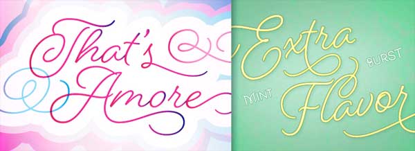
You just don’t sit down and create lettering and typography with such expression and flavor. Laura’s extraordinare hand is not just versatile, it’s both sensitive and rugged at the same time. What do I mean by that? Just take a look at some of her lettering. She can make it go from a whisper to a roar without missing a beat.
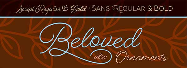
The Beloved Family is one that can be nasty or nice, depending on the setting. Laura writes :
my passion for the craft, devotion to precision as I refine my creations along with my desire to provide designers with type that’s rich with personality and versatility combine to form a body of work that offers practicality and aesthetic appeal.
 With all the extras Laura builds into her font creations, you can design your own, truly unique, typeset … or shall I say “lettering” set! Laura comments

 Spumante is what they call a “semi-connected” script — and this one is a joy to see and use! Dress it up with over 200 swashes, alternates, and ornaments, or use the titling alternates (in the OpenType menu) for a minimalist, unconnected look. Spumante is ideal for food packaging and menus, cosmetic labels, book covers, or greeting cards and invitations.
Spumante is an approachably attractive face transforms from understated femininity to cocktail-party chic in just a few clicks. But look … there are dozens more fonts at Laura’s web site, along with fun articles and learning experiences. Laura writes :
Note above you see I’ve tried my sig in both lettering fonts. Ever since Chuck Green ragged me about using my real signature in the publication, I’ve tried to bounce around experimenting with various scripts. You can test your own passage of type in these fonts, just click the pictures above. And folks, don’t pass up the true pleasure of working with some of Laura’s fonts. You’ll be glad you did!
![]() VIDEO :
VIDEO :
Laura talks about the Spumante lettering font! ![]() The Complete Spumante Family
The Complete Spumante Family![]() The Complete Beloved family
The Complete Beloved family![]()
All 41 Families from Laura![]() LauraWorthingtonType.com
LauraWorthingtonType.com
Also see : Women’s Voices in Type – Laura points us to some really interesting and insightful articles written by Dyana Weissman for Typographica about Women in the type industry!
![]() Typographica : Type Women Talk: Positive Forces
Typographica : Type Women Talk: Positive Forces![]() Type is not lettering.
Type is not lettering.
Stay tuned as we continue the 21st Annual Designing Women celebration for 2016!
More and more new entries will be added all month long . . . and will continue into April! Remember, if you would like to suggest a Designing Woman for this series, there’s still time. Just check it out here: ![]() Register or Nominate your favorite Designing Woman
Register or Nominate your favorite Designing Woman
![]() DTG Designing Women Series Continues . . .
DTG Designing Women Series Continues . . .

Thanks for reading . . . and, thanks for twenty-one years of Designing Women online!

Editor/Publisher : DTG Magazine
+FredShowker on Google+ or most social medias @Showker
Published online since 1988

Please share your discoveries with other DTG readers: ![]() Send an email to our editorial staff
Send an email to our editorial staff![]() Contribute your own article
Contribute your own article![]() Join the Design Cafe forums, or
Join the Design Cafe forums, or ![]() Follow DTG on Facebook!
Follow DTG on Facebook!
The original version of this page resides at : https://graphic-design.com/wp-content/uploads/graphic-design.com/Gallery/2016_designing_women/Laura_Worthington/index.html