Customer-centric web design and UX is on everyone’s mind in 2016. User-friendly websites should offer great content which is easy to find, quick to access and beautiful to look at. Yet so many companies seem to be falling at one of more of these hurdles … Elisheva Sokolic takes look at these issues in today’s web design!
![]() Customer-centric web design and UX is on everyone’s mind in 2016. User-friendly websites should offer great content which is easy to find, quick to access and beautiful to look at. Yet so many companies seem to be falling at one of more of these hurdles, even when they’ve chosen the best website makers from the outset. Look at these three hot web design trends, and our tips to make them successful with customer-centric design in mind.
Customer-centric web design and UX is on everyone’s mind in 2016. User-friendly websites should offer great content which is easy to find, quick to access and beautiful to look at. Yet so many companies seem to be falling at one of more of these hurdles, even when they’ve chosen the best website makers from the outset. Look at these three hot web design trends, and our tips to make them successful with customer-centric design in mind.
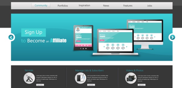
Are Carousels a Thing of the Past?
Carousels are a great way to show more content on your home page, and present information in a fun and eye catching way. One of the most important elements is a hover state. The best way for a carousel to work is for the content to auto-pause on hover, so that your visitors can read the information, and then click through if they choose. This helps to combat issues like the auto-rotate speed not working for every user. For your analytics this will also give you a clue as to the content which is drawing the most attention.
With more Google searches happening on mobile than desktop nowadays, it might be time to re-think your Carousel. If the majority of your visitors are accessing your site via mobile device they are unlikely to have hover capabilities. Writing for Baynard, Jamie Appleseed agrees that
the downside of users potentially opening a wrong slide far outweighs the upside of spreading exposure across the carousel’s slides” making carousels inefficient and ineffective for mobile sites, both for UX and customer data.
How Much Animation is Too Much?
When it comes to animation, graphic designers need to balance speed with content. Animation for its own sake can often decrease your conversions, because users simply want to get their information, or buy their product and move on. Lengthy home page load times are nothing but a turn off to new traffic. The College of Business Administration has published a study which suggests “the tolerable waiting time for information retrieval is approximately 2 seconds.” This is seriously speedy, and not always within your control. Your hosting, the amount of website traffic you’re receiving, as well as the time of day and location that your traffic is arriving from can all negatively influence your page load times, even before you put dynamic content on the page.
Does this mean we should keep our sites as minimalistic as possible? Of course not, not when we have so much competition on the web. Help is at hand, as the same study found that adding some kind of feedback for the wait, such as a progress bar increases the tolerable wait time to as much as 38 seconds. Now that’s more like it.
Animation can be your friend here, and creating skeleton screens which load one element at a time, creating the UI in increments as the page loads is one great way to keep users interested. Multi-part transitions and loading a webpage in pieces has the same effect. Luke Wrobelski, expert in Interaction Design comments in his presentation for Intel,
The bottom line with animation is the same as all customer-centric web design. From the outset, think about the value your animation is offering the user. Is it highlighting the reason why additional input on their part is needed? Is it providing feedback and user gratification? One good animation example of the latter is a ‘Pay Now’ button disabling once it’s been pressed to let the user know the click was successful. Look at your site and streamline animation to what increases UX, and you’ll be increasing conversions at the same time.
Should I Save Time with Apps?
Apps are everywhere, from mobile to desktop, from browser to tablet, and third party app installation can not only save you time, but enable you to offer your visitors extra functionality which you couldn’t build on your own. It can partner your site with some of the biggest names out there, giving you social media integration, payment options and more. It’s easy to get carried away, without pausing for thought about your UX.
Wix has hit the nail on the head here when they comment that
Digital Marketing company Underhood knew the importance of this when they altered their own design in order to better integrate a third party app into their own.
Obviously the more 3rd party tools you integrate into your website, the less you will be able to keep one aesthetic feel to the site, and while sometimes this conflict might be worthwhile, other times it simply isn’t.
Rethinking the dynamic elements of your site from the ground up and focusing your graphic design decisions on the customer from the outset can provide beautiful design and innovation without sacrificing speed, content or efficiency.

Thanks for reading
Elisheva Sokolic,
President of Literally Advice
Elisheva is a freelance writer and editor. As well as other national publications, she currently writes for SLiNK Magazine. She has also worked for various publishing houses and literary agencies, both reading, marketing and editing. She is currently working at Vallentine Mitchell Publishers and Irish Academic Press/Merrion. Elisheva also owns Literally Advice, a consultancy company which edits covering letters, business copy and author manuscripts. elishevasokolic.com
Don’t forget … we encourage you to share your discoveries with other readers: ![]() Send an email to our editorial staff
Send an email to our editorial staff![]() Contribute your own article
Contribute your own article![]() Follow DTG on Facebook!
Follow DTG on Facebook!![]() PIN THIS with DTG on Pinterest
PIN THIS with DTG on Pinterest![]() Graphic Design on pinterest
Graphic Design on pinterest
