Adjusting color on a photo can be tricky business. But this month 4-designer.com provides us with yet more methods of making subtle color adjustments on you photographs.
![]() This month’s Photoshop tutorial comes from 4-designer.com, and works with the subtle color adjustments you can make in photographs.
This month’s Photoshop tutorial comes from 4-designer.com, and works with the subtle color adjustments you can make in photographs.
 Beginning to adjust the pictures is for the sake of taking photographs. For the lack of photography shooting experience, I can’t get the desired effect when I take the photo, so I work on ways to adjust the photographs on the computer using Adobe Photoshop. I have gradually developed my own steps of adjusting colors. Now, I will share these steps with you.
First of all, try your every effort to achieve the best effect, thus, we can get bigger space on the djustment in the latter stage and can better keep the quality of the photographs after the adjustment.
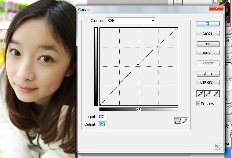
Step 1, adjust the curves and it can brighten the whole picture. On the contrary, if the picture is over-exposed, you can pull the curves down and the picture will be darkened.
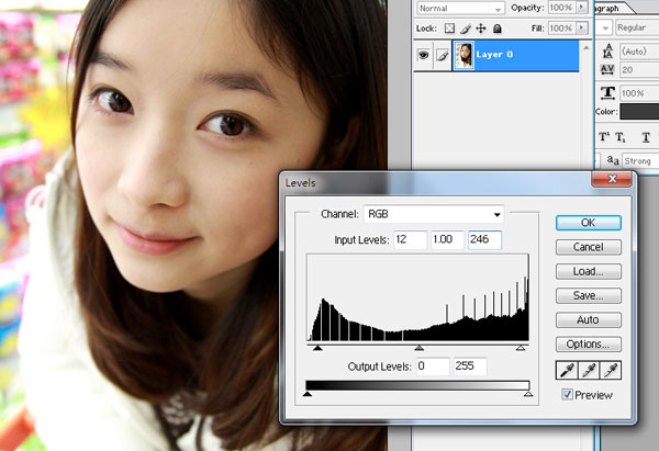
Step 2, adjust the levels. Move the first value to the right and this can increase the contrast to make the picture better arranged. and this can make the picture brighter.
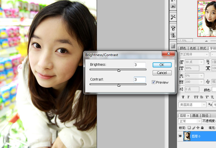
Step 3, adjust the brightness/contrast. Increase the value of the brightness/contrast to brighten the picture and deepen the contrast to make the figure in the picture more prominent.
Step 4, adjust the selective colors (the most important step).
This step decides the distribution of the colors of the whole picture. According to the different situation, the adjustment of the selective colors is different. For example, if there are grasses in the picture, then, adjust them green and adjust it blue if sky is there. All in all, choose the colors which appear in the picture and usually need to choose the red as well as yellow to adjust the color of skin and the luster of the figure. The value is flexible and you can make this value as a reference.

* REDS: Cyan -25 / Magenta -4 / Yellow -6 / Black +4
* Yellowsw: Cyan -12 / Magenta -2 / Yellow -5 / Black -1
* Neutrals: Cyan -2 / Magenta -2 / Yellow 0 / Black -2
* Blacks: Cyan -4 / Magenta 0 / Yellow -4 / Black +3
Click for collection of all dialogs
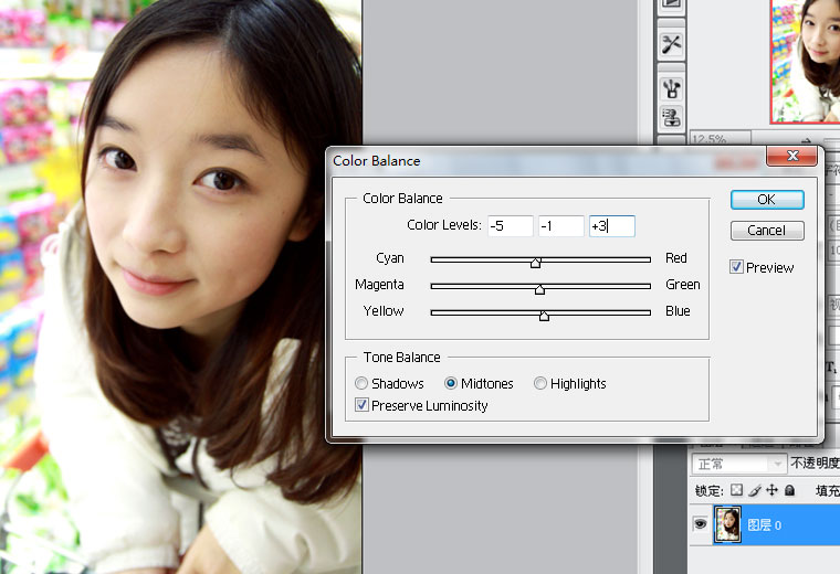
Step 5: color balance. It can adjust the picture in cold or warm tune and you can choose to use it to adjust the picture into the wanted slant cold or slant warm tune.
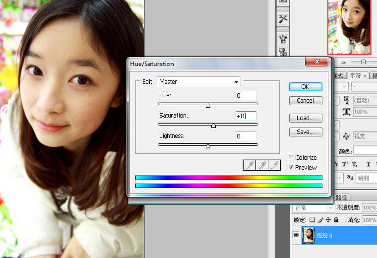
Step 6: hue/saturation. The increasement of the saturation can make the whole picture more bright-colored and colorful.
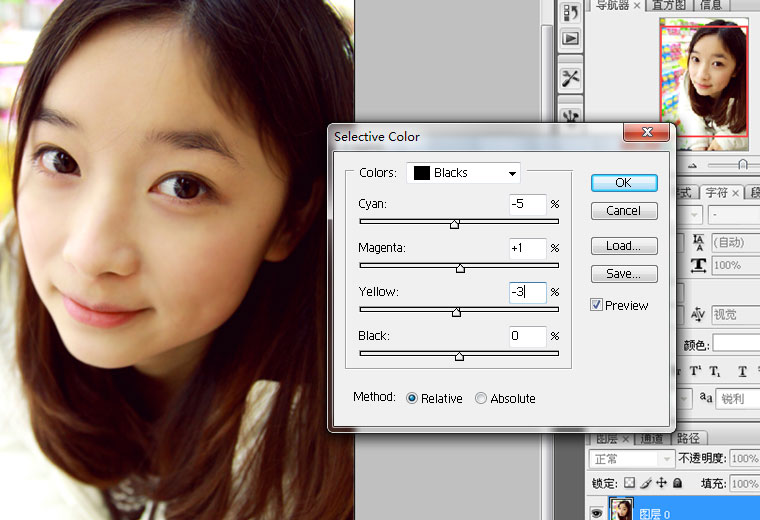
Finally, you can adjust a selective color – black according to the effect you want. This step is amazing, for example, the black part of the hair will turn to be a little purple and the whole picture will add another color as well as another kind of feeling.
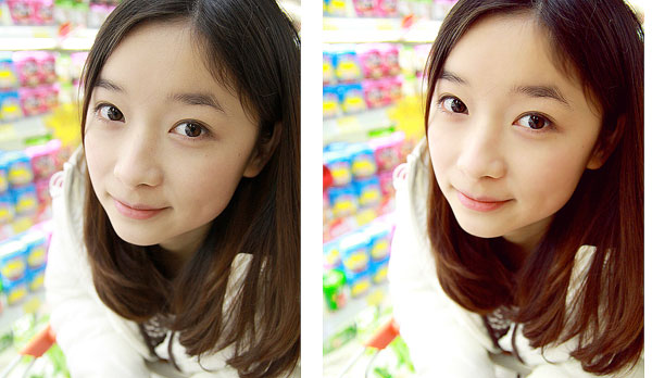
After the adjustment of the picture, you still can use the blur tool to grind the skin of the figure to make the skin more smooth and comfortable.
Everyone has different feelings to colors and the situation is not the same. Therefore, I just tell you a method here and all the values are adjustable according to the different situation. So, please do not be fettered by the values and go to use these methods to boldly adjust the colors.
Anyone is welcomed to redistribute and quote the content only if he or she will credit its author: http://4-designer.com/.
Thanks for sending this one in, and, thanks for reading
Don’t forget … we encourage you to share your discoveries with other readers. Just send and email, contribute your own article, join the Design Cafe forums, or follow DTG on Facebook!