Now we’ll take an inspirational look at just a few of our samples of excellent typography where letters, characters, letterforms, words and phrases have been bent and formed into a shape — a powerful for building a metaphor or sending a visual message
While the primary purpose of type and typography is to communicate words, thoughts, and information, letterforms are quite beautiful and can be used to do more. Fashioning letters and words to send subliminal or direct messages visually is probably one of the strongest design techniques you can use. To pull it off however, it’s got to be right — and it’s got to be good. These are just a few in our collection that are very good. There are more, so stay tuned — this series will roll out over the weeks to come.
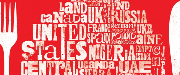
Shaping type to tell a story
Craig Ward is a London based designer and illustrator who creates some stunning typographic treatments. He works in a variety of media from letterpress and linocut as well as digital and three dimensional. His portfolio on will blow your doors off.
![]() Shaping type to tell a story
Shaping type to tell a story
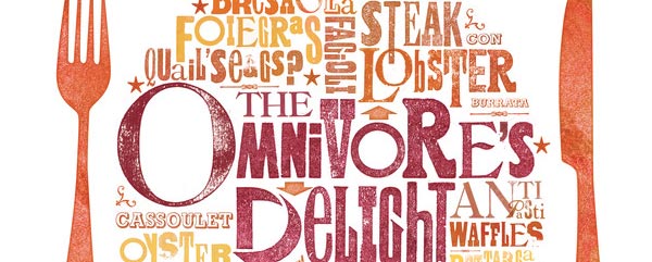
Delight
Also from Crais Ward is “Delight” — in both typography and design — yet also a great menu cover or placemat for a restaurant
![]() Delight
Delight
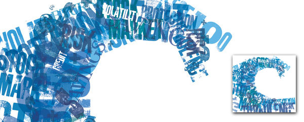
The Wave
also from Craig — this one with a monochromatic look and feel takes a departure from his usual style. Artistic brushing adds to the overall metaphor of this one
![]() The Wave
The Wave
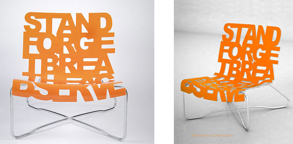
Typography becomes life
The Dharma Lounge makes a bold statement : “Stand Forget Breathe Acknowledge Observe” … and so does the design work of Palette Industries. Also see their Alberta Cancer Foundation Chair
![]() Typography becomes life
Typography becomes life
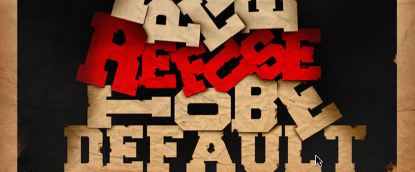
Some People refuse 2 B default
In this piece by Ahmed Galal (Digital Art, Text Art) a poster takes shape with typography as if it were built out of crumpled paper. Ahmed claims it took him about 4 hours to finish it. Find a whole pile of super work in his Deviantart gallery.
![]() Some People refuse 2 B default
Some People refuse 2 B default

Freedom is Slavery
He calls himself “Madfusion” on Deviant, but we know him as Ivan (ee-Vhan) Vidovic, and this “Skull” is just one example of the striking work you’ll find in his studio.
![]() Freedom is Slavery
Freedom is Slavery
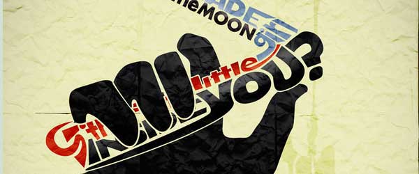
Switch blade stuck in the moon
Ben Mendelsohn (cellardoor13 on Deviant) displays a remarkable array of skills and talents in art-direction, illustration, design and photo re-touch, on his gallery page. His Favorite Design Quote: “Less is more”
![]() Switch blade stuck in the moon
Switch blade stuck in the moon
If you want to embark on a metaphorical or illustrative typography project, first ask what the meaning of the message is. Then look for visual shapes, forms, colors, motions or objects that send your reader that message.
As I said before, this series will continue, so stay tuned… and …
thanks for reading
Don’t forget … we encourage you to share your discoveries about
favorite or famous graphic designers and illustrators with other
readers. Just comment below, join the forums for discussion, or give me a look at Facebook