

Heraldic Symbol Fonts
 Gerald Gallo is kicking the year off right with a series of fonts based on heraldry. First a collection of creatures, griffins, and magical creatures.
Heraldic Creatures shows many fabulous creatures that were created for use on heraldic crests. The Heraldic Creatures font is an assortment of simplified renderings of some of these creatures. 
There is a total of 47 creatures all located under the character set keys. Find these and others at Gerald's Ornaments page.
----------------------

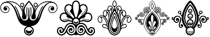
The shield, a form in heraldry, has infinite design subdivision possibilities. Shield Ornamentscontains a selection of 98 geometric designs on rounded and pointed shields. This one also comes from Gerald's Ornaments page.
This collection presents more than 80 printer symbols, cartouches, and ornaments from the mid-1800s.
These are ideal for traditional, period design as well as superb wallpaper.
Gerald Gallo collection -- Graphics by Gallo LLC - Bethesda, MD 20814 USA
www.graphicsbygallo.com
![]()
Gerald Gallo Presents
... his latest from a family of over 106 fonts. This one called "Prominent Display" is from his headline-only series and is not for the meek. This one is superbly suited for big display use, and oddly enough for the internet. Straight lines and 45-degree turns raster clean and crisp. It's also great for signage using vinyl cutters or plotters.
Rah, Rah, Rah,
Here's Gerald Gallo's headline font just in time for football season...

Display University is a display font that gives you the big lead when you need that extra yardage. It was designed specifically for display, headline, logotype, branding, and similar applications.
 The bonus is you get two fonts -- two fonts in one: the character set is in outline, and the shift + character set is solid. So mix and match. Unfortunately it cannot be used in concert to produce multicolored type, but it's easy to stroke and repeat for that good-old grid-iron look.
Gerald says: "I envision Display University used in connection with scholastic and sport themes."
We agree... sisk, boom, bah
![]()
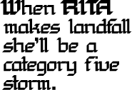 Display Chamfer is another of those killer display fonts not intended for text. We tried some 16 point text with it for a very unusual effect! WOW. No, you wouldn't want a lot of text, with this font!
Noting the straight legs and 45-degree curves you'll see this font will do well in just about any setting -- online or on lpaper. This is the fourth font in Gerald Gallo's series of display fonts intended for display use only. It was designed specifically for display, headline, logotype, branding, and similar applications -- including lowercase and numbers. Here's a sample
More?
See Jerry's Display Intense Font in use
For October, see Gerald Gallo's Jackolantern
See the Display Exquisite Font
See the Ornate Initials Font
See Jerry's icon fonts for Logos and Designs
Don't miss Gerald Gallo's Casual Font
We love Gerald's Pleasant Handwriting
Visit Jerry in his virtual studios and see not only some of his graphic design work, but his full collection of fonts as well. Visit Graphics by Gallo, and see his other great works...

- Bethesda, MD 20814 USA
- www.GraphicsByGallo.com
Return to the DT&G Type Department
- Questions or comments on this article?
- SUBSCRIBE : to the Designers' CAFE email list