Halfway through July and here we are with a font I know you’ll like and an even hotter ad for the beach in Rio a magazine charges your iPhone . . . I love July!
- The Lord of the Fonts: fonts in The Hobbit and The Lord of the Rings
- Magazine ad that charges your cell phone ??? Sure!
- Yana Bereziner : Nordic Font
 Halfway through July and here we are with a font I know you’ll like and an even hotter ad for the beach in Rio a magazine charges your iPhone . . . I love July!
- The Lord of the Fonts: fonts in The Hobbit and The Lord of the Rings
- Magazine ad that charges your cell phone ??? Sure!
- Yana Bereziner : Nordic Font
Yana Bereziner : Nordic Font

Yana Bereziner, Web Designer, Graphic Designer from Kyiv, Ukraine must have been influenced by the Nordsmen of yore!
Nordic is a unique Display Face, that was created from the inspiration of norwegian runes. Since it is a distinctive logotype it will work best in large, open settings like posters, headlines, t-shirt designs and uses where the typography is uninhibited.
This is just one weight, there are two faces with 3 weights and you can pick up the full version!![]() Yana Bereziner
Yana Bereziner![]() GO here to get Nordic alternative regular free
GO here to get Nordic alternative regular free
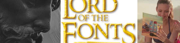
The Lord of the Fonts: a guide to fonts in The Hobbit and The Lord of the Rings

What would the Lord of the Rings trilogy be without its iconic logo? The chiseled yellow letters are pretty close to perfection where movie logos are concerned. But that’s not the only instance of certain characteristic typefaces used throughout the trilogy and its marketing. Most of them have recurred in the new Hobbit films – but what exactly are they and where can they be obtained?
Fonts do matter. Sometimes a correct typeface is the one thing that makes a difference between a promising, but rather obvious fan art and a professional-looking artwork.![]() www.theonering.net
www.theonering.net![]() Learn how to create Hobbit type in Photoshop with Deke McClelland
Learn how to create Hobbit type in Photoshop with Deke McClelland
Magazine ad that charges your cell phone ??? Sure!

Well if you want true advertising concept design, here it is. If you were to design the perfect ad for beach goers, what would your dream up? Draftfcb Brazil developed a magazine insert with solar panels and a USB port affixed to it that could be used by beach goers in Brazil to charge their phones so they never have to leave the beach.
![]() Thanks to AdRants for this one!
Thanks to AdRants for this one!
Ready for more? Stay tuned for the NEXT edition of Creative Tidbits …
 What did you miss in the last Creative Tidbits?
JOIN the creative experience! We’d like to hear from you! On the Facebook page, you’ll find the gallery “Art is where you find it” — you can contribute art there. Or, let DTG visit your site — we’d love to have you contribute there and become part of DTG!
And, … Thanks for reading

Editor/Publisher : DTG Magazine
+FredShowker on Google+ or most social medias @Showker
Published online since 1988
Don’t forget … we encourage you to share your discoveries with other readers: ![]() Send an email to our editorial staff
Send an email to our editorial staff![]() Contribute your own article
Contribute your own article![]() Follow DTG on Facebook!
Follow DTG on Facebook!![]() PIN THIS with DTG on Pinterest
PIN THIS with DTG on Pinterest![]() Fred Showker, Design on pinterest
Fred Showker, Design on pinterest
This page was originally published at : https://graphic-design.com/wp-content/uploads/graphic-design.com/creative/tidbits_210.html