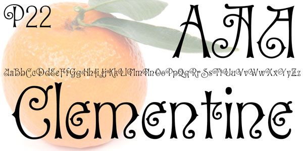
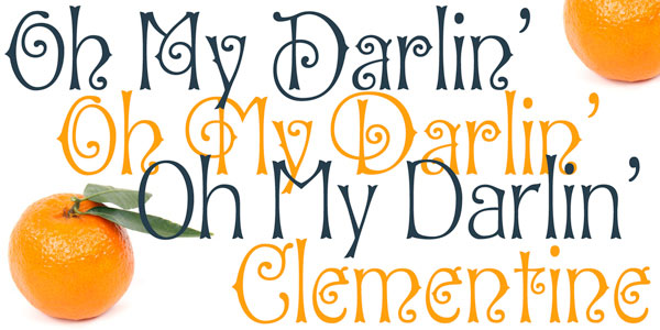
We’ve talked about P22 more than we really should over the years, but this new one from Ted Staunton is too nice to ignore. We often talk about decorative fonts leading us to different times, moods and emotions — well Clementine does just that!
![]()
We’ve talked about P22 more than we really should over the years, but this new one from Ted Staunton is too nice to ignore. We often talk about decorative fonts leading us to different times, moods and emotions — well Clementine does just that!
This set of two fonts is heavily inspired by a variety of 19th Century faces without being a direct revival of any one in particular. 
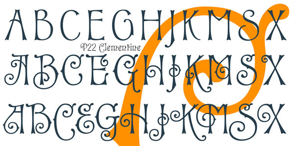
Undulating curves, swirly terminals and bifurcated semi-serifs give these faces plenty of character. Both fonts include f ligatures and ct/st ligatures.

Clementine Curly includes a full set of alternate curly caps as opentype alternates making it essentially a bonus font within a font!

![]() Full story : Clementine from P22
Full story : Clementine from P22
Surf along with us — and please, share your findings with DTG readers! We’ll be back to continue our 21st Annual Fall Fonts Festival Surf … stay tuned!
 NEXT: The Festival Continues . . .
And, thanks for reading
Editor/Publisher : DTG Magazine
+FredShowker on Google+ or most social medias @Showker
Published online since 1988
Don’t forget … we encourage you to share your discoveries with other readers: ![]()
![]()
![]()
![]()
![]()
![]()
![]()
![]()
![]()
![]()
![]()
![]()
![]()
![]()
![]()
![]()
![]()
![]()
![]()
![]()
![]()
![]()
![]()
![]()
![]()
![]()
![]()
![]()
![]()
![]()
![]()
![]()
![]()
![]()
![]()
The original version of this page was published at : https://graphic-design.com/wp-content/uploads/graphic-design.com/Type/festival/2015/clementine/font.html