This will be great fun — looking at political logos, and a state logo, plus an opinionated artist, a promo for a nonprofit, and lots more to get your creative juices flowing. If you find some creative inspiration, send it along and share whith all our readers!
- Reading through the eyes of a dyslexic: New font simulates frustration
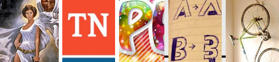
- New TN logo named ‘Pork of the Year’ by Beacon Center
- The 2016 U.S. presidential candidates’ logos, ranked
- The Star Wars poster is ultimately a piece of shit
- Creative Ways to Promote Your Association
- Bikes become Art – Not a Paper House
Have a great time . . .
 This will be great fun — looking at political logos, and a state logo, plus an opinionated artist, a promo for a nonprofit, and lots more to get your creative juices flowing. If you find some creative inspiration, send it along and share whith all our readers!
- Reading through the eyes of a dyslexic: New font simulates frustration
- New TN logo named ‘Pork of the Year’ by Beacon Center
- The 2016 U.S. presidential candidates’ logos, ranked
- The Star Wars poster is ultimately a piece of shit
- Creative Ways to Promote Your Association
- Bikes become Art – Not a Paper House
Have a great time . . .
The Star Wars poster is ultimately a piece of shit
 maverick graphic designer Stefan Sagmeister explains why he thinks that record cover designs will always be superior to film posters in this exclusive interview
The New York-based designer pointed to the Star Wars film posters as examples of bad graphic design compared to record sleeves during an interview at Amsterdam’s What Design Can Do conference.![]() Full story : www.dezeen.com
Full story : www.dezeen.com![]() Here is a Another sample…
Here is a Another sample…
Reading through the eyes of a dyslexic: New font simulates ‘frustrating’ condition by making words almost impossible to read
 Unlike most campaign posters, Daniel Britton’s designs are almost illegible. With parts of the letters missing, the slow process of trying to decode the words becomes frustrating and wearing. And that is exactly how it feels to have dyslexia, says Mr Britton, 25, who created the images to raise awareness of the condition.
Mr Britton, from Hartley, Kent, made the posters while in his last year of university, because he believes dyslexia is misunderstood and misrepresented.![]() Full story : Associated Newspapers Ltd
Full story : Associated Newspapers Ltd![]() Here is a Another sample…
Here is a Another sample…
Bikes become Art – Not a Paper House
 In his blog posting called “30 Creative Bicycle Storage Ideas” interior designer Daumantas Toleikis presents a collection of storage solutions, many of which turns a bike into art. It’s a great idea, and with today’s lightweight bikes — it’s an easy design solution too!
Not a Paper House is a blog in Lithuania, focused on interior, architecture, design. But it says very little about the owner or background. ![]() Full story : notapaperhouse.com
Full story : notapaperhouse.com![]() Here is a Another sample…
Here is a Another sample…
NEXT : Promotions, Logos, logos and more logos . . .
Creative Ways to Promote Your Association
 Don’t overlook these less familiar and non-traditional methods of promoting your association and its publications. There are many ways to promote your association, including paid advertising, SEO, press releases, traditional offline networking, and so forth.
Many people, however, tend to overlook more creative and less familiar methods that often work just as well. When you implement nontraditional promotional strategies, the field is less saturated. By being creative and innovative, you can carve out a space for yourself where there is little or no competition. The following are some of the methods you should consider for promoting your association.![]() Full story : Yan Revzin – Association Media and Publishing
Full story : Yan Revzin – Association Media and Publishing
New TN logo named ‘Pork of the Year’ by Beacon Center
![]() The controversial new Tennessee state logo was elected the “Pork of the Year” by participants in a poll organized by the Beacon Center of Tennessee.
The controversial new Tennessee state logo was elected the “Pork of the Year” by participants in a poll organized by the Beacon Center of Tennessee.
The Beacon Center, self-described as a free-market policy organization but generally considered a conservative think tank, issues the award for “government waste” and a corresponding report every year. This year, they allowed a popular vote for the award: 47 percent of participants chose the $46,000 logo project.![]() Full story : The Tennessean
Full story : The Tennessean
The 2016 U.S. presidential candidates’ logos, ranked
 Chris Stout-Hazard writes :
I’ve long held the ridiculously biased and shamelessly partisan opinion that Republican campaigns are … uh … less than excellent at graphic design. I have some theories on why this might be the case, which I will not be sharing. What I will be sharing is my attempt at assessing and ranking the logos of the fourteen (as of June 7, 2015) declared candidates. I have also reviewed all of the candidates’ websites for logo integration and overall design, and oh man do you ever owe me for that.
![]() Full story : The Washington Examiner
Full story : The Washington Examiner![]() Here is a Another sample…
Here is a Another sample…
What did you miss in the last Creative Tidbits?
JOIN the creative experience! We’d like to hear from you! On the Facebook page, you’ll find the gallery “Art is where you find it” — you can contribute art there. Or, let DTG visit your site — we’d love to have you contribute there and become part of DTG!
And, … Thanks for reading
![]()
Editor/Publisher : DTG Magazine
+FredShowker on Google+ or most social medias @Showker
Published online since 1988
Don’t forget … we encourage you to share your discoveries with other readers: ![]() Send an email to our editorial staff
Send an email to our editorial staff![]() Contribute your own article
Contribute your own article![]() Follow DTG on Facebook!
Follow DTG on Facebook!![]() PIN THIS with DTG on Pinterest
PIN THIS with DTG on Pinterest![]() Fred Showker, Design on pinterest
Fred Showker, Design on pinterest
This page was originally published at : https://graphic-design.com/wp-content/uploads/graphic-design.com/creative/tidbits_193.html