On a roll with a jaunt through a little history, meeting some old faces, and sip some Gin! This is number six, and continues with :
[*] Exploring Printing History at The Newberry Books, Graphic Design
[*] Like a brother to the Bourbon family, here comes GIN
[*] Signs from other Signs with Ampergram
[*] Food… Don’t Waste It 1883
[*] Cooper Revisited
. . . and more!
![]() On a roll with a jaunt through a little history, meeting some old faces, and sip some Gin! Continue on with :
On a roll with a jaunt through a little history, meeting some old faces, and sip some Gin! Continue on with :
[*] Exploring Printing History at The Newberry Books, Graphic Design
[*] Like a brother to the Bourbon family, here comes GIN
[*] Signs from other Signs with Ampergram
[*] Food… Don’t Waste It 1883
[*] Cooper Revisited
. . . and more!
Exploring Printing History at The Newberry Books, Graphic Design, Type / Typography
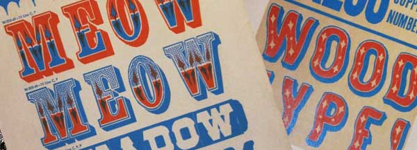
The Newberry Library’s archive of printing history has been documented online since June this year, featuring everything from type specimens and catalogues, to posters and direct mail. It’s also accompanied by some astute commentary, making it one of the most interesting print and type blogs around…
Founded in 1887 The Newberry is an independent research library in Chicago which offers its readers an extensive collection of “rare books, maps, music, manuscripts, and other printed material spanning six centuries.”![]() Full story : creativereview.co.uk
Full story : creativereview.co.uk![]()
![]()
![]()
![]()
![]()
![]()
Cooper Revisited
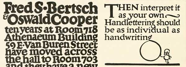

Once again we touch on Cooper … the last time was in the late 1990s … but the font just seems to come back looking as fresh as yesterday.
Two Coopers: lettering examples by Oswald (“Oz”) Cooper, of Cooper Black fame, and Frederick G. Cooper, who inspired Oz and many other lettering artists and cartoonists of the early 1900s. Leslie Cabarga, who wrote the book on F. G. Cooper, is selling a massive archive of his work. Images found in Lettering (1916), by Thomas Wood Stevens
![]()
![]()
![]()
![]()
![]()
![]()
![]()
![]()
![]()
![]()
![]()
![]()
Food… Don’t Waste It 1883
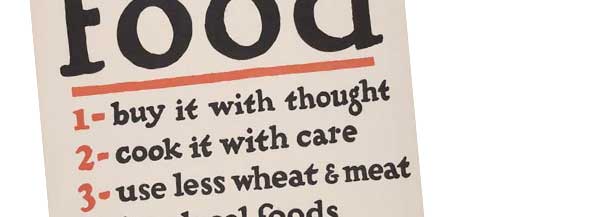

Several years ago the Fonts Fest featured “Cooper Misunderstood” … here, we’ve run across a historical reference that reads :
F. G. Cooper, b. 1883 Food… Don’t Waste It. — a poster by the [United States]: U.S. Food Administration, [between 1914 and1918]. ( New York : W.F. Powers Litho.)![]()
![]()
![]()
![]()
![]()
![]()
![]()
![]()
![]()
![]()
![]()
![]()
Signs from other Signs with Ampergram
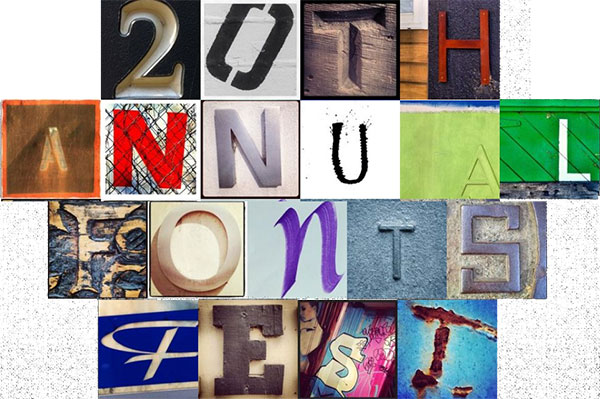

Here’s a very cool app for iOS (iPhone and iPad), Android that enables you to create endless typographic compositions using cool photos of fonts. You can capture and tag your own letters, or use the app’s already stellar offerings generated by the community.
Combining typography with popular photo editor Instagram was the bright idea by Phillip Pastore. ![]()
![]()
![]()
![]()
![]()
![]()
![]()
![]()
![]()
![]()
![]()
![]()
Like a brother to the Bourbon family, here comes GIN
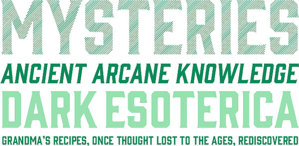

A typeface from Fort Foundry’s Mattox Shuler, the Gin family is a hard-working design featuring tall letterforms with angular serifs. Featuring regular, rough, round, and lined variations, this typeface provides both flexibility and character to designs.
Hewn from similar letterforms, the Bourbon family—also from Fort Foundry—makes an excellent more condensed companion to the Gin collection. Check them both out! ![]()
![]()
![]()
![]()
![]()
![]()
![]()
![]()
![]()
![]()
![]()
![]()
NEXT: Typography and lettering make FACES . . .
Previously
- 20th Annual Fonts Festival for October
- 20th Annual Fonts Festival : fonts, lettering and typography surf
- Fonts, lettering and typography surf TWO
- Fonts, lettering and typography surf THREE
- Fonts, lettering and typography surf FOUR
- Photoshop Fonts, type, lettering effects tutorials Madness
- 20 Years of Fonts Fest Surfs : Free Poster
- … and The Surf Continues
And, thanks for reading
Editor/Publisher : DTG Magazine
+FredShowker on Google+ or most social medias @Showker
Published online since 1988
Don’t forget … we encourage you to share your discoveries with other readers: ![]()
![]()
![]()
![]()
![]()
![]()
![]()
![]()
![]()
![]()
![]()
![]()
![]()
![]()
![]()
![]()
![]()
![]()
![]()
![]()
![]()
![]()
![]()
![]()
![]()
![]()
![]()
![]()
![]()
![]()
The original version of this page was published at : www.graphic-design.com/Type/20th_Anniversary/20th_Fonts_surf_6.html