From time to time, our friends out at Shweiki Media produce some tutorials and articles to help their printing clients get more bang for their bucks. We’re lucky that when they author these files, they send them to me for DTG readers! Consider this, the next time you have a cover to design
![]()
When it comes to publications, people do tend to judge by the cover — that’s why it’s important to make it the best it can be. Here Shweiki Media presents 12 excellent strategies for a publication to consider and implement when designing a cover to ensure that, with its first impression, it delivers the correct message, garners interest and drives sales.
Figuring out how to create a brilliantly designed cover can be heart-wrenching or hilarious, or fall anywhere in between. Although the wisdom goes “Don’t judge a book (or magazine) by its cover,” there’s no doubt that most people–at least until they read it for the first time–will. It’s important to have a cover that promotes what it delivers, stays true to the vibe of the publication and–hopefully–will catch an eye in the supermarket check out line. And when it comes down to standing out, without question, remarkable magazine covers have made history…and sales.
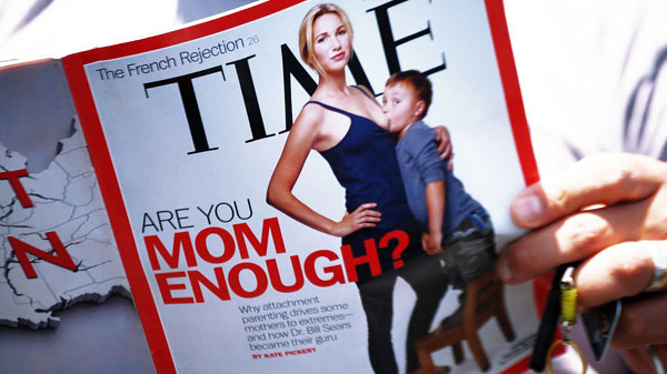 The shock value of covers is often a huge talking point (and selling point) for magazines. Whether most people agree with the message or not, there’s no such thing as bad publicity.
Here are 12 rules for designing remarkable covers.
Rule 1: Content beats design. Even with the most beautiful, attention-getting cover, if there’s no story, it’s not gonna work. It’s important to have the content to back up the cover.
Rule 2: People buy emotionally, then justify their decisions logically. A good cover should seek to provoke any of these 6 emotions. Love, joy, surprise, anger, fear or interest.
Rule 3: Have a strategy for the colors used on the cover–choose them on purpose. The color palette is in the photo. One should zoom in, pull it out with the Doppler tool, use the color wheel to find complementary and analogous colors.
Rule 4: Take some risks when designing covers. There’s no such thing as bad publicity. There’s a reason that’s a common–and correct — line of thought. If people talk about it, bad or good…it’s good.
Rule 5: Use a generous dose of whitespace Negative space is actually very positive. It makes the cover look less busy while also allowing attention to be drawn to strong cover lines and great pictures.
Rule 6: Use only two typeface families. This adds some interest and allows for differentiation between different parts of cover text but also doesn’t overwhelm the (potential) reader.
Rule 7: Photography sells better than illustrations. Great cover photography is easier said than done, but nothing beats an amazing cover photo.
Rule 8: Jaw-dropping relevant benefits. It’s important for a magazine to remember that it’s competing with hundreds of other publications. A cover should visually communicate clearly and effectively what the reader can expect from the magazine.
Rule 9: Use numbers. “10 Richest People in the World ” reads better than “Some Rich People.” Readers like lists. And even if the number is completely random, it works. Who wouldn’t want to pick up a magazine promising “327 Hot Fashion Ideas”?
Rule 10: Ask “What are we selling?” should be the question publications ask themselves.
Rule 11: Answer (the reader): “What’s in it for me?” (WII-FM) Much like a customer thinking about buying a product, the reader is going to wonder what they’re gaining by opening the publication. It’s important to consider that it’s necessary to give them a reason to read — and say it loud and proud.
Rule 12: Break the rules. Shweiki Media’s mission has always been to help publishers improve by providing the most profitable, hassle-free printing experience possible. This includes guaranteeing the highest quality product, exceptional customer service and on-time delivery.
As a printer and publisher, Shweiki Media also believes that this hassle-free experience includes making their clients better. Utilizing relationships with industry experts, Shweiki Media strives to educate clients and help them thrive in the exciting world of publishing–while having lots of fun along the way!
The shock value of covers is often a huge talking point (and selling point) for magazines. Whether most people agree with the message or not, there’s no such thing as bad publicity.
Much like a customer thinking about buying a product, the reader is going to wonder what they’re gaining by opening the publication. It’s important to consider that it’s necessary to give them a reason to read.
![]() shweiki.com magazines division
shweiki.com magazines division
![]() Google Findings Show Magazines Are Driving Mobile Search Activity
Google Findings Show Magazines Are Driving Mobile Search Activity
![]() Condé Nast says young people’s magazine readership is UP
Condé Nast says young people’s magazine readership is UP
![]() Magazine Digital Readership Tiny but Growing
Magazine Digital Readership Tiny but Growing
Don’t forget … we encourage you to share your discoveries with other readers. Just send and email, contribute your own article, join the Design Cafe forums, or follow DTG on Facebook!