Tim Clukey has been teaching digital media courses for over 14 years at the Plattsburgh State University Communications Studies Department in Plattsburgh, NY. He shares these insights into the application of presentation media.
![]() Throughout your life there can be many circumstances that require you to stand in front of a group (large or small) to present your ideas/sentiments on a topic. The stakes may be high or low depending on the occasion and the outcome of your efforts. The appreciation of a small group of friends, a grade in a college course, a raise, or even a large contract award may be dependent on your delivery. You can greatly increase the potential success of your presentation (provided your ideas are sound/worthy) by incorporating simple delivery techniques in your media.
Throughout your life there can be many circumstances that require you to stand in front of a group (large or small) to present your ideas/sentiments on a topic. The stakes may be high or low depending on the occasion and the outcome of your efforts. The appreciation of a small group of friends, a grade in a college course, a raise, or even a large contract award may be dependent on your delivery. You can greatly increase the potential success of your presentation (provided your ideas are sound/worthy) by incorporating simple delivery techniques in your media.
Whether you opt to use PowerPoint, Prezi, SlideRocket, or any one of the other dozen or so presentation programs that exist, the effectiveness of your delivery can be increased when you’re sitting down to put things together on the screen. There are tried and true elements you can include to increase your ability to communicate with your audience. Likewise, there are many items that can sabotage your delivery efforts — that you can easily avoid.
Follow the guidelines below when you’re constructing your presentation. Refer to the Include/Avoid list and make edits as necessary. When you think you’re done, see how your presentation stacks up by evaluating your work with the checklist included at the end.
FIVE ITEMS TO INCLUDE
1. Use Images/Diagrams
- Use more images than text in your presentation.
- Images can set the tone of your content and convey ideas more clearly.
- It’s especially helpful to use appropriate images on your “Title” slide as this
- may be projected for an extended period of time.
- Make sure your images have a purpose/help to focus your ideas, but be selective.
- Avoid using images merely for decorations. They must serve a purpose/have meaning.
2. Use Contrast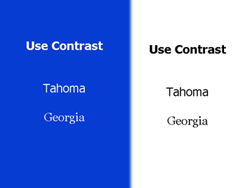
- Use light-colored text on a dark background (preferred) or dark-colored text on a light background.
- There should always be a marked contrast between the colors you choose for the text and the color of the background.
- When you incorporate a clear contrast between the text and background, it makes it easier to read and doesn’t create eye strain.
3. Use Text Fonts/Sizes that Make it Easy to Read
- Use fonts that were designed for screen/projector use (as opposed to print).
- Georgia & Tahoma fonts were designed with screen/projector use in mind.
- By using common fonts (and avoiding fancy, computer-specific fonts) you won’t run into a problem that could reposition all of your text — making it difficult to read. (If you want a specific font for a title — build a .Gif. And if you don’t know what that means — just stick with the more popular fonts you already have.)
- Use font sizes that are 28 points or higher to make it easier to read and to avoid eye strain.
- Use upper case for titles only. There should be no ‘shouting’ text in your body content.
4. Use Bullets PROPERLY to Convey the Highlights/Headlines
Follow the 6 x 6 Rule for using Bullets
- Don’t use more than 6 words per bullet (okay, 7-8 tops) (Don’t use complete sentences, and when possible use action words)
- Don’t use more than 6 bullets per slide (If you have more than 6, break it into two slides)
- Reveal each bullet one at a time — as you cover them (This applies to charts/diagrams as well)
- Following this rule helps you to avoid putting all your text onscreen
- Following this rule helps your audience to stay with you as you discuss each item (and they won’t have the option of reading ahead of you).

5. Use Spell-check! (always)
- Use the spell-check feature. – Nothing detracts from your credibility with an audience more than poor spelling.
- If the software you’re using doesn’t have this option, copy your text into a program that does — and check your work. If that’s not an option, have two other people proof your work.
NEXT: FIVE ITEMS TO AVOID in your presentations
FIVE ITEMS TO AVOID
6. Avoid Reading to your audience
- Do not put ALL of your text/content/speech on the screen and reading it to your audience!
- Text should ONLY display the highlights/headlines of your content, giving YOU the floor to explain/describe the details.
- If you have important, lengthy text that must be used verbatim, put it in a handout — don’t put it on the screen. (If it’s that important, your audience should probably have a copy/printout.)
7. Avoid Cartoon-Style Animations and Sound Effects
- Cartoon-style animations & sound effects are too distracting and detract from the content/presentation (and they’re just plain annoying).
- Animations and sound effects slow your presentation down and they get old very fast. Avoid them.
- Simple text animations (e.g. fly-ins) and slide transitions are okay to use provided they are simple and not distracting (use a consistent style – don’t vary them).
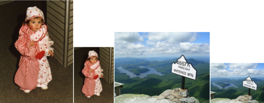
8. Avoid Altering the Natural Proportions of Images/Photos
- When using images/photos, keep (constrain) the natural proportions/layouts.
- Some images are wide (landscape style layout) while some are tall (portrait style layout). Don’t turn one style into another by simply altering the sides, top, or bottom.
- Altering the natural proportions of an image ‘squishes’ the image, making something (or someone) look ‘cartoonishly’ thin or flat.
- Most software allows you to properly alter the size of an image by holding down the *SHIFT* key and dragging one of the corners. [See samples below]
- If this doesn’t seem to work, use a photo editing program to properly crop/resize the image and include this version in your presentation.
9. Avoid the ‘Too Many’s’
- Avoid using sound effects.
- Avoid using too many colors, backgrounds.
- Avoid using bright colors (like bright red text on a bright green background (See Tip #2). This makes it difficult to read and causes eye strain.
- Avoid using too many different fonts/type sizes.
- Avoid using too many different types of transitions.
- Avoid using too much clip art and flash graphics (see Tip #7).
- Avoid hitting the spacebar/mouse button so hard that you can hear it in the next room when you’re transitioning to the next slide.
- Avoid using too many slides (aka “PowerPoint Poisoning”).
10. Avoid Projecting Slides When the Focus is on YOU
- When you need the audience’s undivided attention to discuss an important point/topic/issue, shut off the slide (temporarily).
- Many podium/presentation controllers have a Mute button that will allow you to “go to black” on the screen. Pressing it a second time will return you to your current slide.
- Some presentation software allows you to “go to black” by simply pressing the letter ‘B’ key on the keyboard. Pressing it a second time will return you to your current slide.
- Some programs also allow you to press the ‘W’ key to get a blank, white screen – but this is usually too bright, distracting, and may cause eye strain for your audience.
- There’s one other suggestion that can be helpful. After your “Title” slide, include a slide that gives a quick overview of your presentation – so your audience knows what to expect.
PRESENTATION CHECKLIST
| ITEMS INCLUDED | ITEMS AVOIDED | [_] Good Use of Images (overall) | [_] Avoided Too Much Text Per Screen | [_] Effective Image on Title Slide | [_] Avoided Too Much Text Per Bullet |
| [_] Included Overview Slide | [_] Avoided Animations |
| [_] Good Contrast Text/Background | [_] Avoided Sound Effects |
| [_] Good Use of Font Choices | [_] Avoided Unnatural Image Alterations |
| [_] Good Use of Font Sizes (28 points or >) | [_] Avoided Too Much Clip Art |
| [_] 6 Bulleted Items Max per Page | [_] Avoided Too Many Colors |
| [_] 7-8 words per Bullet (Max) | [_] Avoided Too Many Fonts/Sizes |
| [_] One Bullet Revealed at a Time | [_] Avoided Too Many Transitions |
| [_] Checked Spelling | [_] Avoided Flash Graphics |
| [_] Re-Checked Spelling | [_] Avoided Conflicting Colors/Styles |
| [_] Identified Focal Points / Slides Off | [_] Avoided Too Many Slides |
Thanks for reading, hope you have many, many successful presentations!

Tim Clukey
Tim Clukey has been teaching digital media courses for over 14 years at the Plattsburgh State University Communications Studies Department in Plattsburgh, NY. He also completes digital audio archival restoration work for SUNY Plattsburgh’s Special Collection Library. His digital archive work on the Marjorie Lansing Porter Collection is stored at the Smithsonian Center for Folklife and Cultural Heritage in Washington, DC.
Visit Tim in the Communications Department where you’ll find an array of excellent careers in the field of Communications
Don’t forget … we encourage you to share your discoveries with other readers. Just send and email, contribute your own article, join the Design Cafe forums, or follow DTG on Facebook!