Gerald Gallo comes back again year after year with new fonts — sometimes, fonts you just can’t find anywhere else … this year : cross stitch fonts, some new ornaments, art deco titling and headlines, and even alpha-numeric styling fonts!
![]() Gerald Gallo has been busy since the last Foll Fonts Festival — here are some new PostScript Type 1 screen and printer fonts for this season — including some all new Initials, an unusual alpha-numeric series, and a collection of fonts for the cross-stitch artist!
Gerald Gallo has been busy since the last Foll Fonts Festival — here are some new PostScript Type 1 screen and printer fonts for this season — including some all new Initials, an unusual alpha-numeric series, and a collection of fonts for the cross-stitch artist!

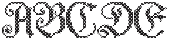
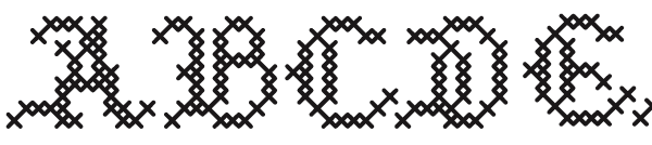
we begin our tour with the cross-stitch fonts — each is meticulously crafted to cater to the cross stitch artist. Above we see Gallo Classic Cross Stitch font. Below is a more decorative Gothic font called Gallo Elaborate Cross Stitch font. (Remember, you can click on these to see more of the font in a pop-up!)
Next is the “Majestic” cross stitch, . . .

Medieval …
and Regal Cross Stitch fonts …

All of these are designed specificly for cross stitch. If they’re a little hard to see and appreciate, try squinting. Yet, when completed, and stitched, they’ll be quite handsome. All Gallo Cross Stitch fonts are based on uppercase characters 12 stitches tall and contains upper case characters A-Z, numbers and punctuation. They’re available in OTF and TTF versions.
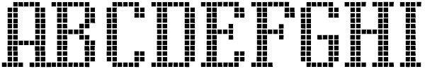
Display Squares
Another series capitalizes on the digital format by using pixel squares for the letterforms. No matter what size the pixels are, they’ll always be distinct!

Above is Display Squares #1, and below Display Squares #2. These really are display fonts, and not intended for text use.
On the next page we’ll continue with more specialty fonts from Gerald Gallo, at Graphics by Gallo in Bethesda, MD, USA
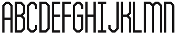
Classic Art Deco … Gerald calls this his “Display Crisp” font, and that’s because it actually will display crisp — even in pixel use on the web. This is a display font but features small caps for headline use! (See full set)
The Art Deco look and feel of that font is contrasted by the decorative ornamentation of the Art Nouveau period reflected in Gerald’s new ornament fonts . . .
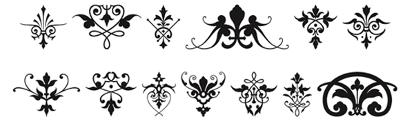
Victorian Ornaments – Here we see classic art nouveau ornaments that make superb book ornamentation, or expand really big to get wonderful vector art for further modification. This one, above, is called “Victorian”. Not only do they work alone, but try piecing them together for rare borders, corner treatments and wall-paper designs.
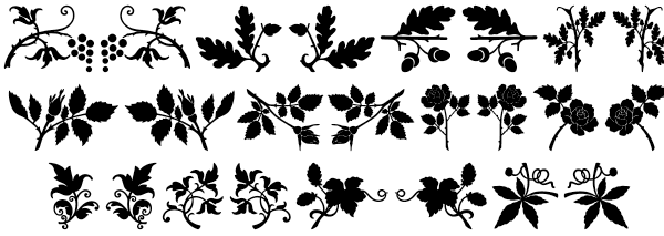
Plant Ornaments joins Gerald’s other dingbat fonts with an array of new foliage. These are particularly nice in the Printer’s Ornament style as decorations, corner devices, borders and wallpaper — but also for the “country” look of Pensylvania Dutch motif designs. This new font goes so well with Gallo’s Fancy Flowers (pictogram font)
Numbers, numbers, numbers
Then there are Gallo’s alpha-numeric fonts. There are actually ten different fonts in the “Display Digits” series, each containing just numbers, in an array of font styling
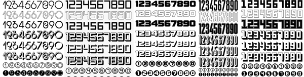
What we like best about these are the circled numbers. Very often we need numbered circles for diagrams and infographics … these are superb for that use. Here are samples of Display Digits 1, 3, 4, 5, and 10 … see the others at Gerald’s site!
More and more Gallo Fonts . . .
Previously we saw Gallo Fonts November, 2009 with Quilt Patterns, Gallo’s Leaves & Trees collection, Gallo’s FISH font, Gallo printer font, Birds Flying, Gallo Happy-Go-Lucky , Gallo Display Dots – and Gallo Fonts March 2010, which included Art Deco “Glorita”, Gallo Carefree , Gothic Initials one, two, and three, and Gallo Art Nouveau
Over the years Gerald has been quite busy, and his fonts collection now ranges over 200 fonts. He’s also opened a “merchandise” center on ZAZZLE, and you’re invited there for some unique gift selections.
![]() Graphics by Gallo LLC Website
Graphics by Gallo LLC Website![]() Graphics by Gallo Merchandise Store
Graphics by Gallo Merchandise Store
![]() MORE to come…
MORE to come… ![]() Many, many more episodes of Fred’s Fonts surf …
Many, many more episodes of Fred’s Fonts surf …
thanks for reading
Don’t forget … we encourage you to share your discoveries with other readers. Just send and email, contribute your own article, join the Design Cafe forums, or follow DTG on Facebook!