This Photoshop tutorial answers a call for help from a Photoshop 911 reader, with a series of steps used to simulate the famous “Looney Tunes” logo screen — while practicing techniques common to all versions of Photoshop — that all Photoshop users should know
A READER AT THE PHOTOSHOP 911 FORUMS asked for help simulating the famous Looney Tunes cartoons background we all know and love. I was going to key the instructions right into the forum reply, but realized there is a little more to it than would be appropriate. (Forum thread.)
The techniques are simple. I’ll give the most basic steps — which will work in ANY version of Photoshop or Photoshop Elements since version 3.5 — then turn you loose, knowing the principles, to create your own masterpiece. I know there are more advanced techniques with layers blending and layer styles — but the importance of these steps represent what goes on in the background of Photoshop while using the newfangled tools. Once you know the basics, you’re free to then utilize the layers styles and actually understand what how the settings work, and what they modify.
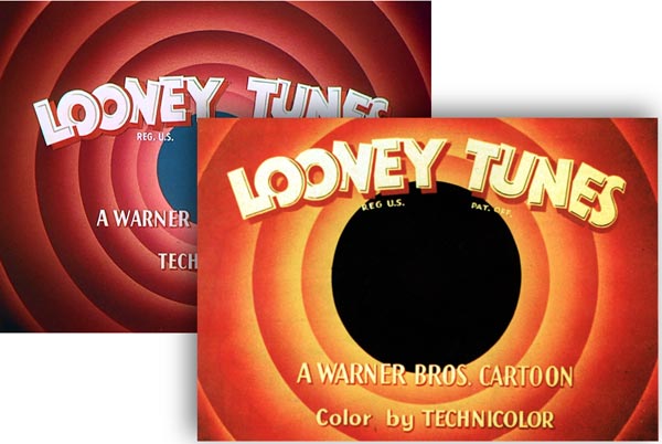
The single most important step in this process is analyzing (or designing) exactly what is happening in the art to be simulated, and understanding what specific looks you’ll be creating for a successful results. Careful sizing and color selection is crucial in simulating or emulating a specific look and feel.
1) Set up the file for the intended print, web page, etc. In the “New File” dialog, set file size, shape and resolution so the end product will satisfy the job.
2) Generate a new layer and name it “Target frame” then fill it with BLACK
3) Expand the window to make working space for your circles
![]() use the crop tool, and drag it out beyond the edges of the file size to crop it at about twice the size. Later you can select your “Target Frame” layer and crop the file to the final size and resolution. (This is a good rule to remember, no matter what the art is, if image areas will eventually bleed off the edges of the format.)
use the crop tool, and drag it out beyond the edges of the file size to crop it at about twice the size. Later you can select your “Target Frame” layer and crop the file to the final size and resolution. (This is a good rule to remember, no matter what the art is, if image areas will eventually bleed off the edges of the format.)
4) Set center Guides
![]()
![]()
![]()
![]()
![]()
![]()
![]()
![]()
![]()
![]()
![]()
![]()
![]()
![]()
![]()
![]()
![]()
![]()
![]()
![]()
![]()
![]()
![]()
![]()
![]()
tap V. with the black target window layer active
![]()
![]()
![]()
![]()
![]()
![]()
![]()
![]()
![]()
![]()
![]()
![]()
![]()
![]()
![]()
![]()
![]()
![]()
![]()
![]()
![]()
![]()
![]()
![]()
![]()
note the center bullet
![]()
![]()
![]()
![]()
![]()
![]()
![]()
![]()
![]()
![]()
![]()
![]()
![]()
![]()
![]()
![]()
![]()
![]()
![]()
![]()
![]()
![]()
![]()
![]()
![]()
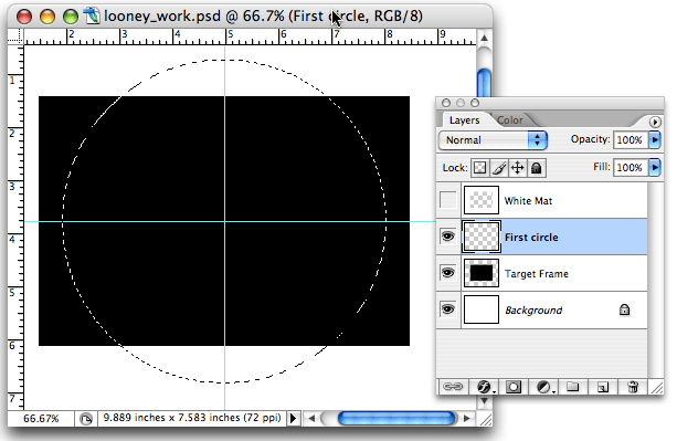

5) Analyze your color scheme. Each ring is different — you’ll start out with at least three colors Open the analysis diagram.
6) Make new layer [SAVE THE FILE]
7) Generate the circle: Select the Circle Marquee tool is selected (Tap ‘M’)
![]()
![]()
![]()
![]()
![]()
![]()
![]()
![]()
![]()
![]()
![]()
![]()
![]()
![]()
![]()
![]()
![]()
![]()
![]()
![]()
![]()
![]()
![]()
![]()
![]()
Hold Option/Alt key, position cursor over center bullet,
![]()
![]()
![]()
![]()
![]()
![]()
![]()
![]()
![]()
![]()
![]()
![]()
![]()
![]()
![]()
![]()
![]()
![]()
![]()
![]()
![]()
![]()
![]()
![]()
![]()
press the shift key and click / drag out. This draws a perfect circle, centered on your center bullet cross grid.
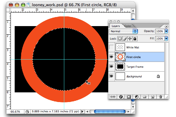

8) FILL the circle with the medium color (#1)
![]()
![]()
![]()
![]()
![]()
![]()
![]()
![]()
![]()
![]()
![]()
![]()
![]()
![]()
![]()
![]()
![]()
![]()
![]()
![]()
![]()
![]()
![]()
![]()
![]()
9) Generate the “Hole” by repeating steps #7 and #8, except this time, you’ll drag the perfect circle to REMOVE the center of your ring.
![]()
![]()
![]()
![]()
![]()
![]()
![]()
![]()
![]()
![]()
![]()
![]()
![]()
![]()
![]()
![]()
![]()
![]()
![]()
![]()
![]()
![]()
![]()
![]()
![]()
When sized properly, DELETE
![]()
![]()
![]()
![]()
![]()
![]()
![]()
![]()
![]()
![]()
![]()
![]()
![]()
![]()
![]()
![]()
![]()
![]()
![]()
![]()
![]()
![]()
![]()
![]()
![]()
you should have a perfect ring of orange, or #1 color
![]()
![]()
![]()
![]()
![]()
![]()
![]()
![]()
![]()
![]()
![]()
![]()
![]()
![]()
![]()
![]()
![]()
![]()
![]()
![]()
![]()
![]()
![]()
![]()
![]()
NAME this layer: “First Circle” [SAVE THE FILE]
Next… the fun begins!
Now the fun begins.
10) Select Background: Tap ‘W’ to select the Wand Tool, and click in the background, outside of the orange ring
11) Choose: Select > Modify Selection > Expand
![]()
![]()
![]()
![]()
![]()
![]()
![]()
![]()
![]()
![]()
![]()
![]()
![]()
![]()
![]()
![]()
![]()
![]()
![]()
![]()
![]()
![]()
![]()
![]()
![]()
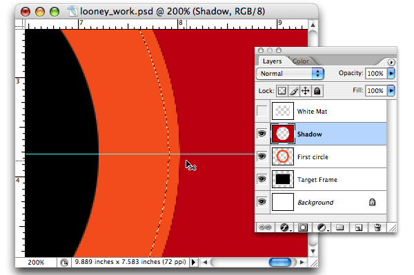

12) Generate NEW LAYER, name this layer “Shadow”
13) FILL that layer with the ‘Shadow’ color (a dark red),
![]()
![]()
![]()
![]()
![]()
![]()
![]()
![]()
![]()
![]()
![]()
![]()
![]()
![]()
![]()
![]()
![]()
![]()
![]()
![]()
![]()
![]()
![]()
![]()
![]()
14) BLUR: Choose: Filters > Blur > Gaussian Blur
![]()
![]()
![]()
![]()
![]()
![]()
![]()
![]()
![]()
![]()
![]()
![]()
![]()
![]()
![]()
![]()
![]()
![]()
![]()
![]()
![]()
![]()
![]()
![]()
![]()
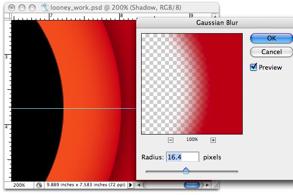

Now, we’ll generate the “HIGHLIGHT” blur. It’s the same process as the “Shadow” layer
15) Select the layer: “First Circle”
![]()
![]()
![]()
![]()
![]()
![]()
![]()
![]()
![]()
![]()
![]()
![]()
![]()
![]()
![]()
![]()
![]()
![]()
![]()
![]()
![]()
![]()
![]()
![]()
![]()
![]()
![]()
![]()
![]()
![]()
![]()
![]()
![]()
![]()
![]()
![]()
![]()
![]()
![]()
![]()
![]()
![]()
![]()
![]()
![]()
![]()
![]()
![]()
![]()
![]()
16) Click on the ‘Shadow’ layer, and generate then another layer, name this new layer “Highlight”
17) Select Inner Circle – Choose: Select > Modify Selection > Expand
![]()
![]()
![]()
![]()
![]()
![]()
![]()
![]()
![]()
![]()
![]()
![]()
![]()
![]()
![]()
![]()
![]()
![]()
![]()
![]()
![]()
![]()
![]()
![]()
![]()
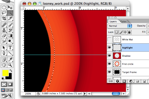

18) Colorize: With the selection still active (racing ants)
![]()
![]()
![]()
![]()
![]()
![]()
![]()
![]()
![]()
![]()
![]()
![]()
![]()
![]()
![]()
![]()
![]()
![]()
![]()
![]()
![]()
![]()
![]()
![]()
![]()
![]()
![]()
![]()
![]()
![]()
![]()
![]()
![]()
![]()
![]()
![]()
![]()
![]()
![]()
![]()
![]()
![]()
![]()
![]()
![]()
![]()
![]()
![]()
![]()
![]()
![]()
![]()
![]()
![]()
![]()
![]()
![]()
![]()
![]()
![]()
![]()
![]()
![]()
![]()
![]()
![]()
![]()
![]()
![]()
![]()
![]()
![]()
![]()
![]()
![]()
19) Blur: Choose: Filters > Blur > Gaussian Blur
![]()
![]()
![]()
![]()
![]()
![]()
![]()
![]()
![]()
![]()
![]()
![]()
![]()
![]()
![]()
![]()
![]()
![]()
![]()
![]()
![]()
![]()
![]()
![]()
![]()
move the slider to drive the highlight color deeper into the circle. When satisfied, say “Okay”
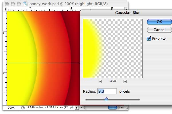

You’re finished shading the first ‘ring’ or circle — next we’ll clean up and turn you loose …
Clean Up & Finish Up
Now that our shadow and highlight shading are complete, we’ll use the original dough-nut circle as a selection guide to trim out and clean up both fills in the background that are no longer needed.
20) Selecting both backgrounds (open diagram)
![]()
![]()
![]()
![]()
![]()
![]()
![]()
![]()
![]()
![]()
![]()
![]()
![]()
![]()
![]()
![]()
![]()
![]()
![]()
![]()
![]()
![]()
![]()
![]()
![]()
cmd/cntrl – CLICK on the layer icon of the layer: “First Circle” to select your orange circle
![]()
![]()
![]()
![]()
![]()
![]()
![]()
![]()
![]()
![]()
![]()
![]()
![]()
![]()
![]()
![]()
![]()
![]()
![]()
![]()
![]()
![]()
![]()
![]()
![]()
Choose: Select > Invert Selection to switch the selection to the background only
![]()
![]()
![]()
![]()
![]()
![]()
![]()
![]()
![]()
![]()
![]()
![]()
![]()
![]()
![]()
![]()
![]()
![]()
![]()
![]()
![]()
![]()
![]()
![]()
![]()
Select the ‘Highlight’ layer and DELETE
![]()
![]()
![]()
![]()
![]()
![]()
![]()
![]()
![]()
![]()
![]()
![]()
![]()
![]()
![]()
![]()
![]()
![]()
![]()
![]()
![]()
![]()
![]()
![]()
![]()
Select the ‘Shadow’ layer and DELETE
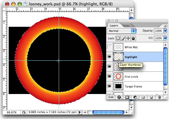

You now have your first RING shaded and highlighted
To me the “Shadow” was not dark enough. I decided to add yet another layer of BLACK for deeper slight layer. I repeated the “Shadow” process above, but this time I did NOT “Select / modify / expand” the selection but merely filled the background selection with black, and then ran the Gaussian blur again.
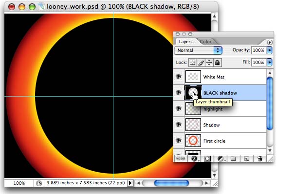

21) SAVE THE FILE, and then Choose “SAVE AS…” and rename the file “Circle 2” … and move forward to finish the piece.
Now you know how to create a ring. The next step would be to create your second ring, inside the first, and follow the same basic steps, modifying them only to support your analysis or design of the finished look. In the original Looney Tunes backdrop, notice how the circles get generally ‘lighter’ as they recede to the center. Also note they always fill that center with a ‘cool’ color so it visually recedes into the distance — suggesting a “hole.”
Also note that in the beginning I set up a white mask layer at the very top of the layers stack. I didn’t talk about that, but it’s useful to toggle that layer on from time to time to view the progress of the finished look. I made the work space larger so I could work on full circles for ease of viewing — but at the end, I’ll crop and finish the piece to that white mask — the final target size.
As you go through this process, your color selection, modification of selection sizes (expand / contract) and the blur counts all become areas of interpretation and exploration to achieve the final result. You can go back and modify or re-do any of the layers, and even add more layers to develop the exact look you need. Remember you can also use the Opacity slider in the layers palette to soften any of the effects. This could also have easily been generated in any version of Illustrator since #2, utilizing the gradation modification tools. Actually it would be easier than Photoshop.
If you wish, you can also introduce some noise, or texture to fully replicate the grainy feeling of the original art which was produced using tempra or dye media in an airbrush on slightly textured board — then mangled through the primitive photography stages of bringing that famous mark to the silver screen!
Now you know, have some fun.
thanks for reading
Don’t forget … we encourage you to share your discoveries about
favorite or famous graphic designers and illustrators with other
readers. Just comment below, join the forums for discussion, or give me a tweet at Twitter/DTG_Magazine