The magic of experimenting in graphic design! Freelance designer Dasha Wagner presents her innovative ideas and interesting solutions. Elegant style and color harmony along with some totally practical typography makes her projects unique.
I could show you ten-thousand examples of wow typography, as hundreds of blogs do every day. But over the years there are several things I’ve learned about “wow typography” …
- There is usually no client, and is the work of a designer flexing the typographic muscles hoping to attract clients…
- or, the client is one who’s mission would succeed no matter how wow the typography is, or
- it’s relatively easy to do,
- and it becomes very old, very quickly after looking at so much of it.
In the real world there are ten-thousand “practical” type jobs to every ‘wow’ typography job. Practical type is difficult; very difficult. Few practitioners really have the ability to make typography WOW and practical at the same time.
Dasha Wagner one of those. We were impressed by the way she integrates type into the project to do its job, communicate a strong message and mood — as well as act as the visual attractant that good typography always is. So Dasha stands out because her typography has to be practical by the demands of her clients, yet she’s able to capture a bit of excitement and art into every application.
Dasha writes:
“Beautiful graphic design it is always so expensive…” or “Free pre-press works??? Is it a joke?” 95% of my customers thought about the same before we started working together. Now I hear from my customers: “Your work is awesome, distinct, unique and complete.” and “We’ve gotten so many positive feed backs and great responses!”
I can easily prove that providing of high quality graphic design services at affordable prices can be absolutely real. My field is interesting ideas in print design (such as direct mail, logos, calendars, magazine layouts, ads and many others).
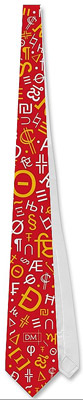
We believe that. If you look at her packaging, and even the typographic necktie (at right) you’ll agree that typography can fulfill its mission and be exciting at the same time.
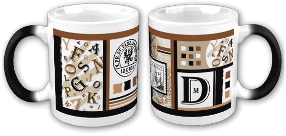
In these coffee mugs, Dasha balances the colors, layout, shapes and typestyles to evoke the feeling of coffee.
Dasha continues:
Tight deadlines? It’s my specialty!
Striving for perfection and innovation is extremely important in being a good designer. I want to help my customers by offering them only the best design solutions. I truly believe that elegant and dynamic design can make people’s live more colorful and enjoyable.
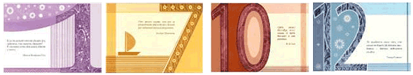
Here is a perfect example of how Dasha merges fun with work. This series of cards employs some playful numbering and typography, coupled with imaginative color treatment. (See the whole set) They’re successful because the type works. They’re fun because the type has personality.
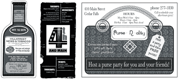
Even in black and white newspaper ads, Dasha manages to retain that spark of freshness that makes the job visually appetizing — proof that B&W can be as inviting as color. Yes, they are effectively designed, and got the job done when published.
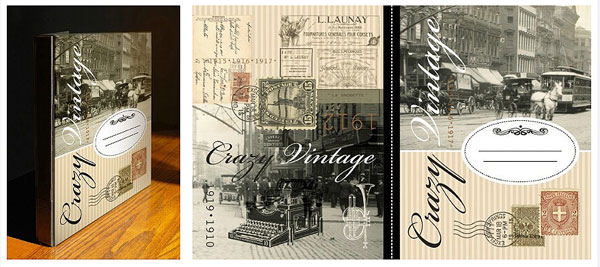
In packaging, it’s very easy to rely on the sans serifs and bold type treatments we see every day. But when the subject matter dictates a mood and a theme; that takes typographic savvy to get the message across while painting a pristine picture.
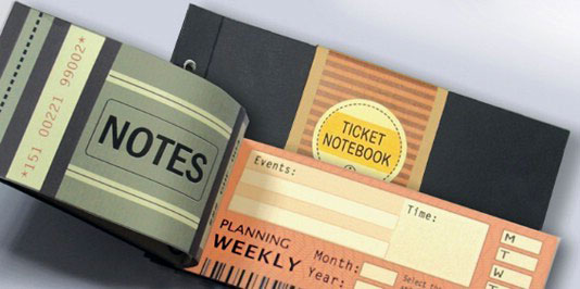
This ticket booklet could have been very boring. In fact, we’ve seen dozens of ticket books that are all very boring. But here, Dasha applies bold, flat color areas with punchy type and a slightly skewed layout to create a memorable design. Leafing through this ticket book takes on a more pleasurable event then merely pulling out a ticket. It is very convenient to mark times and dates of events and meetings in the arrival and departure columns. Practical design of the address/phone pages helps the user find the necessary information quickly.
Dasha has participated in promoting of such brands as: Gerry Weber (Germany), Pompa (Germany), Grand Hotel Europe (Russia), Auchan (France), Columbia (USA), PME Legend (Holland) and others.
Her clients range from Gulliver Shopping Mall (Russia) and Victory Business Magazine (Russia), to The Northern Iowan (USA) and DPI Advertisings (Germany).
Dasha Wagner is an Associated Member of the American Institute of Graphic Arts (AIGA). She has been working in the graphic design field since 2000. While still a student, Dasha was a Graphic Design Instructor at the Art Center for Youth Creativity in St. Petersburg (Russia). Later in 2004, she decided to focus on applying graphic design in business. In 2005 she received The Chancellor’s List Award. You can visit her Portfolio and see many more exciting pieces — all visual treats for the graphic designer and consumer alike.
Dasha Wagner
- DM Graphic Design Collection
- State Center, IA, USA
- www.dm-design-collection.com
![]()
![]()
![]()
![]()