Several readers recently requested a very old page from DTG about unique folding designs. Here are several great folding tricks (updated) that are sure to involve your reader as your message unfolds!
From our “Powerhouse Brochures” conference presentation…
A reader from Richmond, VA writes:
“What are some different formats forlaying out brochures, besides the ol’ 3-fold, 6-panel way?”
New life for old brochure layouts…
A lot of people often ask this very same question. The solution to this is really a simple matter of backing up and taking a different perspective on the whole approach. My tried and true philosophy, when trying to break out of old layouts is:
- Look for opportunity! (I talk about opportunity quite often!)
- Ask questions of your project
I won’t launch into a marketing dissertation. But I will pass along this important rule: designing a successful brochure is a duet between two individuals. It takes an important exchange of ideas between the designer and the writer. If you remove either of these parts from the equation, the results will be somewhat less. You have to do both parts? You’ll need someone else to test and cure your ideas. From the moment you arrive at your first concept, you are no longer capable of making judgments about the design. You already know how it’s intended to work. Already, you are too close. It takes that all-important second pair of eyes.
![]() Remember: test and test again.
Remember: test and test again.
Now, let’s design a brochure
We want to look for opportunity and we want to ask questions of your project. Let’s not start like most people do — let’s ask our questions first.
- How can we fold this paper to stand out from the rest?
- How can we force the reader to become involved?
- How can we provide subliminal clues that the reader will want to follow?
Let’s look for opportunity. I find the most opportunity in the basic press sheet.
- Where are you printing the brochure?
- What’s the largest image size?
- How can we build our cuts and folds out of this sheet differently?
Get a press sheet and start folding.
Better yet, go to the printer and get a stack of press sheets. Start folding. Now move the folds. Now reverse the folds.
Give it a try.
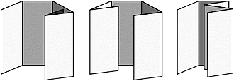 From this example (at right) we discover three very different brochures that all come from the same sheet of paper, but can be designed to tell three very different messages. Or, tell the same story three different ways.
Discovering different ways of telling our story is of paramount importance in designing a successful communication piece.
Don’t have a story to tell? Rewrite your information so it has a lead-in, a beginning, a middle and an ending. What are the logical steps you want your reader to take? How should they “discover the story?
It is very important that we “involve” our reader. One proven way of doing that is by making a story unfold through the panels of the brochure.
Look at the examples and ask how a dynamic story can unfold. How can we force the reader to take the desired logical steps of our message?
These will all run comfortably out of an 11 x 17, or even an 8.5 x 14 legal size sheet.
Some other variations…
If you’re bound into the 8.5 x 11 size, perhaps you might try the “Offset French” fold. Here the sheet is simply folded into quarters. Move the last fold left or right and the simple sheet becomes a powerful opportunity to present your message in a dynamic 1, 2, 3, step-through fashion.
We’ve involved our reader, supplied visual clues to inspire and direct the reader through our message a step at a time, and we’ve taken the opportunity to do a layout that our reader probably doesn’t see every day. Our three important questions are now answered.
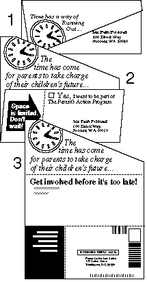
This concept also works very well with legal-size paper. Try different sizes, and try unfolding in different sequences to see how best to integrate the copy into the concept!
Angles???
Here’s another one. Why think in terms of traditional cutting and folding.
This angle cut cost few dollars more than a straight cut version, but look at the wonderful added impact it could have on the reader. Here the story unfolds with very persuading results.
As the brochure opens it reveals each part of our message as WE want it to.
The angled cut provides an unusual presentation of the overall format. It’s different – it will get noticed. The mail panel integrates the readers name as part of the overall look, but also puts the reader’s name and address right on the reply card.
What a motivater!
The reader doesn’t even have to fill anything out! We’ve made it inviting. (The folded flap motivates the reader to open the brochure.) We’ve involved our reader, and we’ve provided an easy way for our reader to respond.
These are but a few examples of new life for the old, tired 3-fold brochure. There are lots more. Once you get those press sheets and start folding, I bet you’ll develop some exciting new ones for your self! Send them to me if you do! (He says with a smile, and a wink!)
Hope you can make it to our workshop in the Washington, D.C. area. Those attending that workshop will get our printed handouts which will include these and a half-dozen or so others , ready to put to work right away! Keep your eye on future issues of DT&G – we’ve got many more great layouts to come!
Until next time… Happy folding!
![]()
Don’t forget … we encourage you to share your discoveries about favorite or famous graphic designers and illustrators with other readers. Just contact me here, or just give me a tweet at Twitter/DTG_Magazine