Someone asked about “Negative Space” and then blogs all over the place picked up the buzz word — but nobody actually delves into the psychology and philosophy of designing with negative space. It’s one of the most powerful tools a graphic designer’s toolbox.
Graphic designers deal with visual elements that must come together for form a composite message. However, those who hone their vision and skills to a fine level, understand that they are dealing with more than just shapes, colors, images and typography. Making a visual “window of approach” also deals with designing the space where nothing appears — the negative space.
 Good design utilizes the negative space as if it were a solid visual element in the design. Where this space occurs, its shape, and what it affects becomes of paramount importance in leading the reader or viewer to the intended result. Designing negative space is also designing the reverse space left behind by other elements, as in the vision of a white arrow hidden in the typography of the FedEx* logo. Some succeed, and some fail.
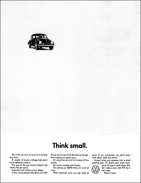
 Probably the most well known use of negative space, aside from logos, is Bill Bernbach’s* famous “Think Small” ad. Bill knew that by leveraging the negative white space of the ad he would a) grab anyone’s attention by virtue of so much white space, and b) force every reader to enter the content well and READ the “Think Small” headline. Notice how the negative space seriously reinforces the whole message of the ad without actually having to read the ad. This ad has been credited with launching Volkswagen into the U.S. market with huge success — and awarded the top advertising campaign of the 20th century.
Visual Gulp
When the human is presented with a ‘visual gulp’ they do more than concentrate on form, image and texture. The mind begins analyzing and sifting through the visual elements deciding what they are, how they relate to each other, and where they fall in space. The notion of 2-dimensional space is almost never considered. As soon as the very first visual element is placed in a blank visual gulp, it affects that space and the eye alters it. The challenge for graphic designers is placing all visual elements into that space so it not only relates to other graphic elements — but relates to the empty space itself. The negative space.
What do we see?
In its investigation of elements in space, the human eye works to make sense out of the elements and their positions in relation with each other even before recognition and understanding take place. So, the elements suggest location, movement, importance and relationships without their individual meaning. The process seems to follow what scientists and Gestalt psychologists refer to as parsimony*, or ‘less is better’. Those who follow the Gestalt* Principles know the extensive research that established the way humans interpret visual stimulus. Vsions perceived by the eyes are grouped in two ways — the brain selects what it considers to be the most obvious foreground and background. Then with each of the elements of foreground and background, the brain has a tendency to further group them as follows: proximity, similarity, connectedness, continuity of patterns, and closure. The Gestaltists saw this as the mind organizing many into a single whole.
Foreground and Background
Without going into a full-scale dissertation on the Gestalt Philosophy, and design axioms — you can study those until you are quite literally ill, we can focus on two elements in all visual perceptions as foreground and background. More precisely defined as what’s in front, and what’s in back. That’s what negative space is all about — which element is closer to you, and which element is further away. Within this established realm of “space” the next focus is:
- what is it?
- how important is it?
- what does it relate to?
- what comes next?
This subliminal test takes place in milliseconds, unnoticed by the recipient, when the viewer’s eye is called upon to analyze any given ‘visual gulp’ or window of approach. Which is closer, the stop light, or the car in front of you? Which is more important? How do we know this?
Now, let’s apply this to the science of utilizing negative space in visual communications.
Negative space: an exercise in ‘seeing’
In the following exercies, ask yourself these questions about what you see.
Do not look at the element or object for its own value — only ask…
- Where is it?
- Is it static or in motion?
- Is it more important or less important?
- Why did I look at it?
Open the Negative Space Demonstration now. (Click to advance from slide to slide.)
Ask questions as you move through the series. Notice your initial emotional response. Also notice how the addition of the second element completely changes the entire premise of the arrival. This is negative space at work.
Recognizing and Designing Negative Space
As in the Volkswagen ad, where you place the negative space and the elements it effects sends a subliminal message to the reader. Bill placed the picture of the Volkswagen high on the page, and to the left. This instantly gives the impression of distant but advancing — coming into the scene. If he placed it to the left, with the white space behind it or above it, the message would have been, here — already arrived. But you cannot deny that the vast field of white drove your eyes immediately to the headline. You couldn’t help yourself.
Negative space is
- a separater — to separate unrelated elements
- a magnet — to pull or push the eye toward an isolated element
- a motivator — to move the eye in a specific direction.
- a trick — first you don’t see it … but then you do

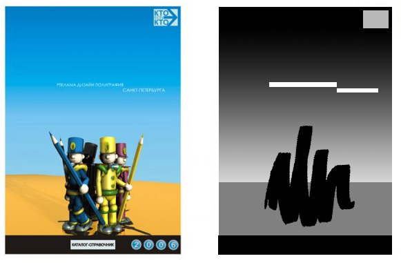
We return to one of the layouts created by Parkol, and ask how the elements in this design utilize negative space to achieve our design goals. We see the window as a whole — but to dissect it, we convert it to grayscale shapes to better understand their relationships. The squibble object is obviously the subject, by virtue of its centering on the fore ground field. It has “pointing” devices which help our eye rise to the white shapes in the receding blue field. The two lines of type take on enormous importance simply by virtue of their isolation, and positioning in space above the squiggle. The logo in the upper corner also becomes important for the same reason — reinforced by the fact that it is following the motion established by the movement from squiggle to headline. The viewer cannot look away from these elements, and if they do look away, they’re pulled back again.
Here’s a second example. Can you dissect it to discover its motion and object / plane relationships? Open Diagram #2
In your next layout, I want you to establish what your elements will be, but then, make each element purely grayscale. Make the grayscale “value” of each element resemble that of your real-world elements. Then, ask yourself how you can arrange these elements so that the negative space promotes fluid movement from one element to the next in order of importance.
Next: Designing Spaces
Thanks for reading
Don’t forget … we encourage you to share your discoveries about favorite or famous graphic designers and illustrators with other readers. Just comment below, contact me here, or just give me a tweet at Twitter/DTG_Magazine
ALSO IN THIS SERIES:![]()
Further reading: ![]()
![]()
![]()
![]()
![]()
![]()
![]()
![]()
About Bill Bernbach
![]()
![]()
![]()
![]()
![]()
![]()
![]()
![]()
THE ART OF NATURE by Brenda Tharp ![]()
![]()
![]()
![]()
![]()
![]()
![]()
![]()
Structure of Intelligence — Copyright Springer-Verlag 1993![]()
![]()
![]()
![]()
![]()
![]()
![]()
![]()
Photographing the World Around You: A Visual Design Workshop; Freeman Patterson![]()
![]()
![]()
![]()
![]()
![]()
![]()
![]()
Learning to See Creatively: How to Compose Great Photographs (Paperback)
by Bryan Peterson