Beth Rogers shares her views in a critique of Art works by Mark Vatnsdal
Art works by Mark Vatnsdal
In order for your work to be seen at its best, your site needs to be revamped so that visitors can easily see what they came for
The original post said:
"Hi, I'd like to get an idea of how well this site is working. It's strengths and weaknesses. What needs to be added or removed. I appreciate all comments... Looking for feedback on a site designed to introduce past work to galleries and curators. predominantly images of paintings at the moment."
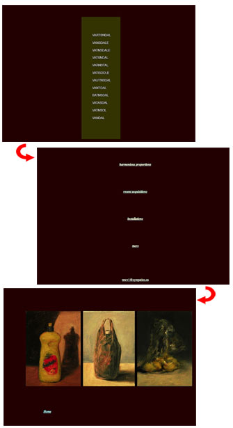
 The home page of the site opens with a dark brown background color, and for some reason, there is a column of asterisks in the same color down the middle of the page, above a color block that has a series of words centered in it. It seems to be variations of the artist's last name. My only explanation for the column of asterisks is to force the 'welcome' block towards the bottom of the page, but I'm not sure of the reasoning behind this. By clicking on the color block, I'm taken to the 'directions' page, which has the same column of asterisks at the top, forcing a series of links down to the bottom of the page. Each of these links is also separated by a group of asterisks as well.
Since this page is completely empty except for the five text links, it makes for a page that's approximately two screens long for no apparent reason, and it also means I have to click twice before I get to see any art at all.
The first link in the list is 'harmonious proportions', which has an inviting title, but when that page opens, the scroll bar at the bottom lets me know that the page is a little over two screens wide on my monitor. By looking at the source code, I see that its set in tables - and one row has cells that are 480, 582 and 1465 pixels wide. Only the center cell of that row has content, so I don't know why the table is set at that width.
Instead of showing the entire image of each picture, my suggestion would be to use interesting crops of the pictures as thumbnails that will click through to the complete picture - the pictures on this page are portraits of dogs and they are lovely, but most visitors won't want to scroll back and forth to see if they've missed any.
Another page I visited was titled 'installations' and the background changed to a dark green - a series of colored boxes was centered on this page; by mousing over each box, you were shown different pages to visit. This was a very inviting way to take you further into the site. It would make for an interesting navigation system -- it shows creativity and piques the viewer's interest. I won't go into a breakdown of the rest of the pages -- the layout is very similar.
I love your artwork -- there is so much feeling in it - and you obviously are very talented. In order for your work to be seen at its best, your site needs to be revamped so that visitors can easily see what they came for: don't make them scroll back and forth.
Have your main page with an image of your best work, and as I suggested earlier, make creative use of thumbnails to introduce your work; have each picture 'framed' with a one pixel border to set it apart from the background, add links along one side or the bottom to use for navigation, have a page that introduces you and your art, and consider having fewer pictures per page, with a little information about each picture.
Think through your reasons for using a dark background -- make sure it isn't overwhelming your work, rather than setting it apart.
Finally, check your meta tags to see if you're missing some search engine recognition. When I searched for your name on Google, the first listing was the IMDB site, and the third listing was your main page, but the only text it showed was "cool hit counter". Adding a description tag will make finding you easier. Also make sure your 'alt' tags for each picture are as descriptive as possible, and make sure your page titles are descriptive as well; that's another way to make the search engines see you.
Again, you've got some great work here; I'd love to see more of your artwork.
Beth
Beth Rogers Rogers Web Services
Previously: Beth Critiques "First United Methodist Church, Richmond Indiana"
Return to the Critique Department
Participate in your Design Center
Lots of fun and information for all... don't forget, any community is only as good as the participation of its members. We invite your tips, tricks, comments, suggestions and camaraderie.
- Ask for the DT&G Monthly: to receive DT&G newsletter each month, happenings in the Design Center and regular columns like the "Mail Bag" and "Cool Sites"
- SUBSCRIBE : to the Designers' CAFE email list
- Link to this site, and then show us the link. We'll send you any of our current door prizes, just for your trouble.
- READ Our Writer's Guidelines: before sending articles
- SUBMIT: a news link, new font, or product review
- SUBMIT: a link to a Photoshop web site
- Trademarks & Legal

