

Beth Rogers shares her views in a critique of www.firstumcrichmond.org
First United Methodist Church, Richmond Indiana
lovely, warm and inviting
The site has a lovely color scheme, which is warm and inviting, without being boring. I like the use of the green in the background picture, which works very well with the red cross. The oranges and other warm colors give a nice balance to the green, and the "burnt" edges on the title sections keep the site from looking too formal.
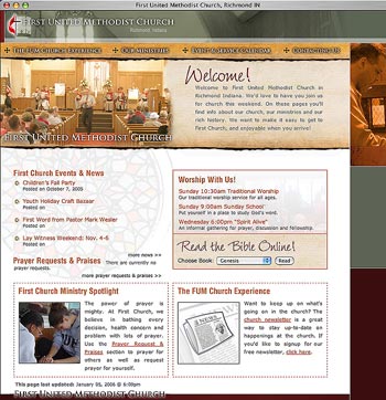 The whole look and feel of the site is that this church is friendly and approachable and that it cares about all its members, as well as the surrounding community. The menu animation flows well, and doesn't make too much movement. It opens and closes quickly, so the page below isn't blocked unnecessarily.
The title sections on each page feature a variety of church-related pictures that change when you refresh the screen; one in the title section, and another one to the right. While still on the home page, I clicked several times to see as many pictures as possible, and I noticed that sometimes the pictures were similar, without matching. For instance, showing empty chairs on the right, along with an empty sanctuary on the left might leave a bad impression.
My suggestion is to limit it to the picture in the title section and drop the one on the right. The stained glass window in the background can then continue down the right side. I think I would also remove the pictures of the empty chairs and the empty sanctuary from the choices.
On the other pages, I like the option to choose which size font I want to use. That's a seemingly small touch that adds to the statement above- your church cares about all its members and visitors. I did notice in several places that a '?' is showing up in some of the articles.
Another nice touch on some of the other pages that really caught my eye: for example, on the "news" page, you have a 'Check this out' section that points to other pages of interest. You also have a 'sign-up' section on the newsletter page. The extra graphics on those pages add visual interest, and make the site more memorable.
On the 'Meet the Pastor' page, I was disappointed to not be able to finish his article- hopefully that's something that will be completed later. I do notice there are lots of pages that don't have any information yet -- I know you're still working on the site, but again, I was disappointed not to be able to see everything.
All in all, I think you have a wonderful site -- it's going to take lots of work to finish, and it will probably be time-consuming to maintain. You've really set yourself some high standards to keep, but I can tell it's a labor of love to you. Congratulations on a very nice site, and I hope to be able to see the rest of your work soon.
Beth
Beth Rogers Rogers Web Services
Return to the Critique Department
Participate in your Design Center
Lots of fun and information for all... don't forget, any community is only as good as the participation of its members. We invite your tips, tricks, comments, suggestions and camaraderie.
- Ask for the DT&G Monthly: to receive DT&G newsletter each month, happenings in the Design Center and regular columns like the "Mail Bag" and "Cool Sites"
- SUBSCRIBE : to the Designers' CAFE email list
- Link to this site, and then show us the link. We'll send you any of our current door prizes, just for your trouble.
- READ Our Writer's Guidelines: before sending articles
- SUBMIT: a news link, new font, or product review
- SUBMIT: a link to a Photoshop web site
- Trademarks & Legal