Newsletters: Graphic Design for Hard Times
or... let design and layout save you from the slump!
This begins a series on better layouts, better design, and better strategy in these hard times for graphic designers. But this is not just for graphic design professionals -- this series will be aimed at anyone who needs to provide compelling information to a target reader or customer base. That could include the self-employed business person in just about any field -- the over-worked employee of a company who is now responsible for collateral materials. Graphic design professionals depend on their clients business to provide the income you need to survive. But in many sectors, the business doesn't have the financial resources to hire a graphic design professional -- those are the ones hit most by the current down-turn in the economy. So let's talk.
Rediscovering the newsletter
Why am I starting this series with newsletters? First of all there are thousands of newssletters. Recently however, the trend I've seen has been getting further and further away from effective, beneficial newsletter design. I cannot account for this trend. Back in the late 1980s and early 1990s, with the advent of personal computers and desktop publishing, there were many books and scores of seminars teaching non-professionals how to design effectively using the new desktop publishing tools. But all those efforts have given way to multi-media and the internet as driven by the aggressive technology industry. In the late 1990s, newsletter art seemed to fade into the background while the internet took center stage. New talent, as well as the emerging work force, missed the 'learning era' of publication design, only to be set adrift to work things out on their own. Consequently, newsletters I'm seeing today remind me of those early attempts at desktop publishing.
Even though companies now push their customers and clients to the Internet for their information -- the Web is not the end-all for your organization's marketing and PR mix. Many would like you to believe that -- but it just isn't true. I've also singled out newsletters because a good newsletter is worth far more than the web site in terms of readability and friendliness. Print newsletters, that people can hold in their hands, offer a reliable and effective vehicle to deliver your message to your readership -- and have it last. Newsletters lay around and are looked at again and again. They are tangible reminders of your organization even when the reader is not at the computer.
If you don't have a newsletter, then you might want to consider creating one. Even if it's a single sheet, mailed in a #10 envelope, it's a tangible communication between you and someone who is important to you. It's contact, and a reminder of who your organization is and what it does so well. Readers won't just 'stumble' across this information on their computers -- but they will stumble across it in their mail boxes. When they do, you want to make sure they open it and at least browse it.
Designing an effective newsletter
Your newsletter is an extension of your organization, your services or your product. Therefore the design must send that message to the viewer both in the information written and visual presentation. In order to accomplish that goal, a number of recommended practices have been established through research that should be followed.
Most professional design agencies or public relations agencies already know these rules. If your firm employs those services, then turn to those professionals and work with them to fine-tune the look, feel and editorial makeup of your newsletter to take your organization the extra mile. If you don't have a professional team working on the project, then keep reading.
Getting up and running with a nicely designed, multi-page newsletter is costing between $500 and $2,500 U.S. according to DesignQuote.net. While this seems to be a reasonable cost for the design of a newsletter, it exceeds the budgets or capabilities of many small businesses or nonprofit organizations. Keeping a sharp eye on what features are best becomes an important step even if someone else is doing it for you. Let's take a look at what makes the difference between a marginal 'bush-league' newsletter design and one that will represent your organization as competent, organized and professional.
Overall Personality
From the moment that newsletter arrives in the hands of the reader, the visual look and feel is making the impression that will be a lasting one. Visual elements and overall layout will encourage readership -- will draw the reader in. It is of utmost importance for that initial approach to be fresh, inviting, competent, and most of all, speak to the reader in an appropriate "voice" for your organization.
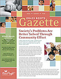
I want to use this nonprofit organization newsletter as an excellent example. Of course, yours will probably be different -- but the rules are the rules, just the same. The visual axioms I'm pointing out today transcend the specific subject matter, and will relate to almost any publication today.
So get out your old newsletter and dust it off. Pin it up on the wall, stand back and we'll ask some questions and point out strong points you should be seeing in your newsletter.
1. Attention-getting approach
The first big challenge is getting your reader to notice. Once you get their attention, and "endear" yourself to them, then you'll have to drive home your main messages.
Understand that today's reader is overworked, overstressed, and has the attention span of a 5th grader. (Maybe not even that much!) So quickly grabbing their attention, and drawing them into the content is a major challenge. Each page, spread, or what I call "window of approach," needs to have a unified look -- and a major focal point.
Open this diagram and move it to the side so you can follow along.
In this example, we see a strong "establishment" image. These colorful blocks serve a bigger purpose than just looking good! The grid, interspersed with photos
a) grabs attention
b) illustrates elements of the organization's mission
c) acts as a frame for the Name Plate ("banner")
d) Funnels the attention to the editorial entry point.
See how the reader can quickly take in the whole picture, and be wisked into the white area containing editorial. Notice also how the configuration sets up a repetitive motif or theme that will be carried out through the inner pages.
2) Set the tone
This particular example is all about children -- and a nonprofit organization. So everything here -- the graphics, type fonts, backgrounds and so forth are all designed to give this newsletter a specific "personality." While the texts may deal with issues that are not so happy, the benefit to children is what the organization is all about, so here, we're selling the "benefit" -- which in reality is the product.
3) Memorable identity
While "Gazette" is not necessarily the most compelling newsletter name to come along, you will want to establish a name and banner that is unmistakable. This example certainly accomplishes that goal. It doesn't have to be cute, and it doesn't have to be a graphical wonder! In fact, the more simple, easy to read, and quick to comprehend is always better than technical wonder. (Too many publications today try too hard to impress with technical "wow" -- at a time when quick, powerful and unmistakable understanding is more important.)
Here, the selection of a casual serif font, set in reverse, and spaced with lots of air makes the banner instantly understandable. No games here! And the reader can read it on their coffee table from across the room! The second time they see it, and every time after that, it will be immediately recognized. People like that. They subconsciously yearn for the familiar.
4) Reader Clues and directional devices
While it is difficult to fit everything you need to say into the allotted space -- you must persevere to present only the important information. The less you write, the easier it will be to read. Readers do want detail. You just have to make it inviting.
a) Effective directional devices help your reader through the storyline
b) Effective devices like headlines, subheads, call-outs let the browser get the message. Subheads and call-outs make the information easy to skim.
Note that it's been researched that as many as 72% of adults today don't actually read all the text. Some will once they are drawn in. Life is just too fast paced for many who want the bottom line, and want it now. So all they are going to read are the captions, the callouts and possibly all the heads and subs heads. Make sure you embody the "message" or "gist" of the story in those devices -- and you'll be taking care of both kinds of readers.
In this example, the designer has been so bold as to provide a powerful arrow pointing to an important list so the reader is strongly compelled to tumble into that list. Highly effective, even though a bit corny.
Also see:
Ready to use Newsletter templates Department
Thinking In Type: The Practical Philosophy Of Typography
Design: Type with Character
Business: Rise of the Designer / Copywriter
Marketing: The 10 Commandments of Guerrilla Marketing Design
Business: Designing For Print On A Budget
Design: Designing an interactive PDF newsletter
Business: Freelance Marketing Exercises
Return to the Design Department, or back to the Front Page
Participate in your Design Center
Lots of fun and information for all... don't forget, any community is only as good as the participation of its members. We invite your tips, tricks, comments, suggestions and camaraderie.- Ask for the DT&G Monthly: to receive news about DT& headlines, happenings in the Design Center and regular columns like the "Mail Bag" and "Cool Sites"
- SUBSCRIBE : to the Designers' CAFE email list
Did you like this article? If you like the kinds of content brought to you by the Design Center and DT&G, why not consider becomeing a friend by making a small contribution? You'll be helping us continue our ten-year tradition of quality content on the web.


