


Newsletters: Graphic Design for Hard Times
Effective Newsletters: Readability, organization, typography
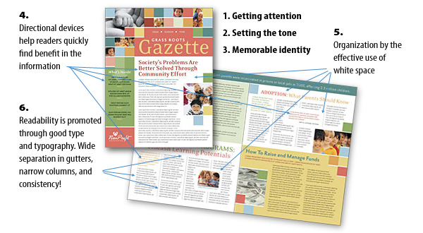
Continuing the thread of building effective newsletters, let's look at Effective organization, Readability and Typography.
5) Effective organization
One thing that kills readership is chaos. A publication that looks poorly organized will not get good readership. They won't take the time to figure out where or what goes with what -- and they'll wander off some place.
White space -- or what I call "negative space" is a powerful organizational tool. It separates, and it isolates. White space is most effective calling attention to important groupings of information.
White space should be pulled to the outside of groups of information which specifically relate to each other. It should also be used to separate things that relate, but are more important (like callouts) and for things that are different.
Effective and consistent use of grids is always the mark of a professional publication, and the reader subconsciously knows and understands that.
Try to refrain from the use of unnecessary divisional elements like boxes, rules, borders or lines. If something is to be set apart, use white space or simply introduce a different background. In the example, the gold space signals a departure from the running content for something very important. You can change mood and tone the same way.
6) Readability, type that works
Typesetting is an art. It doesn't make the publication 'readable' by its self.
a) Narrow columns are easier to read, more quickly
b) Generous gutters help the eye follow, and separate effectively
c) Typography should be kept simple. I strongly recommend a single font or face for headlines and subheads, and another for the actual text. Serif text is said to be more readable in columns. But that rule has been argued greatly.
d) Decorative type must NOT distract from other elements, and should always be in keeping with the subject matter and the tone of the publication.
e) Line spacing - At least 20% additional spacing (leading) between lines, is required, and as much as 30% makes the text more comfortable to read. Yet too much line spacing is bad because it causes the reader to stall and slow down to read. Open this diagram and move it to the side so you can follow along.
Consistency is the rule above all. If you use one font/face/style for a given element, then use the same throughout. When you change the face/style/posture make darn sure there's a good reason to do so -- because when you change, it sends the signal of change to the reader.
Learn from the Pros: Professional Layouts and Templates
 Many people aren't comfortable with facing a blank screen (page) to begin setting up the layout and grid. Most understand that they do not have the professional or formal background and education to design these devices for their publication.
In our example today, we've used one of hundreds of ready-made layouts you can obtain and modify with your own content. Our partner Stock Layouts offers this particular layout along with many others, which you can download and modify.
All their layouts come with everything you need, press-ready. Custom graphics, photography and visual devices (at right) are all included in the package. (Enlarge) So, even if you don't have your own professional photography -- you can still have it in your publication.
All StockLayouts have been printed and proofed so you know they're going to work when time comes to print. Yet in the templates, the colors can be modified to fit your own color scheme. Typography in StockLayouts is well conceived and well implemented. You can easily paste in your own copy and pickup the styling already built into the style sheets of the popular layout programs.
This particular layout is even part of a family of templates which are carefully designed to work together -- business cards, letterheads, brochures, and the newsletter. You can also use the newsletter layouts in single-sheet applications like menus, sell sheets, handouts, or fact sheets.

 Making you look good!
The most important goal of any marketing, public relations or collateral materials package is to make you look good. And nothing works better than a design package created and implemented by a skilled professional graphic designer. That's what you'll get with StockLayouts. Even if you only use the layout package as a springboard to your own design -- or if you're a graphic designer looking for simple solutions to re-sell to your clients, you can't go wrong relying on the professional resources at StockLayouts!
Getting the picture: involve your readership!
Once you've developed your excellent newsletter design, select your articles carefully. If the content is too 'pitchy' the readers will notice. Try to lead with an important article that will captivate your readership. Look for how-to or helpful hints type articles you can include. If it's a localized newsletter, have a cameo interview or spotlight on a known local person -- be sure to include a photo. Nonprofits should look into their donor ranks and find a substantial donor who is willing to be featured, and is willing to explain why they are passionate about the organization. You'll be surprised at how many people will see the article and comment. You'll also be amazed at how many other people your featured guest shows the newsletter to. Commercial entities can contact loyal customers for this article. All the other customers will want their profiles published too!
Last but not least, invite and urge your membership, or readership to contribute. Perhaps offer a gift or "prize" for an editorial contribution that runs. After some track record of this, you'll begin to see others wanting to join the ranks of the 'published.' It's amazing how contagious "getting published" is!
And, as always, the Design & Publishing Center is here to help. Perhaps you need a 3rd party assessment? Then, you may want to consider our NEWSLETTER MAKEOVER CLINIC to let you know how good or bad your publication is! If you have further questions, or problems, just drop us a line , or log into the Design Cafe where you'll get help from others who have been there! I also frequent that forum, so I'll see your query as well.
Thanks for reading! Until next time... keep on learning
![]()
Fred Showker, Editor/Publisher
Also see:
Ready to use Newsletter templates Department
Thinking In Type: The Practical Philosophy Of Typography
Design: Type with Character
Business: Rise of the Designer / Copywriter
Marketing: The 10 Commandments of Guerrilla Marketing Design
Business: Designing For Print On A Budget
Design: Designing an interactive PDF newsletter
Business: Freelance Marketing Exercises
Return to the Design Department, or back to the Front Page
Participate in your Design Center
Lots of fun and information for all... don't forget, any community is only as good as the participation of its members. We invite your tips, tricks, comments, suggestions and camaraderie.- Ask for the DT&G Monthly: to receive news about DT& headlines, happenings in the Design Center and regular columns like the "Mail Bag" and "Cool Sites"
- SUBSCRIBE : to the Designers' CAFE email list
Did you like this article? If you like the kinds of content brought to you by the Design Center and DT&G, why not consider becomeing a friend by making a small contribution? You'll be helping us continue our ten-year tradition of quality content on the web.