In its earliest years, the letter that evolved into our F was an Egyptian hieroglyph that literally was a picture of a snake. This was around 3,000 B.C. ![]() Through the process of simplification over many years, the F began to lose its snakelike character, and by the time it emerged as an Egyptian hieratic form it wasn’t much more than a vertical stroke, capped by a small crossbar. with a slight stretch of the imagination it could be said to look like a nail.
Through the process of simplification over many years, the F began to lose its snakelike character, and by the time it emerged as an Egyptian hieratic form it wasn’t much more than a vertical stroke, capped by a small crossbar. with a slight stretch of the imagination it could be said to look like a nail.
This may be why the Phoenicians called the letter “waw,” a word meaning nail or hook, when they adopted the symbol for their alphabet. In its job as a waw, the character represented a semi-consonant sound, roughly pronounced as the W in the word Know. However, at various times the waw also represented the ‘v’ and even the ‘u’ sound.
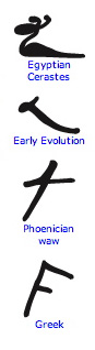 When the Greeks assimilated the Phoenician alphabet, they handled the confusing waw with typically Greek logic: they split it into two characters. One represented the semi-consonant W and the other became the forerunner of our V. (The ‘w’ sound became the Greek digamma, or double gamma, and was constructed by placing one gamma on top of another.
While the character was eventually dropped from the Greek alphabet, it was able to find work in the Etruscan language. Here it did yeoman’s service until the Romans adopted it as a symbol for the softened ‘v’ or double ‘v’ sound. Even today, the German language (an important source for English) uses the V as an F in words like “vater,” which means father and if pronounced “fahter.”
Finally, the F found a permanent home as the very geometric sixth letter of the Roman alphabet.
And you know you can have a great deal of fun just looking at all the letters “F” that have been created! If you’ve got pre-school kids, let me recommend this collection of “F” activities!
… and thanks for reading!
![]()
Thank you Allan Haley for this historic minute.
Allan Haley is a long time hero of the Design Center, and his expertise in typography and typographic design is second to none. His clients include Apple, Adobe, Linotype, Xerox, IBM, and Agfa Monotype among others. He is also currently the Chairman of the Advisory Board of the Goudy International Center at RIT. Allan was executive vice president of ITC, And before that was in charge of typographic development at Compugraphic Corp. (now Agfa Monotype). He writes for publications such as U&lc, How, Dynamic Graphics, and Step-by-Step Graphics. He is highly regarded as an educator, and he is a frequently requested speaker! Thank you Allan Haley
- See all my pins on Pinterest. . . including
- The years of the typography blog . . .
Enjoy our February poster . . . first published in 2009