

Web Critique - DAILY SAVINGS
Some of you may not realize this, but at the Design Cafe, Web Site Reviews forum, there is an ongoing, daily dialog between web site creators and designers. They like to look at each other's sites, and provide feedback, and constructive criticism for improvement.
One participant requested a review of the "Daily Savings" web site, so we thought we'd take a look.

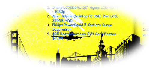
This is one of those side-scrollers we all love to hate. When first arriving, this site seems to cry out "Help, I'm Tacky!" -- but then playing with the controls, and navigating back and forth, it actually becomes cool!
The little navigation tool works very well, and its function is quite obvious -- probably the saving grace of side-scrollers! Ingenious programming keeps the tool front and center as the page scrolls. The mouse scroll-wheel, in this case, scrolls horizontally as well.
Trouble in Paradise?
While its garish black-on-yellow color scheme reinforces the Yellow Pages effect, this site's unique kitsch may betray itself. Scrolling becomes so much fun -- and the way the coupons bounce upon arrival -- perhaps cause the content to become secondary! Although I spent a while looking and reading the content, I now (five minutes later) cannot remember anything beyond the city-scape scrolling side to side.
Glitches:
* In some scroll sets, the type overlaps graphics -- light blue type over black spells difficult recognition and legibility.
* The graphic panels which make up the wide, horizontal background sometimes break apart, causing a yellow strip to open between images. Distracting to say the least.
Quips
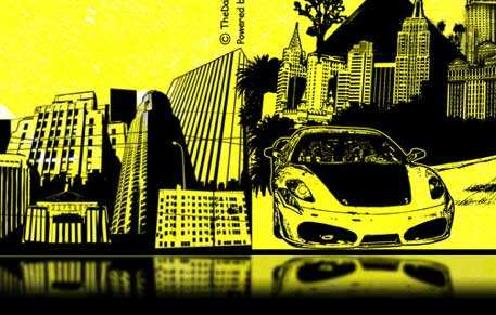
Just about no one but me would notice this small quibble -- but reflections on the water should be sharp where they meet the subject, and the blurring should fall off as it moves away from the subject. This has been given the same amount of blur across the whole reflection. Although a small quibble, it would look a lot more realistic if given a graduated fall-off, and perhaps the reflection continues just a bit deeper into the black.
![]() See: this article about Reflections
See: this article about Reflections
![]() Tutorial: Creating Realistic Shadows (applies to reflections too)
Tutorial: Creating Realistic Shadows (applies to reflections too)
![]() Tutorial: Shadow Fall-Off (an oldie but a goodie!)
Tutorial: Shadow Fall-Off (an oldie but a goodie!)
Bottom line:
It's a pretty cool site, and offers the visitor a unique experience which may just be the stroke of genius for stickiness. However, as it evolves, and new content pours in -- problems may be ahead!
Go ahead and try the TheDailySavings.com for yourself. If you have your own comments to share, just log in and post to the Design Cafe , and post to the Web Review Forums!
... and thanks for reading!
![]()
Fred Showker, Editor / Publisher of DTG Magazine
Return to the Web Design Front Page..., or
Back to the Design Center
Participate in your Design Center
Lots of fun and information for all... don't forget, any community is only as good as the participation of its members. We invite your tips, tricks, comments, suggestions and camaraderie.- Ask for the DT&G Monthly: to receive DT&G newsletter each month, happenings in the Design Center and regular columns like the "Mail Bag" and "Cool Sites"
- SUBSCRIBE : to the Designers' CAFE email list
- Link to this site, and then show us the link. We'll send you any of our current door prizes, just for your trouble. SHOW US YOUR LINK