

Bernard Peh takes a look at the www.visualorange.net web site
Looking for Visuals at Visual Orange
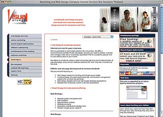
Look And Feel
When I first entered the site, my first impression was that the site has a common corporate look and that it is well planned and designed. My eyes were drawn to the striking words (logo) on the top left hand corner named "Visual Orange". The word "Visual" seems to be emphasized and that made me think I should be expecting something visual... I then zoomed out and look at the site as a whole. The second part that caught my attention was the credit card icons in the payment section. I think exposing the payment procedures on the front page is not a good idea. It might give people a negative impression of the comapny.
 I then started looking at the content which bored me easily after some scrolling. I have to agree that the text is good for SEO but bad for the end-user especially when it is in the index page. Maybe it is just me or the design of the logo, I am waiting to see some strong graphics or surprises which I cannot find any.
Navigation
The navigation is very consistent thought the site. The left navigation menu is simple and effective. However, the sub-menus are not easily recognized. I had to do a few clicks before I knew how to use the sub-menus.Other than lightening the blue at the side, it would help by adding some bullets, icons or even some spaces before the sub-menu label.
The breadcrumb looks cool but I not too sure of the [hr /] line above it. Maybe making the line thinner of even leaving it empty might be a better idea. While navigating the site, I came across a link exhcange page, ie http://www.visualorange.net/html/link_popularity.php. The title of this page is "Link Popularity Exchange Farms"....Hang on, Did I see the word "farms"? Never use such terms! Terms like these are prohibited in the SEO dictionary. The company might want to manually screen through all the titles of their web pages to make sure the titles are named approriately. The special char "|" looks cool but might not be good to use in the title.
[Editor's Note: actually the links and titles have now been changed on the web site. But that's still a bad reflection on a site that offers search engine optimization not to know that rule!]
Design, Layout And Content I like the spaciousness of the layout but what impresses me most is the profiles of the employees at the top right hand corner. I am not sure if I like the male in the photo, but I definitely like the concept.
This is what a company should sell; the people that makes up the company. It tells the customers that the company has nothing to hide and gives the customers a sense of security that they are dealing with real professionals rather than some ghosts from outer space (just joking).
The contents of the web pages are pretty boring especially those that require scrolling. Perhaps more graphics could be beside the text to make them look more interesting. Alternatively, the banners on the right column could be changed more frequently. Very Often, I felt like increasing the size of the content area in the centre column. There are important contents in there but not enough room to show. In the worst scenario, I would change the layout to 2 column just to fit in the contents and that would also allow for some interplay of graphic elements as well.
Conclusion
Visual Orange is obviously a commercial site targeting at people who are looking for professional services. With that in mind, I thought the site could be more professional by injecting some strong graphics and portfolio to showcase their talent.
I felt that the colors, font type and layout are carefully planned but I am not yet convinced of their design skills.
Bernard Peh
Bernard Peh is a great passioner of web technologies and one of the co-founders of www.sitecritic.net. He lives in Melbourne and works with experienced web designers and developers, providing insights into creating effective websites for commercial and non-commercial use. He is also a strong believer of work passion and commitment. During his free time, he enjoys reviewing websites, doing freelance SEO and PHP work.
Return to the Critique Department
Participate in your Design Center
Lots of fun and information for all... don't forget, any community is only as good as the participation of its members. We invite your tips, tricks, comments, suggestions and camaraderie.
- Ask for the DT&G Monthly: to receive DT&G newsletter each month, happenings in the Design Center and regular columns like the "Mail Bag" and "Cool Sites"
- SUBSCRIBE : to the Designers' CAFE email list
- Link to this site, and then show us the link. We'll send you any of our current door prizes, just for your trouble.
- READ Our Writer's Guidelines: before sending articles
- SUBMIT: a news link, new font, or product review
- SUBMIT: a link to a Photoshop web site
- Trademarks & Legal