RLM critiques Tightline Design web site (Link has gone dead, picked up by the porno domain scalpers
Tightline Design
Tight line may not be the right term for this one...
 Main index page: - Although the flash is a nice touch and the Text logo is good, the size of the flash movie is too large to view on 'standard' sized browsers. The mouse-over for the 'enter' link uses a lime green as its hover color. This is quite bad. Not only does the text change (another no-no) but the color has no continuity with the rest of the page.
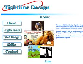
Main Page (home.html) Pros: - The use of picture based images is presents a nice clean look to the site. - I like the use of rotating images on the main menu it's different; possibly use slightly better resolution images?
Cons: The use of a light blue on a white background it not 'reader friendly'. There is not enough contrast between the background color and the text color. - The total size of the site via the table is too large. Again it extends off the screen and does not scale to the size of the browser. - The mouse over on the image menu changes the color of the image to a light grey. Again no contrast. People with any vision impairment at all would not be able to read or navigate this site well.
Graphic Design Page (graphic.html) Pros: Having a photo gallery of your work is always a good thing. - Having a description and detailed information about each project is very good.
Cons: There is no option of viewing the full-sized image of the project. Many of the project's contain small text and/or small details that are not viewable in the cropped picture.
Regarding the placement of the photo gallery's content, it appears to float at the right of the screen. The blue border image fades to white before it gets to the photo gallery. Consider moving that so it is ontop or below the image selected.
Regarding the images in general, it is preferable to have at least a 1px black or equiv. border around all of the images you are presenting as it helps the contrast, gives them a presentable look and helps them 'pop' off of the page. - NONE OF THE LINKS ON THE GRAPHICS PAGE WORK. This is very bad for any site.
Web Design Page (web.html) Pros: Again having examples of what projects you have worked on is a very nice feature. - Having links to working sites you have creates is a great feature.
Cons: Alignment on the page is not consistant. Top images and text are centered, the banners and text below is centered in a smaller area. - Again, no image borders.
Skills Page (skills.html) Okay description of what you can do. But, I would consider expanding your description and getting more detailed, citing any special events etc.
Contatcs Page (contact.html) Definatly have enough information to contact you via mail/phone/email. However, again - Lime-Green mouse over on light blue text = bad,bad,bad. The contact infomration is a different size font than the rest of the site. It looks out of place and takes away from the overall consistancy of the site.
Overall Comments: For a basic web site it is a very good start. You have showed proficiancy using tables, flash, java script, CSS and general HTML. I do believe, however, that a fresh look be taking. For someone who has a cert in Graphic and Web Design this is not a good representation of what one would expect. Basic graphic design principles state that a high level of contrast is needed, which is not implemented on the site.
* With the tables and flash being larger than a standard browser (minimun size 600x800) the user is forced to scroll around to either view the site or see if there is any other information there. For elderly users or users with mobility issues, this is extra work that is not needed.
* Choice of color overall is not good, in my opinion. Light blue on white is very hard to read. The mouse overs of light grey and lime green are also hard to read. Even people who don't have reading or visual issues have hard times reading those colors, let alone users who are color blind. A color scheme using higher contrast colors should be looked into.
* None of your images have 'alt' tags. In the event that an image doesn't load there is no explanation as to what the image was or its intended use. Also text-to-speach software use alt images to read the web site to those with visual problems.
Overall the site is okay... good for a first stab, but a re-vap is warrented.
RLM
Fred Comments: RLM, you've been very kind. Perhaps too kind. Two other reviewers (who requested not to be published) looked at this site and were immediately repulsed. Both volunteered that if a designer is putting up a web page in these days and times, it had better be good. Which Tightline isn't. As RLM put it this is "good for a first stab" -- but does the viewer expect a stab from a designer? No.
My recommendations would be to (first) watch that swf a couple more times and ask if that's all he's got. If it is, then scrap it -- it turns away more viewers than it lures in. He can be developing a better swf to launch later. (Second) Then take a look at each page as a whole. What captures the eye? Perhaps this site should be celebrating the images of design work more than the infrastructure.
Take some time and surf as many designers' web sites as you can. See how well the competition is doing. For instance, see Percolator Creative, one of our contributors to Design Planning in this month's Creative Net.. Then, it's back to the design board for you, fella.
Here's a big round of applause to RLM for taking his time to critique this web page. We appreciate it, our readers appreciate it, and the web site owners appreciate it. BRAVO RLM!
Folks, go pick out a web site to critique , and then help out the site owner by sending in your reviews.
Return to the Critique Department
Participate in your Design Center
Lots of fun and information for all... don't forget, any community is only as good as the participation of its members. We invite your tips, tricks, comments, suggestions and camaraderie.
- Ask for the DT&G Monthly: to receive DT&G newsletter each month, happenings in the Design Center and regular columns like the "Mail Bag" and "Cool Sites"
- SUBSCRIBE : to the Designers' CAFE email list
- Link to this site, and then show us the link. We'll send you any of our current door prizes, just for your trouble.
- READ Our Writer's Guidelines: before sending articles
- SUBMIT: a news link, new font, or product review
- SUBMIT: a link to a Photoshop web site
- Trademarks & Legal

