

Last year we reviewed the Thomasina Web Site in our article "An American Idol Web Site Gone Bad? -- now they're back with an all new makeover, and we're taking another look at "Thomasinamusic.com"
Thomasina Music Round 2
...one year later
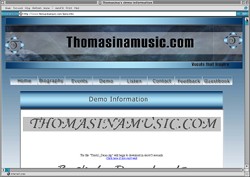
 The revised version of Thomasina Music is much more appealing then the original. The design is more open, less rigid, and more suitable for its purpose. The site has readable content, is easy to navigate, and serves well enough as a site for family and friends to enjoy. But it still sells nothing.
The start page needs a really distinctive banner that makes the name memorable, one that people can always associate with this person. Believe me, Thomasina must distinguish her site from one with a very similar URL which I happened upon inadvertantly. It could be very embarrassing to have her name confused with another.
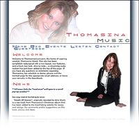
The current banner is not unattractive, but it seems too large in relation to the tiny font found in the material below it. The text is not integrated with the image, and there is no unity in its design.
I agree with Fred that an original or uncommon font would be more appropriate for defining the image of an attractive young performer. However, I do not recommend anything too flashy. Thomasina sings popular music, but she is basically a refined and sincere young person who would not want to betray her personal creed by suggesting she is anything other than what she is.
Who is Thomasina?
A "Welcome" paragraph is appropriate as an introduction to the star of the site. But a history of the site's revision might not interest the visitor.
Who is Thomasina? That is what people need to know right away. What does she sing? What success has she had to date? Where can she be heard? There must be something here at the start to bring the visitor into the site and make people want to read more.
The page margin columns look outdated. I would leave them off, which would free up more space for the textual content to be presented in a larger font. The various photos included on this page and subpages are not a bad idea. But they do cause a problem with spacing. The very long lines of text are not easy to read.
Although I like the idea of including photos of Thomasina, I find these particular ones more appropriate for a model than for a singer. They would be much more striking and memorable if they showed Thomasina in action - holding a mike, consulting in a recording studio, laughing with friends, singing before an audience, and depicting important milestones in her career.
Are the "links and affiliations" a mild form of advertising or just courtesy acknowledgements? Do they belong on the start page?
As a whole this is a nice personal web site -- but lots of questions continue to make the Thomasina site somewhat less than it could be.
Review by Bennie C. Taylor
Notes from Fred:
Bennie, once again, you've summed it up beautifully!
 This is a vast improvement over the original site (shown at right) and the owners should feel a degree of pride. I know I do for having inspired them in part to make changes.
But there's still work to be done. Bennie touched on the areas of the photos and the typography in the arrival scene, and I just want to kind of drive that point a little harder.
The photos are really not flattering enough. This is an industry of style and appeal. Thomasina needs to have a couple of shots taken by a pro who knows how to pull out the best in a person's appearance. The large shot at the top is not high enough quality for the job. It's flattering enough in terms of the pose facial expression and so forth. The technical aspects of the presentation are simply not good enough.
Take a look at any of the stars in positions you aspire to: Jennifer Lopez uses this photo at her site. The pose, the little fogging effect, it all works. But it's the quality that puts her there. Celine Dion has a framed photo, but look at the inviting quality of the shot. You can achieve this with a 4 to 7 megapixel digital camera, you just need to get into the right light. The same goes for Faith Hill. And, don't tell me the shots work because the women are beautiful to begin with. We're looking for polish -- not necessarily beauty. Take a look at some of the make-overs in last month's "Beauty Retouching" column. Those women weren't particularly beautiful either -- but their photos sure are. The pictures of Thomasina lack the kind of polish she must have to succeed.
For this one or two shots you really have to put everything into getting the shot -- it's not an impulse or second thought. She needs to get her hair done and have a good, photographic make-up job. The photographer needs to LOOK through the view finder. A sharp photographer would have seen that (in the seated pose) the tilt of the head caused the jowl to puff out. That adds about twenty years to Thomasina. They would have also noticed the little tuft of hair draping across the neck. Now she's got a double chin. That could have been touched out. I could list a hundred other reasons why the seated pose should have been shot again. But you get the picture. Now go and get a new picture. Enough.
Wrong Typography Style
Randy or Simon might say ... "Wrong song selection for you!" I would say "Wrong typography!" Bennie touched on this but I want to make an emotional appeal. Why do people like female singers? Yes, you're right: men and women have very different reasons for idolizing female artists -- however, both of their emotions are based on sexuality. Now, let me ask: do you think that headline type font reflects the feminine qualities of the singer and the music? You've selected an extended, squared-off sans serif type face, then spaced it out. Personally, I don't care for extended, squared off women -- particularly those who are spaced out. I doubt if any of those attributes apply to Thomasina -- do they? Make a list of Thomasina's most admirable characteristics. Now, match those characteristics with a type font and you've got it made.
Those are the only two gripes I have. :-)
Thanks again to Bennie Taylor for helping us out on this critique today.
Bennie Taylor is a graphic designer specializing in Web Design at Mt. Cheaha Web Design, www.mcwebdesign.us.
Read the original critique...
Return to the Critique Department
Participate in your Design Center
Lots of fun and information for all... don't forget, any community is only as good as the participation of its members. We invite your tips, tricks, comments, suggestions and camaraderie.
- Ask for the DT&G Monthly: to receive DT&G newsletter each month, happenings in the Design Center and regular columns like the "Mail Bag" and "Cool Sites"
- SUBSCRIBE : to the Designers' CAFE email list
- Link to this site, and then show us the link. We'll send you any of our current door prizes, just for your trouble.
- READ Our Writer's Guidelines: before sending articles
- SUBMIT: a news link, new font, or product review
- SUBMIT: a link to a Photoshop web site
- Trademarks & Legal