

Reviewer Bennie C. Taylor visits the "Night Photography by David Baldwin" web site and files this review:
Lessons in Color
...content takes a back seat!
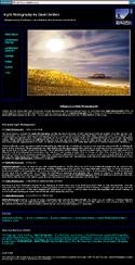 Sharing your enthusiasm for night photography and offering helpful tips to others creates good content. But you want to insure your visitors do not miss the content section of your site. The design you are using now led me to view the photos first. If I had not been reviewing the site, I might not have scrolled down to find your text. The start of this content should be visible above the bottom of the visitor's screen -- and you do not need to include a lot of text on the front page. People won't read much unless you make it seem they will be missing something if they do not. Perhaps start a bulleted list with the title of each of your four main points and then offer a link to continue reading on an inside page.
Because your text is important most readers would prefer to see a very dark font on a white or light-colored background. Also note, long lines of text are not easy to read no matter what colors you use. Limiting the width of each line will encourage people to read more. One method of doing this is to put your text into columns of fixed width. Or you might surround the text with broad margins.
Your navigation scheme is basically simple and sound. But I do not care for the color of the links. Don Peterson does a beautiful job of following usability rules by making his links a very bright blue on light backgrounds (for example, see www.newark1.com).
Lead the reader: The link named "Notes" is too vague and not at all intriguing. Link to each of the subjects you are including right from the start page. Visitors might also enjoy reading a couple of hints about exposures and circumstances under which some of the photos were taken. Share an anecdote with us about the dog that chased you through a field. Why not add a photo of yourself at work? I assume your photos are not for sale. But suppose someone did want to purchase one. You could address this issue on your contact or about page.
Link Color: Any other color used for the basic link looks contrived and seems to clash with other colors on the page. A neutral color would be a better choice than green or orange, for example. And correct your stylesheet to insure that links do not change size when clicked. On this site this is simply annoying. On some it can throw the entire balance of the design out of kilter.
Displaying Photos: 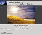 Personally, I like to see photos surrounded by black or dark gray. A solid dark background lets me focus on the photos without distraction. Not everyone prefers this, of course. It might take a little experimentation to find a design that will allow easy readability of text as well as a dark background for the photos. Many artists use a simple black background to show off their work, but it is not very imaginative. Why not try something slightly different to make your site distinctive? Shown here is one example I've put together as a suggested use of color.
Good, interesting content can add to the user experience. Your photos are very nice, and your content is certainly readable. Raise the importance of your words by giving the content a place of its own!
Bennie C. Taylor
Reading Color
from the Editor
Thank you, Bennie for your insight. Your comments on long line lengths and readability are dead-on. However, I would like to pick up on your color comments and dig a little deeper for a moment. We are seeing lots of sites with the black background for displaying color -- and granted, it does make for a striking presentation. But is it really best for the color itself?
For hundreds of years, artists and color specialists have maintained that all color reads more truly to the human eye when displayed on a neutral or medium gray background. There have been tomes and tomes of research and learned writings about the phenomena of how we perceive color for those who wish to study.
London designer Andrew Bellamy probably does the best job of capsuling the science of color in his latest book Systematic / Subjective Colour Selection from AVA Books. He pulls together the science behind the in-depth works of Josef Albers, Bauhaus, to illustrate the theory of presenting color against color. The book presents convincing evidence that the color itself is dramatically affected by the color against which it is seen -- and ultimately how you can control how the color is perceived by carefully planning it's environment. Although Bennie didn't elaborate on why she built the example the way she did -- notice how much more beautiful the color photo looks against her selections of gray.

Click on the above contact strip and see how the color photo reacts to the incremental steps of gray from black to 30% gray. Which do you feel provides the best presentation of the color. Watch carefully what happens to the yellows and blues.
- Sample on 30% Gray
- Sample on 50% Gray
- Sample on 70% Gray
- Sample on 80% Gray
- Sample on Black, and
- Sample on White
It helps to open all of the above windows at the same time, so you can toggle between them for a more astute comparison. While many people will react differently, I believe you'll find the white and black versions the least visually appealing.
Andrew Bellamy cautions:
"Should a designer choose to select a colour scheme subjectively, outside the systems of the colour wheel, it is vital that he or she be aware of the optical effect that adjacent colours have on each other. Colours are never seen in isolation and it is therefore essential to be aware that colour is conditional."
I highly recommend Systematic / Subjective Colour Selection by Andrew Bellamy, to anyone who wants to understand the art and science of color. It's an innovative 2-books-in-1 guide, bound together: one fully covers the fundamental principles of color, and the other details the various effects and phenomena caused by the interaction of different colors and how our eye reacts to them. You even get a detachable color wheel -- making the whole package a powerful design tool.
Fred
Special thanks to Bennie Taylor for the first part of this critique. Bennie is a graphic designer specializing in Web Design at Mt. Cheaha Web Design, www.mcwebdesign.us.
Return to the Critique Department
Participate in your Design Center
Lots of fun and information for all... don't forget, any community is only as good as the participation of its members. We invite your tips, tricks, comments, suggestions and camaraderie.- Ask for the DT&G Monthly: to receive DT&G newsletter each month, happenings in the Design Center and regular columns like the "Mail Bag" and "Cool Sites"
- SUBSCRIBE : to the Designers' CAFE email list
- Link to this site, and then show us the link. We'll send you any of our current door prizes, just for your trouble.
- READ Our Writer's Guidelines: before sending articles
- SUBMIT: a news link, new font, or product review
- SUBMIT: a link to a Photoshop web site
- Trademarks & Legal