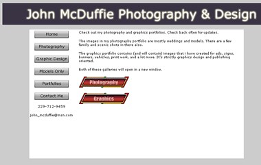
Bennie C. Taylor critiques John McDuffie Photography & Design
John McDuffie Photography & Design
Too many clicks, not enough photography
Most visitors enjoy looking at colorful or interesting photos -- few potential customers want to read page after page of text. I expect your files contain all the photos and images you would need to create an attractive and effective web site.
My advice: redo the entire site making samples of your work the most prominent feature and explanatory text secondary. The home page should serve as an overview of the site and as a table of contents. It also reflects the creativity and personality of the author. Design a striking logo for your business and a banner which is representative of your style.
 Splash pages are annoying to many of us. Many people do not want to click to enter. I want to be greeted with a brief description of your services and some samples of your work to support your claims. If you must include the complete details of your photo packages, etc., then continue your text on sub pages. People who want more details will go there for the information, but only if you have already caught their attention with something which interests them. There are so many ways to approach your design.
One idea: divide your home page into two parts - left and right. Feature "photography" on the left with a little explanatory text and links to more samples (or to a page of thumbnails), and "design" on the right. Your logo thumbnails do not look good. You have sized the small versions with code. But you need to use a graphics editor for this job. Also, each would be much clearer if you made the width at least 150 instead of 100 pixels. Some images cannot be drastically reduced without losing their identity. See this sample.
And when your full size logos open in a new window, make sure they fit on the page without horizontal scrolling. You want to show the whole image at a glance.
Usability
 When I clicked on the "portfolio" button I found two new buttons to click. (At right.) Unfortunately, one of my security programs blocked them (more about this below). So, I abandoned IE6 and switched to my Firefox browser. The buttons became operable. But their style and location make them seem to be merely an afterthought to all the pages of text. They are too ornate and too complicated to blend with the rest of the site.
Where you invite people to email you, make that statement an active link to a page which includes your email address. If you can interest a potential customer with your starting text then don't lose them by forcing them to click the "contact" button on the left. Visitors are basically lazy. If you do the work for us we feel more kindly toward you and your business.
On the sub pages you need to increase the margin widths. White space makes the page more attractive and helps bring the reader into your content. I was able to increase the size of the font - that's good. But not everyone knows how to do this (or wants to be bothered with doing this) - so start with one that is reasonable and let people make it smaller if they wish. Also, divide the text up into paragraphs with informative headings. This breaks the monotony of the black on white and may help search engines rank your pages.
Function
I wonder why you decided to use XML. HTML and Cascading Style Sheets are so much easier, require a lot less typing, and save you bandwidth which can be used for graphics. Personally, I would drop the navigation buttons completely. They do take me around the site, but what a lot of work when text links can be just as attractive. It is never a good idea to give the navigation buttons too much prominence, in any case, because they can detract from the content.
Note: The complete Norton anti-everything came on the computer I bought recently. Since I am afraid to disable any of these features, I have encountered some problems accessing material locally and on the Internet. How widespread this situation will become I do not know. But I believe that if you want everyone to be able to view all portions of your site you would fare better by avoiding the use of any of the ActiveX and other controls which make Norton perk up its ears and block the material you want to show.
As I said before, you have all the photos and images you really need to create an attractive and effective web site. Start by making changes suggested above.
Bennie
Fred Comments...
Bennie Taylor is a graphic designer specializing in Web Design at Mt. Cheaha Web Design, www.mcwebdesign.us.
Return to the Critique Department
Participate in your Design Center
Lots of fun and information for all... don't forget, any community is only as good as the participation of its members. We invite your tips, tricks, comments, suggestions and camaraderie.
- Ask for the DT&G Monthly: to receive DT&G newsletter each month, happenings in the Design Center and regular columns like the "Mail Bag" and "Cool Sites"
- SUBSCRIBE : to the Designers' CAFE email list
- Link to this site, and then show us the link. We'll send you any of our current door prizes, just for your trouble.
- READ Our Writer's Guidelines: before sending articles
- SUBMIT: a news link, new font, or product review
- SUBMIT: a link to a Photoshop web site
- Trademarks & Legal

