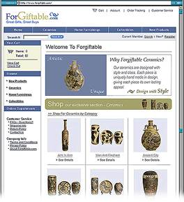
Mike Swope critiques the Forgiftable web site...
Forgiftable does not mean Forgettable!
... Forgiftable - Great Gifts, Great Buys
Let me start by saying that this site's design is a GREAT start to an aesthetically pleasing web site which offers what some will consider to be great gifts, possibly great buys, as advertised below the site's logo at the top of the pages.
There are many things about the site that I find immediately attractive, and there are things about the site that can be improved to match visitors' expectations of web sites and to offer a "polished" finish, as Fred Showker would say. When the site first loads, it appears as one would expect a professionally produced e-commerce site to appear, a la Amazon.com.
There is the obiligatory logo in the upper left hand corner. Account links in the upper right hand corner. A DHMTL navigation bar the width of the page immediately below these. A search box and login and register links below the navigation bar. Shopping cart information in the sidebar. Etc. Etc. Etc.
 So the site sets high expectations for visitors from the very outset. This isn't a bad thing, but the site falls short of these expectations, and that's not a good thing. I believe the site *functions* as it was intended, but it is the finish, or lack thereof in this example, that will disappoint visitors and makes the site awkward to navigate, coloring the visitors' experiences with the site.
The designer of this site would benefit from hosting user testing sessions during which he/she observes visitors as they enter and navigate the site. These testers can be anyone: co-workers, friends, bitterest enemies. It doesn't matter. The trick with such sessions is to just observe, don't ask for or expect verbal feedback. The designer *needs* to see how his/her site affects visitors behaviors. What they expect. What doesn't meet their expectations. Where they click. Where they don't click.
Actions speak louder than words
It doesn't matter what they say about the site; it just matters how they use it.
If visitors can't use it, or are uncomfortable using it, they won't buy. I believe the site's design accomplishes about 80% of its intended task - lead visitors through to make purchases. The home page's layout first catches the eye with the ceramic vase on the pale blue background in the approximate middle of the page. Not only is it a good photograph, with the subject photographed well, but the vase itself is artistically pleasing, too. This reinforces the initial professional appeal described above. In this case, the vase itself has an intriguing shape and motif that I believe warrants further discussion from connoisseurs of such vases. I like this vase. We can learn great things from this vase!
From this vase, my eye moves to the right to take in the graphic text, "Why Forgiftable Ceramics?" From here, my eye travels to the khaki banner head just below these two items. I am ready to click to see more. Just as the site designer probably intended. But the site's design falls apart quickly. I can't click the khaki banner head. It isn't a link. Neither is that great photograph of the vase. Then I notice the text immediately below the khaki banner. I mouse over it, and the cursor indicates it is a link, but the status of the link does not change as visitors expect in a professional site. I notice then that there is more content, lots more content in fact, below this link, below the "fold" as it were, hidden from view.
There are 17 more superb photos, two more banner heads, and a banner ad about free shipping. As a visitor, I begin to feel overwhelmed at this point, pulled in several directions at once. It's hard for visitors to keep things straight in their heads when they can't see them and take them in at a gulp. Visitors now have to remember what they've seen and mentally compare that with the other 20 things they're now seeing as they scroll, and also then organize that information to make sense of it. That's a lot of work to expect of visitors.
Navigation and comprehension should be as effortless as possible. Fortunately, these flaws in the home page do not spill over to the subpages as completely as I had anticipated. In fact, it is the subpages that I find easiest to navigate, and actually enjoy visiting. For several reasons.
The subpages are not as heavy-handed as the home page. Their task is executed much more gracefully. Show off the great ceramic products available at Forgiftable.com! The products are displayed in a 3x3 grid. If a category has more than 9 products, other pages are added. The number of pages in any category -- i.e. Page 1 of 3, Page 2 of 3, etc. -- is clearly displayed above the product photos, with arrows for navigating between the pages. There is also a "jump to page" navigation dropdown tool at the bottom of these pages, to skip looking at page 2 if the visitor wasn't to look at page 3. Above the page navigation is a breadcrumb to show visitors how deep they are within the site in relation to the home page. A nice feature, too.
There is no memorable clutter on these product pages. That's a good thing!
Unfortunately, the site stumbles again at the checkout process. The shopping cart page, which appears when an item is put into the cart or the visitor clicks on the shopping cart link, tries too hard to be simple, complicating the information presented on the page. The items in one's cart is displayed in a table with three obscure characters whose purpose is not immediately clear.
Since the items are already in a table, the designer can simple include "Add", "Subtract" and "Remove" to the table headings above these characters and simplify the text at the top of the page to just "The following items are in your cart." Text at the top of the other checkout/account pages can likewise be simplified or completely removed. For example, the text at the top of the login page can be removed. All visitors need are the login fields and links to register if they are not already registered and able to log in. All other text is superfluous on this page. Some careful text editing will make the site that much better. If text is superfluous, the designer should remove it. No one will read it anyway. It's just wasting screen real estate, download time and site overhead. The same principle should be applied throughout the site, whenever the designer or webmaster can.
For example, the banners on the home category pages (ceramics, furnishings, collectibles) can be immediately deleted. They are superfluous. They try too hard and get in the way. The visitors have come for the products. Not the banners. Get rid of them.
I must mention again that the photographs in the site are well done and well presented. Though there are some minor flaws in them as a whole, they are nevertheless attractive photographs of attractive products. It appears that the product photos on the front page are supposed to be on white backgrounds, but they are instead on a light gray background, an inconsistency that is at once noticeable because the white-grounded photos are so nicely done. My advice for the designer in this case is to apply more consistency to the photography. It's a small polish that will unbeknownst to visitors encourage them to trust the site and its products.
In summary (for the designer):
- 1) Make the site logo a link back to the home page
- 2) Unclutter the home page. It is trying to do too much work. Take a lead from apple.com!
- 3) Link that which visitors expect to be linked. If testers try to click it, link it.
- 4) Edit the shopping cart page to identify the 3 obtuse symbols' purpose. Don't explain the symbols in lengthy prose when just 3 words in the head of the table will do.
- 5) Remove all text that is superfluous.
- 6) Edit text to its bare essential. If a word or words can be removed, remove them.
- 7) Remove images that are superfluous, i.e. banner heads on the home category pages. And any others in the site that move products lower on the page. This is a good rule of thumb.
- 8) Make the photography more consistent. Make gray-backed photos white instead to be consistent with the others that are alread on a white background. They appear cleaner on white and the intriguing shapes of the products are more apparent.
Mike Swope
Return to the Critique Department
Participate in your Design Center
Lots of fun and information for all... don't forget, any community is only as good as the participation of its members. We invite your tips, tricks, comments, suggestions and camaraderie.
- Ask for the DT&G Monthly: to receive DT&G newsletter each month, happenings in the Design Center and regular columns like the "Mail Bag" and "Cool Sites"
- SUBSCRIBE : to the Designers' CAFE email list
- Link to this site, and then show us the link. We'll send you any of our current door prizes, just for your trouble.
- READ Our Writer's Guidelines: before sending articles
- SUBMIT: a news link, new font, or product review
- SUBMIT: a link to a Photoshop web site
- Trademarks & Legal

