
submit_by = benniet@cableone.net Bennie C. Taylor critiques the FlexBox Custom designed mailboxes web site...
An Identity for FlexBox
... to best showcase the product
This is a neat little site with interesting content and easy navigation. It has no amateurish embellishments; technically, the site works. But it does not live up to the goal you have set - that is, it is not the best "showcase" for your product.
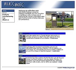 Right at the start you should display a medium to large photo of the mailbox. Use a really appealing and colorful one that captures the imagination of the prospective customer and makes him want this mailbox because it looks so attractive. (See, for example, the Pottery Barn web site.) Note: If you photograph the mailbox in a curbside setting, make sure the background does not detract from the product itself.
The proportional sizes of the various items on the start page (banner, introduction, links, and main content) are out of kilter. This is not a balanced design, and the items you want to demonstrate are lost in a sea of white. After all, you have sent people here to see colorful images which are not available in your other advertisements. Utilize the ample real estate available on the web site to demonstrate your product visually. If the photos are optimized they will load fast enough.
The FlexBox logo is distinctive, but the remainder of the banner is simply distracting. It does not convey any information, and it draws the eye away from the photo of the mailbox. You could use this space for a motto or legend, an address, or some other visually informative image. Or you could just leave it blank.
With the banner and introduction placed, it is time to add the main content. Here you would demonstrate the features that are unique to this product. The small thumbnail photos and tiny text do not make a bold enough statement. Do not wait to show something impressive on a linked subpage because you cannot be sure anyone will click to continue. Do not mislead the viewer with an arrow which suggests an active link. Make your thumbnail photos and the section headings clickable. People expect that, I think. It is frustrating to be forced to click "read more..." to continue.
The subpages are well organized but just as disappointing visually. Here, everything is still much too small and confined. I do not want to scroll to see the various features of the mailbox. Why not line those photos up side by side with text explaining the features. (That is a very simple way to integrate images and text.) And make the text large enough to read. You can add quite a lot of visual and textual information if you do not center the content in such a narrow space.
Since you are introducing a new product, you might want to ask for comments about the mailbox. Technically you are already set up to run a simple survey. Ask what people like or dislike about the product. Does anyone want a decorative mailbox? Including the price of the various items is good. Will your mailbox sell at the suggested price? Will the mailbox be offered in stores at a later date? Or will you market it online? Will customers be willing to pay shipping charges on a relatively heavy product?
The manufacturing page is useful. We want to know what materials are used and whether the finish will remain attractive after years of exposure to the elements. Remember that some people still prefer a print version of your information. Give your visitors the option of ordering a free brochure if this is within your budget. Or offer to send email information.
Receiving mail can be an emotional experience at times. Why not show some people happily retrieving a desired envelope from the box? How about some neighbors admiring a box newly installed on their street? There are so many ways to show your product to best advantage - use them all.
You have a lot of good things to work with here and the skills to make a really impressive site. Study other sites that sell and note the things that make you want to see more.
Bennie Taylor is a graphic designer specializing in Web Design at Mt. Cheaha Web Design, www.mcwebdesign.us.
Return to the Critique Department
Participate in your Design Center
Lots of fun and information for all... don't forget, any community is only as good as the participation of its members. We invite your tips, tricks, comments, suggestions and camaraderie.
- Ask for the DT&G Monthly: to receive DT&G newsletter each month, happenings in the Design Center and regular columns like the "Mail Bag" and "Cool Sites"
- SUBSCRIBE : to the Designers' CAFE email list
- Link to this site, and then show us the link. We'll send you any of our current door prizes, just for your trouble.
- READ Our Writer's Guidelines: before sending articles
- SUBMIT: a news link, new font, or product review
- SUBMIT: a link to a Photoshop web site
- Trademarks & Legal