Reviewer Bennie C. Taylor visits the " DeFazio's Catering" web site and files this review:
Good content - wrong place:
...show us the product!
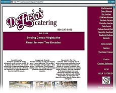
 The content of your site is generally well-organized and easy to navigate. The purpose of the site is clear, and the font is a readable size. Your logo is distinctive, and your menus very appealing. Prominent placing of your phone number is wise. (I would also include the address.)
The overall appearance of the start page is clean, but the page looks rather "chopped up" -- and the emphasis is somewhat misplaced. You want potential customers to immediately see your product -- beautiful food or a catered event. You have a number of photos which would encourage the visitor to keep looking. I would feature one of these (of moderate size and optimized for quick loading) on the home page.
The logo does not need to be so large, and the huge block of dark color immediately beneath it is not needed at all. Maroon or purplish colors are not popular among professional designers. I might use a black and white logo on the web site and let the color come from enticing photos of food and events.
Placing the navigation menu on a dark block of color also intereferes with the flow of the design. These large unneeded blocks of color take up valuable space which could be used for some customer testimonials. Navigation menus look more professional if items are aligned on the left edge.
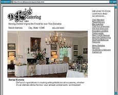
 I've prepared a suggestion shown at right.
"Questions & Answers" should be one link only. Although the linked pages showing your various categories of food items are readable, the background image is slightly distracting - and it is somewhat outmoded today. I would prefer to see a related photo of some of the items listed. Because your link to the "events" is far down the page it might be missed.
In the "events" portion of the site I would offer only one photo of each item and include some sort of caption. The small versions of your photos on the start page are not good. It does not work well to set the size of a photo by HTML code. First, you want to resize the photo in a photo editor and then include the dimensions in the code. If you want to use smaller versions which are clickable to reveal larger ones, then you should inform your visitors; for example, you might even go so far as to say "click here to see our front counter display." See this example.
The spacing of your text in columns is not good; there is too much text in one place, and the columns are too crowded for easy scanning. Divide up your promotional text and use it as captions below pictures of your lovely food. And do not center the text in a column.
It would be a good idea to explain the "team" business - what does that have to do with the meals you are catering? If this is an ad then put it in a separate area to avoid confusion. Too, one of the photos accompanying the "team" section of your page is huge and makes the page load slowly.
You have some great material to work with. I hope my comments will be helpful.
Review by Bennie C. Taylor
NEXT: we hear from Donald Peterson, and WDR
Bennie Taylor is a graphic designer specializing in Web Design at Mt. Cheaha Web Design, www.mcwebdesign.us.
Return to the Critique Department
Participate in your Design Center
Lots of fun and information for all... don't forget, any community is only as good as the participation of its members. We invite your tips, tricks, comments, suggestions and camaraderie.- Ask for the DT&G Monthly: to receive DT&G newsletter each month, happenings in the Design Center and regular columns like the "Mail Bag" and "Cool Sites"
- SUBSCRIBE : to the Designers' CAFE email list
- Link to this site, and then show us the link. We'll send you any of our current door prizes, just for your trouble.
- READ Our Writer's Guidelines: before sending articles
- SUBMIT: a news link, new font, or product review
- SUBMIT: a link to a Photoshop web site
- Trademarks & Legal

