Steve Dallape critiques www.decospirit.com web site
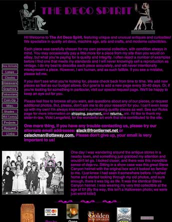
The deco Spirit
Simple as 1, 2, 3...
 1. Lose the introductory splash page. It serves no purpose, other than to force the user to click an extra time to get to the meat of the site.
The clocks page has a white background, which while inconsistant with the rest of the site, works much better in my opinion. (Also, there are some broken image links on the clocks page).
Not much about the design says "Deco" to me, other than the header and the ornaments at the bottom of each page. There is a lot of opportunity here to really utilize Art Deco design principles to reinforce the mission of the site. Other than using different colors, you could try some nice Deco fonts for your navigation buttons.
3. The navigation is straightforward and clear from a function standpoint, but the animated buttons are gimmicky and totally unnecessary. The links at the bottom of the page, particularly the "Contact Us" link, should probably go along the left edge with the other links, for better visibility and easier usage.
Also, I would lose the counter - nobody really cares how many people have visited the site before them. If you need or want that information for your own analysis, check with your web host about getting your site logs. They will give you a lot of useful information about who is visiting your site, where they reached it from, how log they stay, etc. Also, I would try to separate the navigation links visually from the main body of the page.
You have a good idea with the ornaments at the bottom of the pages, you could maybe expand on that with Deco-style initial caps to begin the first sentence on each page.
You have some really gorgeous, interesting things for sale, try putting some example on the main page to pique people's interest and get them to click deeper into the site.
If you used a slightly smaller font, you would probably have room to list the prices and details of the items on the page on which the items first appear, rather than making the user click to find out. Also, it should be possible to put a PayPal link with each item, rather than at the bottom of the page. Anything you can do to nake it easier for the user will result in more sales.
Steve
Fred Comments: Steve, you've been too kind. I skipped the flash intro completely because it's simply amateurish -- that's why I've linked to the "home" page rather than the index page. Most people won't be impressed by it, and the sound is obnoxious. As you said, Steve, it sure doesn't tie into Art Deco.
Aside from your comments above, I think it's important to mention that the combination of purple type on a black background will not be readable at all to anyone with a vision-color deficiency.
The arrival to this web site "visually" says nothing about products -- some of which are lovely. Too bad. A large percentage of visitors, who may have purchased, will simply back out and wander off someplace. You'll be depending on search engines linking into the deeper pages to find product.
I think this site designer needs to spend some time at the Public library going through art books about Art Deco.
Here's a big round of applause to Steme for taking his time to critique this web page. We appreciate it, our readers appreciate it, and the web site owners appreciate it. BRAVO Steve! Oh, and by the way... I like the original version of your logo better! The tilt works for me better than the flag.
Folks, go pick out a web site to critique , and then help out the site owner by sending in your reviews.
Return to the Critique Department
Participate in your Design Center
Lots of fun and information for all... don't forget, any community is only as good as the participation of its members. We invite your tips, tricks, comments, suggestions and camaraderie.
- Ask for the DT&G Monthly: to receive DT&G newsletter each month, happenings in the Design Center and regular columns like the "Mail Bag" and "Cool Sites"
- SUBSCRIBE : to the Designers' CAFE email list
- Link to this site, and then show us the link. We'll send you any of our current door prizes, just for your trouble.
- READ Our Writer's Guidelines: before sending articles
- SUBMIT: a news link, new font, or product review
- SUBMIT: a link to a Photoshop web site
- Trademarks & Legal