
Abyss Arts Design Studio
The submitter wrote:
Abyss Arts is a portfolio of my works in the area of graphic and web design. I'm just a student so I look for professional opinion about my works, so I'll can improve my work :) or may be for new opportunities.
 Actually we're glad this young artist decided to ask for a critique -- and the problems found here can be forgiven because it's student design work. However, we get many, many web sites for review from professionals making the very same mistakes or worse.
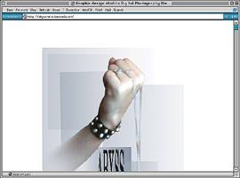
Upon arrival we're greeted with a spash screen -- which is not generally recommended, but frequently used by designers, photographers, architects and others wishing to set a mood or tone for their site experience. The problem is, we're now one click down. The other problem is, the splash screen must has got to be compelling and descriptive if it's going to work and get the reader inside. Therein lies the problem: what has a hand with a studded bracelet holding something got to do with design? And -- if this is a designer's site, why wasn't it designed so the entire image could be viewed and understood in a single view? Here we have to scroll to get the full picture -- which destroys the effect completely.
 Once we're over the splash screen we're ready for some content. No such luck here... we seem to be dropping into the Abyss. (No pun intended.) The next page is equally puzzling -- and equally empty.
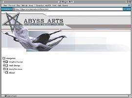
Okay, it's an interactive design studio. But what's the image? We have to study to understand what is being pictured... did you get it right away? Yes, the picture says arts, but the star really doesn't seem to match or fit. And, as you dig down into the various areas of the site the explanation of the star is never forthcoming.
The large, empty field of white is supposed to force the reader to look at the navigation buttons -- which it does -- but by virtue of being empty, the casual, impatient surfer will undoubtedly think there's nothing here. Clicking the navigation at this point begins to reveal content.
As the reader digs into content, the experience leaves a lot to be desired. There's really not enough explanation of what we're seeing -- the thumbnails are too small, and the up-size images are also too small.
The art and design here is very good. But sad to say, the presentation is not convincing us so -- which sells the talents of this designer short. Advice?
- Kill the splash screen, or make it relevant. If you keep it, then make it hold for a moment then jump to the content page. Don't ask the reader to click "ENTER" ... many won't.
- Present content immediately upon arrival on the second page, and make that content the very best it can be. Forget ambiguous images and contradictions in symbols. (We got no connection between the hand in the splash and the star upon arrival.)
- Provide some substance with the portfolio images. Pretty visuals are just that: pretty visuals.
With a little forethought, and some work, this talent could be presented in a truly compelling visual experience.
Return to the Critique Department
Participate in your Design Center
Lots of fun and information for all... don't forget, any community is only as good as the participation of its members. We invite your tips, tricks, comments, suggestions and camaraderie.- Ask for the DT&G Monthly: to receive DT&G newsletter each month, happenings in the Design Center and regular columns like the "Mail Bag" and "Cool Sites"
- SUBSCRIBE : to the Designers' CAFE email list
- Link to this site, and then show us the link. We'll send you any of our current door prizes, just for your trouble.
- READ Our Writer's Guidelines: before sending articles
- SUBMIT: a news link, new font, or product review
- SUBMIT: a link to a Photoshop web site
- Trademarks & Legal