One of the winners in our Fall Fonts Festival was Laura Mizii who wrote to share her reflections on type and typography. The story about her grandfather was so compelling, we had to contact her to learn more, and to share her story with you. These kinds of stories are what makes the very fiber of our art legacy today -- and this story testifies how the past does truly affect the present and future...

Laura Mizii writes: 
"I first got interested in typography when I was approximately age 4. My maternal grandfather was a fantastic artist and illustrator, however, he believed that he wasn't good enough to do this as a full time job. The man, in everyone elses eyes, was as good as Michaelangelo. I would watch him for hours as he hand lettered signs and posters for clubs he belonged to. He would take out the Book of Kells as a reference tool (one that I'd flip through a million times, myself, when visiting). He was a master of calligraphy as well as pen & ink drawings.
It wasn't until I became an adult and he had long passed away, when cleaning one of his master works of religious art, that I realized how many hours of work he had done with such precision. Beyond the Illuminated lettering, (using a magnifying glass and steady hand), I noticed that he had secretly lettered his name, my grandmother's name, my aunt's name, and my mother's name in the scroll work on this one particular piece. It was then that my love for typography deepened more than I ever thought it could.
 Every time I sit in front of the computer trying to design something, I wish my grandfather would come sit by my side and rub off some of his wonderful talent on me. He inspires me every day, and I hope to eventually inherit some of his calligraphic works to hang in my own home some day. But I owe it to him, for my love of typography, and thank him for sharing his passion for it. "
Appreciation for the craft
We were thoroughly warmed by this story and requested to share some of the work. We're thankful that Laura was able to retrieve several of the pieces she wrote about, and photograph them for us. While some of the photos were taken through their framing and glass, we can still see the virtuosity of her Grandfather's work.
Anthony Cole was obviously a watercolor artist, as evidenced by the very photo Laura cherishes today. However, you'll note from this enlargement, his lettering book, triangle, rules, brushes, and the other tools of the lettering artist of the times.
Again Laura writes:
Just wanted to show you this photo I have on top of my desk's console, of my grandfather. In the background (to the left) you can see that he has a lettering book, called Letters & Lettering! He was definitely a calligraphy and typography nut.
The Illuminated Page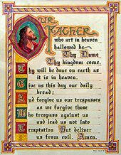
Now, think about how you do lettering today. Imagine there are no lasso tools, no undo, no history palette, no layers or other software tricks that help make artists out of mere mortal people. Then consider how many hours it must take to create such works as these. Just take a look at the work that goes into these pieces and imagine if you had only pen, inks, brushes and speed-ball pens to work with. Could you do it? How long would it take
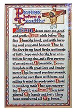
See: The Lord's Prayer enlarged
See: The Lord's Prayer Detail
Note the fine details which went into each letter, not to mention the art and borders.
Illuminated Lettering
 In this page, lettered in 1935, not only does Anthony utilize pen & ink and watercolor, but he's also guilded the frames and borders in metallic gold. In those days you simply didn't stroll to the local art supply store and buy metallic gold ink. You had to mix very finely ground gold, brass or silver powders with the vehicle -- sometimes oil, sometimes water and sometimes lacquer for gold leafing. Painting with this wasn't easy. The viscosity had to be just right or it wouldn't flow through the pen. If it was too thin it would not cover properly and would pucker the paper. If it was too thick with a brush, it would hold to the brush and skip texture in the paper.
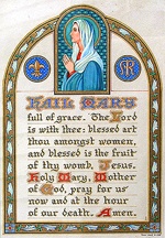
See the exquisite work in Hail Mary
Then consider the details in the gold inks -- how smooth and nearly perfect they are -- the drop-shadows on all the lettering and the other embellishments all in gold. Note also that each and every flower in the border is slightly different -- each illustrated and colored one at a time. You just don't get that with the duplicate command.
IN this version of the "Lord's Prayer" (1946) see now the gold engravings not only illuminate the text but carefully provide a fine textured field for the lettering. Although you must know exactly where to look, and what to look for, the names of the children are finely woven into the borders of the illustration which decorates the left of the page. Spectacular.
A Legacy Worth Saving
We wish to thank Laura and her family for sharing these images. We also hope that all precautions have been taken to hermetically seal the works of art. This is truly a legacy Laura and all her family should be most proud of. One worth saving and appreciating for generations to come.Thank you Laura
Back to the Gallery Index
If you would like to have DTG readers visit your digs in a Design Center monthly Field Trip, just let us know. Tell us a little about your corner of the world and we'll get dates going!
Send us your creations, or those you happen to discover, for The Gallery. All DTG and Design Center readers love to hear from others in the field and see samples of design, illustration, publishing, signs or other visual communications
You send them in and we'll show them in the Design & Publishing Center Gallery.