


Think of your shop as a mini advertising studio and provide a complete image for clients
9 tips on getting paid for your work
Dan Antonelli...
If I could choose one part of the sign business that I could work on all day long, it would definitely be designing logos. It's the part of the business I enjoy the most. For me, there's nothing more satisfying than developing identities for other businesses, then incorporating that design on their vehicle, signage, stationery, and various other advertising mediums.
When I first decided to open my business, I knew that I wanted to focus on being a creative design firm with advertising services in addition to "traditional" sign shop services. Therefore, from the beginning I tried to keep my clients focused on the fact that what we would do was not just letter their vehicles, but develop a cohesive and unique identity for their business. And the beginning of that identity was their logo design.
 Initially, it was sometimes tough to bring this concept home to clients. Many had trouble understanding the concept of a "logo". Some could at least understand the concept of a design or sketch fee, but the separate logo fee was something many just didn't comprehend.
Over time, and after listening to clients and other artists, I've found the following tips to be useful in helping me get paid for the time necessary to create a logo.
TIP #1 Give them something tangible.
You may have a tough time explaining image and identity to your client, but tell them you'll give them cameraready art and a floppy disk with their logo. All of a sudden they can see the light.
TIP #2 Have many examples.
 In my brochure I have samples of about 25 logos I've designed for other small businesses like theirs. When they see other companies that they know, it makes it that much clearer in the client's mind what a logo really is.
TIP #3 Don't give ideas away.
Avoid the "can you show me what it looks like" clients unless they're willing to give you a deposit. I've used this line many times for the clients who say they've never paid for a sketch: "Can you ask an architect to show you drawings of what a secondstory addition might look like on your house -- for free -- because you're not sure if you want one?"
I gently try to explain that I've got the same level of education as an architect and that my education wasn't any cheaper. You need to be compensated for your experience and your education, or you're selling yourself short. (This goes for sign sketches as well as logo designs. Don't give them away!)
Tip #4 Explain the time involved
Explain the time involved in creating art work and sketches. For me, designing logos can be hit or miss when it comes to how long it takes me to be comfortable with a design. Some I can visualize before I even sit down at the computer, then I can bang it out in half an hour. Others, I'll struggle with for over four hours before I'm happy with it. Add to that the time it takes to meet and show sketches (I generally don't show them more than one or two proposed sketches), and you've got a lot of hours invested.
Clients need to realize what goes into a design and the obvious reasons for being compensated for it. And "getting their business" isn't a reason to design for free. If you can spend all that time working for nothing, perhaps you might want to update your résumé. You won't make a career or build a business that way.
Tip #5 Change the fonts and add some art.
 Change the fonts and add some art. I think it's easier to sell a logo design when it doesn't look like it just flew off a computer. Avoid using standard typefaces -- especially the common ones. No one wants to see their business name in Arial Bold. Update your font catalog or hand letter some art and scan it in. I like to alter the typefaces I choose so that they have a more custom feel.
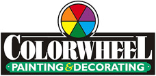
For example, you can change the cross stroke on the letter "a" or the center stroke on an "e" (see ColorWheel and Carnet Consultants). Whenever possible, use some artwork, but remember to keep it simple. Incorporate simplified graphics, similar to Poseidon Pool, Eastern State Tire, and Strong Roots to make the design a little more unique for your client. You can also add simple but effective effects to the lettering, such as prismatic lettering (see Alexis Transport, Andrei Paving, and Santa Maria) or fades and blends.
ARTICLE CONTINUES ON NEXT PAGE
©Dan Antonelli
See Dan Antonelli's excellent series of books on logo and graphics design...
Return to the Design Department, or back to the Front Page
Participate in your Design Center
Lots of fun and information for all... don't forget, any community is only as good as the participation of its members. We invite your tips, tricks, comments, suggestions and camaraderie.
- Ask for the DT&G Monthly: to receive news about DT& headlines, happenings in the Design Center and regular columns like the "Mail Bag" and "Cool Sites"
- SUBSCRIBE : to the Designers' CAFE email list