George Engel has been a friend to the Design Center and the User Group Network for more years than we care to admit. His writings are always intuitive, informative and fun -- he has been an Apple hardware/software guru since the beginning of the Mac, and is one of our favorite contributors.
This article was written for the 'Lakeland Mac Users Group' newsletter after his meeting presentation on type and typography...
My Typography Demo
by George M Engel
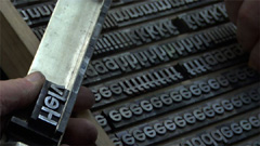
 LIKE THE PRESENTATION THIS MONTH? As you know by now, type has always fascinated me, from the time that I worked part-time in a Newspaper office as a copy boy and lugging the papers upstairs to the loading dock from the Presses. Watching the Typesetter print those lead slugs from the machine and setting them into his tray for final metal press conversion copy, and watching him proofread backwards was an eye-opener for me then.
 The printed word from that time on was my opening into the world around me. The Library was my doorway into the world and my second home until I finally got my first Library Card. I devoured books by the half-dozen, on most everything that got my attention, from aisle to aisle. I learned to speed-read, as there wasn't enough time in the day for all my activities.
As you can see, during my presentation, I get pretty enthused about the topic of Typography. Since type is all around us and it's used to bring out the emotions in all of us, from newscasts to billboards to advertising, I get pretty emotional at times when it's used the wrong way.
Goebbels in Nazi Germany used type and words to stir racial and ethnic hatred very effectively, and unfortunately. Words can bring out the best, and as history shows, the very worst in us. They can be used simply, as evidenced by that master wordsmith, Hemingway. Come to think of it, have you ever had to use a dictionary, even once, when you read a Hemingway novel, or short story? He writes simply and effectively, using small words and simple sentences, with great impact. Shakespeares' prose and sonnets, or Kiplings' Poems, like 'Gunga Din' : "...Though I've belted you and flayed you, By the livin' Gawd that made you, You're a better man than I am, Gunga Din!"
No matter how many times I've read that since my childhood, it still evokes the same memories, even to the 1939 classic movie with Sam Jaffe as Gunga Din. Imperialistic maybe today, but in the time-frame of 1930's India, it created passion, humor and heart-tugging performances for the Kipling poem.
I mentioned during my presentation some names of typefaces that I use a lot. This typeface that you're reading now is one of my recent favorites, Adobe's Open Type font, Garamond Premier Pro. It's called an 'Old Style' font, reminiscent of a warm period font style. Caslon Pro is another font similar to this Old Style face.
 Some magazines use a first letter graphic to accentuate a paragraph, similar to what I used here. I mentioned that I would do this using a beautiful Aridi Letter form graphic. Aridi is a graphic company that specializes in beautiful graphics, whether it be Letter Faces, Frames or just calligraphic designs like the one below. (See an example of an Aridi Font
) Or, if you don't want to spend the money for this beautiful disk(s) of graphics, you can create your own pseudo-graphics in Photoshop (or similar) like the ampersand I created above using Garamond Premier Pro, Italic; then using a 3rd Party style effect for the color, bevel, highlighting and drop-shadow effect; then saving as a jpg graphic. You can then use this as a special graphic effect in a proper place. To be effective, you have to study manuals on design and layout, and not just place them helter-skelter on a page. I'm using them here as an illustrative design piece, and not as I normally would use them.
 My suggestion for all of you readers would be to start looking at magazine pieces, stories and copy as a student, not as a reader.
* Look and study the design of the article, and how it's structured.
* Why did they do this this way and what are they trying to make me buy?
* Is there too much decoration?
* Too much or too little white space, or negative space around the theme?
* Does the page grab your attention?
* Why does it, or doesn't it do so?
* Think like a student writing a report.
If you'd like to try playing with a Newsletter type of arrangement, there are lots of programs out there to start with, both Mac and PC. Good companies might even have 'tryout' versions online that you can play with for 30 days or so, prior to buying it. Adobe's high-priced software, InDesign CS3 and Photoshop CS3, have 'tryout' downloads available at Adobe's website.
I don't recommend that you start with the high-priced spread. Play with an economy piece of software to get your feet wet and see if you have a talent for it. The only way to get better at using type is to study what's out there in the real world and see what's successful and why it's so.
* Look at pages close and far away.
* Determine if it looks right or not.
You can set type with metric precision, or the way that I do it is to use Optical precision. In other words, the way that the eye perceives it is optically correct. The kerning, or space between the letters, is better when optically correct than metrically correct. You get used to it after awhile. Start looking at that space between letters the next time that you see a billboard, or some advertisement in the paper or magazine. Does it look right, or should that "i" be tucked under that 'F' a little more?
A good friend of mine, Fred Showker, looked at a Newsletter I designed long ago. His criticism was sharp and to the point. Boy, did it hurt! But, it was a piece of crap from a design point, as I look at it now. Fred is a master at Newsletter Design and has taught the fundamentals all over the country at major companies and government installations. I asked him for the truth and I got it. I learned to study the fundamentals more, but I still make the mistake of using too much graphics in my Newsletters. However, it's a voluntary read and not-fot-profit, so I can afford to do it my way
... I put it together for my eyes, and hopefully, for yours.
... continues with "What's My Font"
About the author: George Engel has been a computer guru probably longer than he will admit -- as a computer expert, he authored The Naked Serviceman book, about his journey through the history of Apple's Macintosh as owner/founder of an authorized Apple Service Center. (Available from Amazon, or LuLu) He owned one of the first Apple II computers as well as one of the first Macintosh 128s. He started out with the Upstate Apple Users Group somewhere in upstate New York, and now hangs out with the 'Lakeland Mac Users Group' in Lakeland, FL.
Return to: DT&G Magazine, or the Design Center Front Page
Participate in your Design Center
Lots of fun and information for all... don't forget, any community is only as good as the participation of its members. We invite your tips, tricks, comments, suggestions and camaraderie.- Ask for the DT&G Monthly: to receive DT&G newsletter each month, happenings in the Design Center and regular columns like the "Mail Bag" and "Cool Sites"
- DISCUSS THIS : in the Designers' CAFE forums
- Help Support The Design Center: with your donation, we say thank you with free books, listings, and even links on the front page!
- SUBMIT: a news link, new font, or product review
- SUBMIT: a link to a Photoshop web site


