Designing an unfolding story
design to serve the message, the story and the budget
There are many ways to design brochures and booklets, but when the budget is very tight, and the story is compelling but illusive, the graphic designer has to get creative. Such is the case for this project to design collateral materials for a children's museum fund-raising capital campaign. The criteria for the project presented some demanding thought to get it right, and be successful.
When we brought together the team with the client we brainstormed the whole process. It was decided to work in two distinct phases, first to prepare the audience for what was to come, and second, to present the scope of the project with a compelling "wow" factor. Fund raising is tough enough, but when it comes to subjects that are generally considered non-essential, the project becomes really tough. Let's consider the challenges.
Of course, the establishment of a world class children's museum is a wholly beneficial project for any community. Although the rewards are somewhat obscure, research and proven statistics dictate that it indeed promotes dynamic learning for children as well as fostering tighter relationships within families, between families and more importantly between families and community. The challenge was to tell this story while overcoming pre-conceived notions that "our kids are okay" or "our kids are doing great!" In community fund raising, the compelling motivator is "saving" something. Easy fund-raising says "Let's save the hungry children." or "let's save our sick and lonely elderly." Difficult fund-raising says "you won't see the results of this for fifteen years, but it can change people's lives for the whole community."
We also had to understand the target market. Most potential contributors, with affluence and influence, don't normally see "childhood" as something that needs to be saved. Their kids are grown and successful, and they simply believe they did everything right without a children's museum. On the other hand, young families with children understand the real value of such a facility -- but in that stage of life, today's young families have little excess wealth to share with anyone. Therein lies the dilemma. We, as designers, had to overcome the heartstrings being tugged by other charities for the sick, hungry and homeless -- and paint a picture of investing in children beyond the simple maintenance of basic needs.
Fund-raising marketing materials
Professional fund raisers recommend several selling devices to successfully meet donor expectations and campaign goals. They want a packet of information for each potential donor containing a booklet about the project, a fact sheet, a talking points or testimonial sheet, a pledge device (or 'letter of commitment') and today, a compelling, professionally produced DVD. The group agreed to produce all of those. Facing the project, I knew it wasn't going to be easy because of the time and expense that would be required to do a good job on all of those elements.
The packets as dictated by the pros can run from $3 to $12 each, depending on the amount to be raised, and the market area of the charity. If you've ever seen some of these packets, you'll know what I'm talking about. The Houston Children's Museum* is in the middle of a capital campain to raise $30-million for an addition to their existing museum! Their fund raising packet probably runs upwards to ten-bucks each -- and cost over $2 just to mail to me! In the Houston market, they'll probably need twenty-thousand of these packets. Do the math. We were walking a tightrope -- the package needed to be successful, on a very tight budget, and not give the perception of being too slick and glossy. Ours is a highly conservative, rural, agriculturally-based community, and the stakes are much different. You can't come off looking too slick and professional or the public thinks you don't need the money, or you're squandering the money you have. To raise $4-million, we would need at least 3,000 packets -- while working under a budget that needs to come in under $3 per packet. Put a dollar DVD in that kit, and you're down to $2 each.
Getting creative to tell the story
The first phase was to create a hard-working selling device that wouldn't cost much to produce. Any time you're involved with tight fund raisers, they have a tendency to covet their materials. They don't want to "give away" a 50-cent brochure to just anyone. But in this case, they needed a work-horse brochure that cost pennies, in quantity, that could be given freely. I decided this was the perfect fit for the "Pocket-Pitch" brochure
Veteran sales professionals know the real value of a "pitch book." This is usually an 8.5 x 11, spiral-bound or 3-ring flip-chart the sales person utilizes to walk the viewer through the selling process, telling the story, to the ultimate end of call to action. Think of it as a Powerpoint on paper. I created a handful of pitch-books for specific fund raisers to enlist other solicitors. They've been very effective in bringing fund-raisers on board. But they tap out at $9 each with spiral binding and covers at Kinko's. What we really needed is this pitch-book that will fit in your pocket. A "pocket pitch" book.
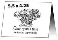
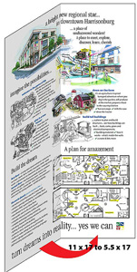
 I took the pages of the pitch book -- which I, myself, have used many times to effectively bring other fund raisers on board -- and reduced / reformatted the pages to fit in a pocket-sized brochure. An 11 x 17 tabloid sheet, folded 4 times becomes a 16-page book, or brochure. It folds down to 5.5 x 4.25 and fits nicely in pocket or purse. It involves a mere single sheet of 70lb offset paper, so they're cheap to produce. Now, the campaign team wouldn't have to feel stingy about spreading these around.
Unique fold unfolds the story
The way it's folded controls how the story unfolds. The purpose of this phase one piece was to generate awareness, tell the success stories of the existing children's museum, and then unfold to an impressive spread that shows what the old, derelict building could become. It's quick and easy, and even if the reader doesn't read the text -- they get the point through pictures and the unfolding of the story. I kept the content brief, and for the most part simple bullet points -- as if it were a slide presentation.
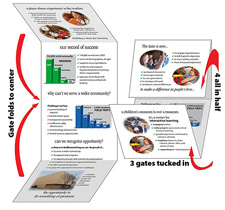
 Here we see how the brochure folds to tell the story. The first opening has the story... how today's children have needs in their lives that aren't being met at home or at school. How specific learning experiences make it easier to learn, and learning enjoyable.
 Opening the brochure to the next part of the story, top and bottom gate folds reveal a tall, vertical spread. This spread reinforces the success stories of the existing museum -- it's bright financial statement, and some market charts showing participation from surrounding counties with impressive numbers. At the bottom, it presents the derelict building to be renovated, and the value of moving the museum into this as a new downtown facility. (Click for an enlargement.)
At the bottom, it closes with "take a look inside" and the reader opens the last fold to arrive at the full 11 x 17 tabloid spread showing the scope of what the project can be.
While the printer had some reservations about that much folding, the project turned out beautifully and has been quite a success. It is a somewhat difficult fold because the first half-fold is then gate-folded, and then half-folded again. So if you want to use this technique, you'll need to ask your printer up front if they can handle that fold. Since you end up with eight layers of paper in places, the fold can cause trouble crossing the paper grain several times. Don't use glossy, coated paper, and don't run color or print across any outward fold. Cracking will make the print look bad. A high-opaque, 70 or even 80lb offset paper works well -- we used a matt coated, which experienced little or no cracking across the folds. To keep costs down, there are no bleeds, and no large solid ink coverages, so cracking and abrading in folding was totally avoided.
Here's what the print PDFs looked like -- the whole job produced in Adobe Illustrator, starting with photos out of Photoshop. It could have easily been done in InDesign or any number of other DTP packages out there.
 NEXT PAGE: Phase 2 now needs to tell the full story. . .
Let's hear from YOU!
Don't forget: when you've got a tough project, give us a call! If you've produced something special (even without our help) please send it along for review. You could be a winner.
Return to the DTG Magazine, or back to the Design Center Front Page
Participate in your Design Center
Lots of fun and information for all... don't forget, any community is only as good as the participation of its members. We invite your tips, tricks, comments, suggestions and camaraderie.- Ask for the DT&G Monthly: to receive news about DT& headlines, happenings in the Design Center and regular columns like the "Mail Bag" and "Cool Sites"
- SUBSCRIBE: to DTG Newsletter email list, or join in the discussions in the: Design Cafe Discussion Forums


